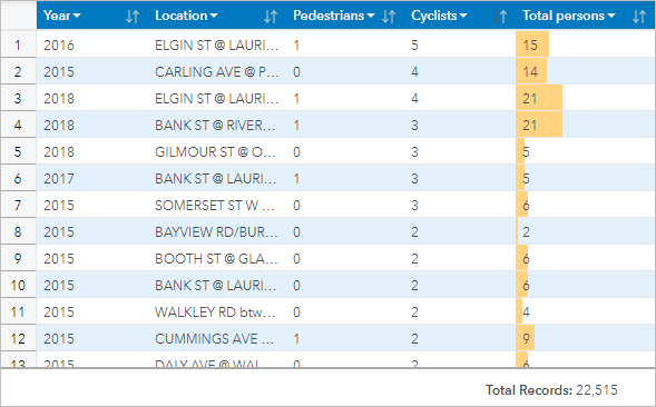


A reference table displays the fields in data in its raw format. A reference table includes the raw values for the selected fields without grouping or summarizing the data.
Example
A GIS analyst is analyzing traffic accidents involving cyclists and pedestrians. As part of the analysis, the analyst creates a reference table that can be used to look up the year and location of the accidents, along with the number of cyclists, number of pedestrians, and total persons involved in the accidents.

Create a reference table
To create a reference table, complete the following steps:
- Select the fields to display in the reference table.
There is no limit to the number of fields that can be used in a reference table. String, number, date/time, and rate/ratio fields are supported in reference tables. If you use a location field, the display field is used in the reference table.
Tip:
You can search for fields using the search bar in the data pane.
- Create the reference table using the following steps:
- Drag the selected fields to a new card.
- Hover over the Table drop zone.
- Drop the selected fields on Reference Table.
Tip:
You can also create tables using the Table button above the data pane or the Visualization type button  on an existing card. Only compatible visualizations (including maps, charts, or tables) are listed in the Visualization type menu.
Usage notes
Use the Table options button  to access the following:
- Table formatting
- Column formatting
- Conditional formatting
- Sparklines
- Invert selection
The Table formatting button  opens the Table formatting pane. The Table formatting pane contains the following functions:
- Use the Color tab
 to change the table style, including the header, base row, alternating row, and gridline colors for the full table.
 - Use the Font tab
 to change the header and cell text font specifications (including the font face type, size, color, bold, and italics) for the full table.
The Column formatting button  is available when one or more columns are selected and opens the Column formatting pane. The Column formatting pane contains the following functions:
- Use the Color tab
 to change the header and base row colors for the selected columns.
 - Use the Formatting tab
 to update the date format (date fields only), set the number of decimal places (number fields only), change the text alignment (left, center, or right justified), add a context label (such as a unit of currency or percent sign) to the left or right of values in the column, convert numbers to a percentage (number fields only), wrap overflowing text, or freeze the column in the first position on the table.
Note:
The Formatting tab is not available when a sparklines column is selected.
- Use the Font tab
 to change the header and cell text font specifications (including the font face type, size, color, bold, and italics) for the selected columns.
The Conditional formatting button  is used to add formatting to the specified columns based on the values in the column. You can choose one or more fields for the Fields to format parameter, or select columns on the table to apply conditional formatting. The following visualizations are available:
- Rule based—Adds format style (cell color, font color, and font styling) based on the specified rules. For number and rate/ratio fields, you can apply formatting to a cell if the value is greater than, less than, equal to, in between, or not in between the specified value. For string fields, you can apply formatting to a cell if the value contains or doesn't contain the specified string. For date fields, you can apply formatting to a cell if the value is after, before, equal to, in between, or not in between the specified date value.
You can also specify a field rather than a constant value. The field type must correspond to the field you are formatting.
- Data bars—Adds bars of a specified color showing the relative magnitude of values for each row in the field. Data bars are supported for number and rate/ratio fields.
The Sparklines button  is used to create visualizations to compare values or view trends from multiple number fields. A new column is created when sparklines are added to the table. The column exists only in the reference table and does not affect the fields in the input dataset. Sparklines can be created as lines, columns, or win/loss visualizations. You can update the colors and column name for the sparklines, and turn on data points indicating values such as the start and end points. For more information, see Sparklines.
Use the Card filter button  to remove any unwanted data from the card. Filters can be applied to all string, number, rate/ratio, and date/time fields. A card filter does not affect other cards using the same dataset.
Use the Invert selection button  to switch all selected and unselected features. Invert selection is only enabled when there are features selected on the table.
Use the Show selection button  to show only selected features in the table. Show selection is only enabled when there are features selected on the table.
Use the Visualization type button  to switch directly between a reference table and other visualizations, such as a bar chart or summary table. The visualization type options depend on the fields used to create the reference table.
Use the Maximize button  to enlarge the card. Other cards on the page will be reduced to thumbnails. The card can be returned to its previous size using the Restore down button
  .
.
Use the Enable cross filters button  to allow filters to be created on the card using selections on other cards. Cross filters can be removed using the Disable cross filters button
  .
.
Use the Flip card button  to view the back of the card. The Card info tab
  provides information about the data on the card and the Export data tab
  allows users to export the data from the card.
Note:
Feature layers must have the Allow others to export to different formats setting enabled to be exportable from reference tables. For more information, see Manage hosted feature layers in the ArcGIS Online or ArcGIS Enterprise help.
Use the Card options button  to access the following options:
- Appearance button
 —Change the background color, foreground color, border of the card, and map rotation, and add or remove the basemap layers and north arrow.
 - Order button
 —Move the card forward or move the card backward relative to other cards on the page.
 - Delete button
 —Remove the card from the page. If you did not intend to delete the card, you can retrieve it using the Undo button
  .
.
Sparklines
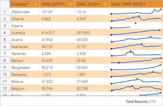
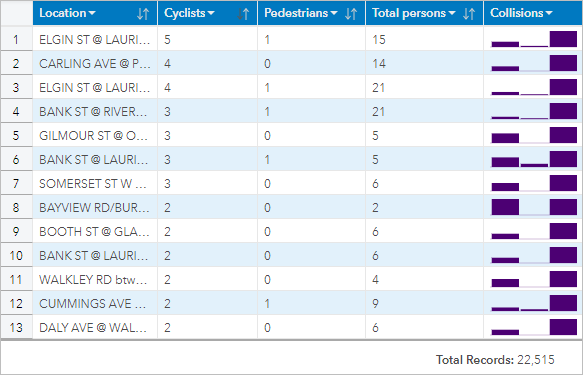
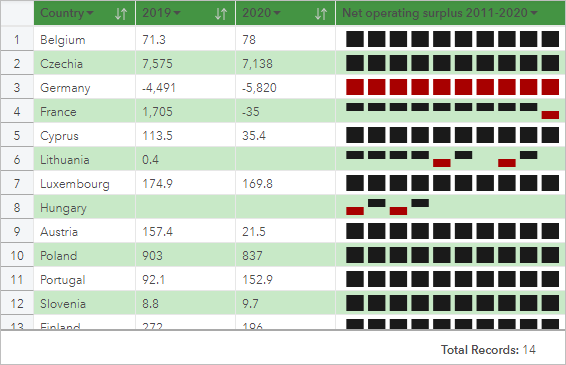
Sparklines are charts inserted into a reference table. The charts show trends or compare values from multiple number fields. Sparklines can be visualized as lines, columns, or win/loss charts.
Lines
Line visualizations are used to evaluate trends in the data. Choose line visualizations when the fields for the sparklines have a specific order, such as chronology. For example, a dataset contains total yearly carbon emissions by country. A line visualization can be created to show whether carbon emissions are increasing, decreasing, or remaining constant for each country.

Columns
Column visualizations are used to show the difference in value in the data. Values in a column visualization can be positive or negative. Choose column visualizations when the fields for the sparklines are discreet and you want to see the difference in magnitude between fields. For example, a dataset contains locations for traffic collisions in Ottawa, Canada. A column visualization can be created to show the number of cyclists, number of pedestrians, and total persons involved in the collision.

Win/Loss
Win/Loss visualizations show the direction of a value (positive or negative) without indicating differences in magnitude and are most commonly used in finance. In win/loss visualizations, wins are positive values and losses are negative values. Values of zero are not represented on a win/loss visualization. For example, a dataset contains net operating surplus data (in million units of national currency) for countries in the European Union and euro area. A win/loss visualization can be created to show when the net operating surplus is positive (win) or negative (loss).

Limitations
Sparklines columns will cause issues with cell heights when some table and column formatting features are applied, such as text size and text wrapping. To avoid this issue, it is best practice to apply formatting changes before adding sparklines to the table.
Resources
Use the following resources to learn more about tables: