


Scatter plots are used to determine the strength of a relationship between two numeric variables. The x-axis represents the independent variable, and the y-axis represents the dependent variable.
Scatter plots can answer questions about data such as: What is the relationship between two variables? How is the data distributed? Where are the outliers?
Examples
The examples below show scatter plots using two variables, three variables, and bins.
Two variables
A public works department has noticed an increase in leaks on water mains. The department wants to know how much of an effect the total length of pipes has on the number of leaks compared to the impact of properties of the pipes, such as age or circumference. A scatter plot can be used to plot the total number of leaks versus the total length of pipes in each zone.
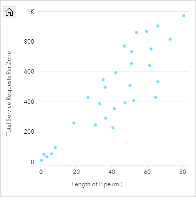
The public works department also wants to know whether there is any difference between pipes surveyed at different times of the year. Using the Color by option, the department can style the points using unique colors for every unique value in the specified field.
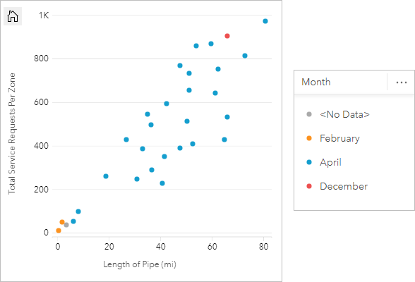
The scatter plot indicates that most of the pipe surveys occurred in April.
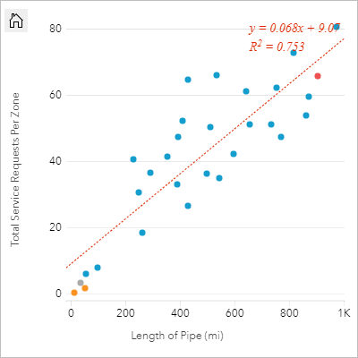
A scatter plot can use regression analysis to estimate the strength and direction of the relationship between dependent and independent variables. Statistical models are illustrated with a straight or curved line, depending on your selected chart statistic. The R2 value can be added to give a measure of the impact of the length of pipes on the number of leaks.
Add a third variable
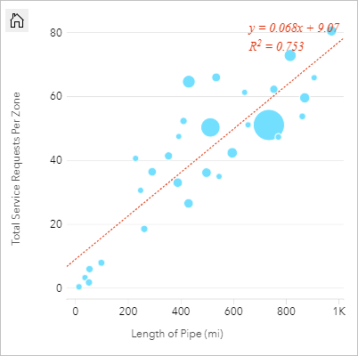
A public works department has noticed an increase in leaks on water mains. The department wants to know how much of an effect the total length of pipes has on the number of leaks versus the impact of properties of the pipes, such as age or circumference. The department also wants to know whether there is a relationship between the number of leaks or length of pipes and the cost per day (including construction, maintenance and repairs, and lost resources through leaks). A scatter plot with proportional symbols can be used to plot the total number of leaks versus the total length of pipes in each zone, with the size of the points representing the cost per day.
Tip:
 Drag a number field to your page and drop it on your scatter plot to give your chart graduated symbols.
The public works department also wants to know whether there is any difference between pipes surveyed at different times of the year. Using the Color by option, you can style the points using unique colors for every unique value in the specified field.
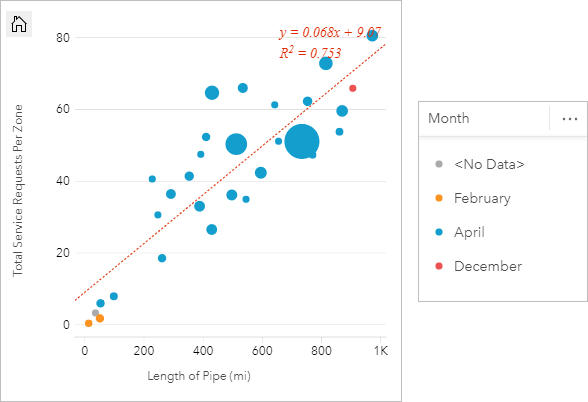
The scatter plot indicates that most of the pipe surveys occurred in April.
Visualize with bins
A GIS analyst working for a consortium of colleges wants to find which states have high-value colleges. The analyst starts their analysis by creating a scatter plot showing the cost of colleges and the average earnings after graduation. The scatter plot shows a positive relationship, but the points are too densely distributed to see more specific patterns.
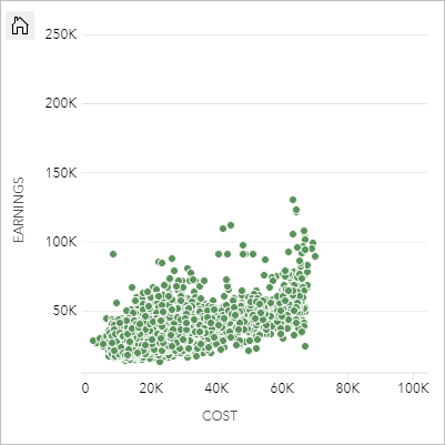
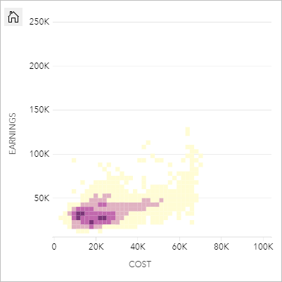
The analyst can change the style of the chart to Bins to see the distribution of the points on the scatter plot. The pattern shows that the highest concentration of colleges have a cost around $20,000 and result in earnings below $50,000.
Create a scatter plot
To create a scatter plot, complete the following steps:
- Select two number
 or rate/ratio
  fields.
Note:
You can search for fields using the search bar in the data pane.
- Create the chart using the following steps:
- Drag the selected fields to a new card.
- Hover over the Chart drop zone.
- Drop the selected fields on Scatter Plot.
Tip:
You can also create charts using the Chart menu above the data pane or the Visualization type button  on an existing card. For the Chart menu, only charts that are compatible with the data selection will be enabled. For the Visualization type menu, only compatible visualizations (including maps, charts, or tables) will be displayed.
Scatter plots can also be created using View Scatter Plot, which is accessed by clicking the Action button  under Find answers > How is it related.
You can add a third number or rate/ratio variable to your scatter plot by selecting a field in the data pane and dragging it to the existing scatter plot card (not available on a scatter plot with bin symbols). The result will be a scatter plot with proportional symbols, where the size of the points represents the magnitude of the data from the third variable.
Usage notes
Use the Switch axes button  to switch the variables on the x- and y-axis.
Click the x- or y-axis to change the scale between Linear and Log.
Use the Layer options button  to open the Layer options pane and do the following to update the configuration options:
Use the Legend tab
To change the color associated with a value, click the symbol and choose a color from the palette or provide a hexadecimal value. Changing the symbol on the Legend tab is only available for unique symbols. to view the symbols on the chart. The pop-out legend button
  displays the legend as a separate card on the page. You can use the legend to make selections on the chart (available for unique symbols).
- Use the Symbology tab
 to change the Color by and Symbol type parameters. The Color by field is used to style the chart with unique values and must be a string field. The Symbol type parameter is used to switch the style of the chart between points and bins. If the Symbol type is Bins, the following additional configurations are available:
 - Resolution—Set the size of the bins. The default Resolution value is calculated for your dataset using Sturges' rule.
- Transition value—If the number of point features in the chart extent is less than the transition value, the chart will display the point features. If the number of points in the chart extent is greater than or equal to the transition value, the chart will be styled with bins. The default Transition value is 2,000.
- Show pop-up—Determines whether pop-ups are displayed when you hover over a bin, and what information is included in the pop-ups.
- Use the Appearance tab
 to do the following:
- For points, you can change the symbol size, symbol color (single symbol only), outline thickness, outline color, and layer transparency.
- For bins, you can change the color palette, bin outline thickness, bin outline color, and layer transparency.
Use the Chart statistics button  to add a line of best fit to the scatter plot. The line of best fit can be linear, exponential, or polynomial. The equation of the line of best fit and the R2 value will also be displayed on the chart.
The following table describes the options for line of best fit:
| Statistic | Description |
|---|---|
Linear | Attempts to fit a straight line through a set of values so that the distances between the values and the fitted line are as small as possible. A positively sloped line (from lower left to upper right of the chart) indicates a positive linear relationship. Positive relationships mean that values increase together. A negatively sloped line indicates a negative linear relationship. A negative relationship means that one value decreases as another increases. Goodness of fit measures, such as R2, can be used to quantify the relationship. The closer to 1, the stronger the relationship is. |
Exponential | Calculates an exponential (upward) curve of best fit to model a nonlinear relationship in your data (R2 for linear regression at 0 or close to 0). |
Polynomial | Calculates a curve of best fit for a nonlinear relationship in your data (R2 for linear regression at 0 or close to 0). A second-degree polynomial equation is used for the calculation by default. You can change the equation to a third- or fourth-degree polynomial equation. |
Use the Card filter button  to remove any unwanted data from the card. Filters can be applied to all string, number, rate/ratio, and date/time fields. A card filter does not affect other cards using the same dataset.
Use the Selection tools button  to select features on the chart using the single select and box select tools, or invert the selection.
Use the Zoom tools button  to zoom in or out on the chart.
Use the Visualization type button  to switch directly between a scatter plot and other visualizations, such as a KPI card or summary table.
Use the Maximize button  to enlarge the card. Other cards on the page will be reduced to thumbnails. The card can be returned to its previous size using the Restore down button
  .
.
Use the Enable cross filters button  to allow filters to be created on the card using selections on other cards. Cross filters can be removed using the Disable cross filters button
  .
.
Use the Flip card button  to view the back of the card. The Card info tab
  provides information about the data on the card and the Export data tab
  allows users to export the data from the card.
Use the Card options button  to access the following options:
- Appearance button
 —Change the background color, foreground color, and border of the card.
 - Edit labels button
 —Create custom labels for the chart axes. To edit the labels, click the Edit labels button and click the axis to make it editable.
 - Order button
 —Move the card forward or move the card backward relative to other cards on the page.
 - Delete button
 —Remove the card from the page. If you did not intend to delete the card, you can retrieve it using the Undo button
  .
.
Limitations
Binned scatter plots are not available for certain remote feature layers. If your remote feature layer does not support binned scatter plots, you can copy the layer to your workbook and create a binned scatter plot using the copy.
Export data is not available for binned scatter plots. You must set the Symbol type to Single symbol to enable exporting data from the back of a scatter plot.
Zoom tools and selection tools are not available on published reports for binned scatter plots with more than 100,000 features.
Navigation will be locked on reports for some binned scatter plots with too many features to display. You can enable navigation by enabling cross filters on the card or adding a filter widget or temporal filter widget for the dataset used to create the card.
Resources
Use the following resources to learn more about charts: