

Choropleth maps use the Counts and amounts (Color) smart mapping symbol type to show normalized data as shaded points, lines, or areas. Choropleth maps help answer questions about data, such as: How do rates or percentages compare by geographic feature?
Example
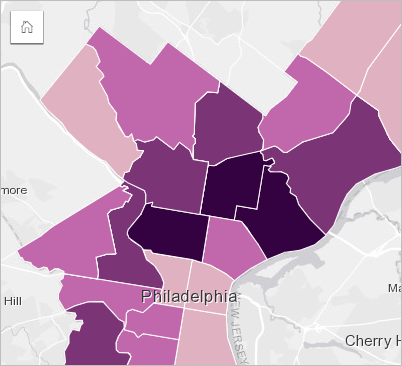
A crime analyst is researching crime frequencies across the city and the correlation between crime and other social issues, such as high unemployment rates. City officials will use the results to implement new social programs across the city in an effort to reduce crime. A choropleth map can be used to visualize the unemployment rates in police districts across the city and compare them to crime rates.

Darker areas in the above map indicate high levels of unemployment, while lighter areas indicate low levels of unemployment.
Create a choropleth map
A choropleth map is automatically created when a rate/ratio field is used to create a map. A numeric field can also be used to create a choropleth map by switching Symbol type from Counts and amounts (Size) to Counts and amounts (Color). Numeric data should then be normalized using the Divide by parameter when used to create a choropleth map.
To create a choropleth map with a rate, ratio, or proportion, use the following steps:
- Expand a dataset in the data pane so that the fields are visible.
- Select a rate/ratio field
 .
.Tip:
If you have rate/ratio values in a number field
 , you can change the field type by clicking the field icon and choosing Rate/Ratio.
You can search for fields using the search bar in the data pane.
- Drag the field to the page to the Map drop zone.
Note:
You can also create a map by selecting a field and clicking the Map button above the data pane.
A choropleth map is created using Counts and amounts (Color) as the Symbol type setting.
To create a choropleth map using normalization, complete the following steps:
- Expand a dataset in the data pane so that the fields are visible.
- Select a number field
 . The number should be a total, such as number of crimes or total sales.
Tip:
You can search for fields using the search bar in the data pane.
- Drag the field to the page to the Map drop zone.
A graduated symbol map is created.
Note:
You can also create a map by selecting a field and clicking the Map button above the data pane.
- Expand the legend to display the Layer options pane.
- Browse to the Symbology tab
 .
. - Change Symbol type to Counts and amounts (Color).
- Choose a number field for the Divide by parameter. The field should have a number that can be used to create a proportion from the first number field, such as total population.
Usage notes
To access the Layer options pane, click the arrow next to the layer name. You can do the following in the Layer options pane:
- Use the Legend tab
 to view the classification values and counts for each class, and to make selections based on classes.
 - Use the Symbology tab
 to do the following:
- Change the field displayed on the map or switch to a different type of map.
- Change the statistics for the display field. This option is only available if location was enabled on the dataset with aggregated features or if the dataset was created through spatial aggregation. For more information, see Enable locations for your data and Spatial aggregation.
- Change the classification type and number of classes.
- Change, add, or remove the Divide by field.
- Use the Annotation tab
 to configure the map pop-ups for the layer and enable labels.
 - Use the Appearance tab
 to do the following:
- Symbols—Change the symbol style properties, such as the color palette, outline thickness and color, and layer transparency.
- Layer effects—Enable bloom and drop shadow effects.
- Use the Attributes tab
 to view details for features that are selected on the map.
Use the Card filter button  to remove any unwanted data from the card. Filters can be applied to all string, number, rate/ratio, and date/time fields. A card filter does not affect other cards using the same dataset.
Use the Selection tools button  to select features on the map using the single select, box select, and lasso tools; zoom to the selection; or invert the selection.
Use the Zoom tools button  to zoom in or out on the map, zoom to a selection, set the default extent of the map, zoom to a layer, or lock navigation on the map.
Use the Visualization type button  to switch directly between a choropleth map and other visualizations, such as a reference table, KPI card, or histogram.
Use the Sync extents button  to link the extent of all maps on the page so they zoom and pan simultaneously.
Use the Maximize button  to enlarge the card. Other cards on the page will be reduced to thumbnails. The card can be returned to its previous size using the Restore down button
  .
.
Use the Enable cross filters button  to allow filters to be created on the card using selections on other cards. Cross filters can be removed using the Disable cross filters button
  .
.
Use the Flip card button  to view the back of the card. The Card info tab
  includes statistics and a text box for a description of the card.
Use the Card options button  to access the following options:
- Appearance button
 —Change the background color, foreground color, border of the card, and map rotation, and add or remove the basemap layers and north arrow.
 - Order button
 —Move the card forward or move the card backward relative to other cards on the page.
 - Delete button
 —Remove the card from the page. If you did not intend to delete the card, you can retrieve it using the Undo button
  .
.
How choropleth maps work
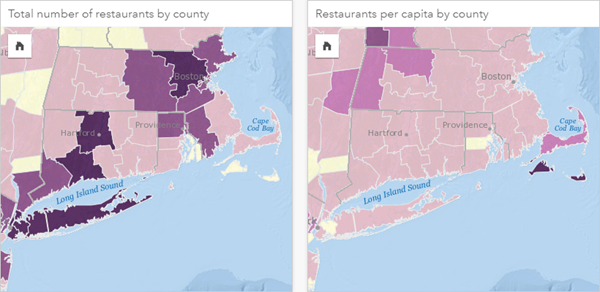
Styling your map using graduated colors, like with a choropleth map, can lead to visual misinterpretations, especially when the features on the map are areas of various sizes or populations. In these cases, larger areas will naturally draw your attention, especially if they're styled with darker colors. You can counter the bias created from different-sized areas in choropleth maps by styling the maps by averages, proportions, rates, and ratios instead of counts or totals. When the data being displayed on a map is a proportional value, it's taking into account the differences between the features, whether it be population, area, or another factor.

Both maps above use colors to show the number of restaurants by county. However, the map on the left shows the total number of restaurants and the map on the right shows the number of restaurants per capita. The counties have some variation in area, but the biggest variation is in the population across counties. The combination of large areas and a large number of restaurants emphasizes features such as Long Island and the Boston area, even over the smaller counties in New York City that are the same color. However, when the population of each county is taken into account, like in the map on the right, you can see that the counties around Cape Cod and inland from the coast have a larger number of restaurants per capita and the majority of the other counties have an average number of restaurants per capita. The per capita map is a correct choropleth map.
Note:
If you want to make a map of counts or totals, such as the total number of restaurants by county, you can make a graduated symbol map.
If you want to create a choropleth map but you do not have proportional data, you can create proportions using a process called normalization. When you normalize data, you take a number, such as total crimes, and divide it by another number, such as total population, to create a proportional value. Normalization can be performed when you create a choropleth map using the Divide by parameter on the Symbology tab  . In the example above, the total number of restaurants in each county was normalized using the total population of the county.
Resources
Use the following resources to learn more about maps: