

Chord diagrams provide a way to visualize tabular datasets in an appealing and informative manner to show directed relationships between categories.
Chord diagrams can answer questions about data, such as the following:
- What is the volume of flow between categories?
- Are there anomalies, differences, or similarities in the volume of flow?
Examples
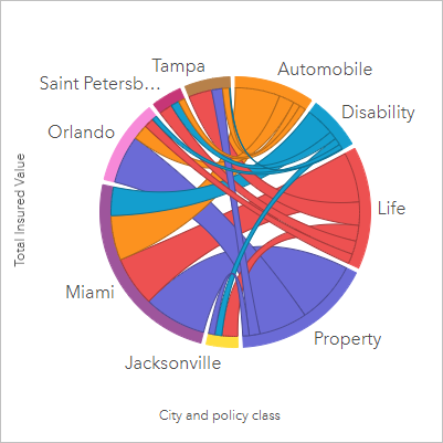
An insurance company is reviewing the types of policies it offers to compare its current offerings to the findings from a recently completed market research project. One step in the review is to compare the total insured value (TIV) of policies in each policy class across cities. A chord diagram can be used to visualize the distribution of subgroups for each category.

The chord diagram above provides a sum of the TIV for each category of insurance policy across cities. The Policy_Class values (Property, Life, Disability, and Automobile) and City values (Miami, Jacksonville, Orlando, Saint Petersburg, and Tampa) are displayed as different colored arcs around the circle. The length of the arc and thickness of the chords are determined by the sum of the TIV. You can see not only which city or policy class recorded the highest and lowest values, but also the policy classes that contribute to the sum of TIV for each city. Miami recorded the largest sum of TIV in each policy class, while cities such as Saint Petersburg and Jacksonville have policies in three of the four policy classes.
When the values in the two category fields are the same, the rate/ratio layout is used. Each chord is bidirectional, with its thickness and value determined by the extent of the relationship or volume of the flow between the categories.
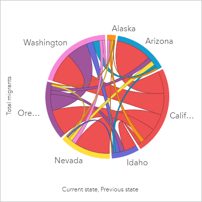
A census bureau department is studying the state-to-state migration flows among seven states in the western United States in a particular year. A chord diagram can be used to determine the migration behavior among the states.

The states (Alaska, Arizona, California, Idaho, Nevada, Oregon, and Washington) are displayed as different colored arcs around the circle. The arc length for each state represents the flow (migration) into the state, so you can see which states recorded the highest influx. The chords show the directed flow between states. In the ratio layout, each chord represents the bidirectional flow between two states, so tapered chords indicate more volume of flow in one direction than the reverse. For example, more people migrated from Alaska to California than vice versa.
Create a chord diagram
To create a chord diagram, complete the following steps:
- Select one of the following combinations of data:
- Two string fields

- Two string fields
 and a number field
  or a rate/ratio field
Note:
If you do not select a number or rate/ratio field, the data will be aggregated and a count will be displayed.
You can search for fields using the search bar in the data pane.
- Two string fields
- Create the chart using the following steps:
- Drag the selected fields to a new card.
- Hover over the Chart drop zone.
- Drop the selected fields on Chord Diagram.
Tip:
You can also create charts using the Chart menu above the data pane or the Visualization type button  on an existing card. For the Chart menu, only charts that are compatible with the data selection will be enabled. For the Visualization type menu, only compatible visualizations (including maps, charts, or tables) will be displayed.
Chord diagrams can also be created using View Chord Diagram, which is accessed from the Action button  under Find answersand How is it related?
Usage notes
Chord diagrams are styled by unique values.
This visualization creates a result dataset  in the data pane, which includes the fields used to create the chart. The result dataset can be used to create additional visualizations, rename the fields on the chart axes or in the pop-ups, or apply filters to the chart.
The categories are arranged in a circle as arcs. The chords are the links or connections between the arcs in the circle that show the relationships or flow between the two categories. The length of each arc and the thickness of each chord are determined by its value.
The values in the chord diagram can be symbolized as a count of features in the categories or as a number or rate/ratio field. If a field is used, the values can be calculated as a sum, minimum, maximum, average, percentile, or median of values from the field.
Note:
Median and percentile are not available for certain remote feature layers. If the remote feature layer does not support median or percentile, you can copy the layer to your workbook.
Use the Layer options button  to open the Layer options pane. Use the Legend tab to view the symbols and make selections on the chart. To change the color associated with a value, click the symbol and choose a color from the palette or provide a hexadecimal value. The pop-out legend button
  displays the legend as a separate card on the page.
Use the Card filter button  to remove any unwanted data from the card. Filters can be applied to all string, number, rate/ratio, and date/time fields. A card filter does not affect other cards using the same dataset.
Use the Selection tools button  to select features on the chart using the single select tool, or invert the selection.
Use the Visualization type button  to switch directly between a chord diagram and other visualizations, such as a grouped summary table, bar chart with a Subgroup field, data clock, or heat chart.
Use the Maximize button  to enlarge the card. Other cards on the page will be reduced to thumbnails. The card can be returned to its previous size using the Restore down button
  .
.
Use the Enable cross filters button  to allow filters to be created on the card using selections on other cards. Cross filters can be removed using the Disable cross filters button
  .
.
Use the Flip card button  to view the back of the card. The Card info tab
  provides information about the data on the card and the Export data tab
  allows users to export the data from the card.
Use the Card options button  to access the following options:
- Appearance button
 —Change the background color, foreground color, and border of the card.
 - Edit labels button
 —Create custom labels for the chart axes. To edit the labels, click the Edit labels button and click the axis to make it editable.
 - Order button
 —Move the card forward or move the card backward relative to other cards on the page.
 - Delete button
 —Remove the card from the page. If you did not intend to delete the card, you can retrieve it using the Undo button
  .
.
Resources
Use the following resources to learn more about charts: