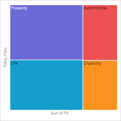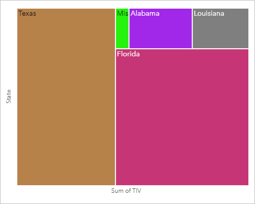


Treemaps can be used to view data in a hierarchical format using nested rectangles. A treemap is like a tree diagram that uses differently sized rectangles to convey numeric values for each branch. The larger the rectangle, the higher the numeric value.
Treemaps can answer questions about data, such as: What are the proportions of categories to the total?
Examples
An insurance company is reviewing the types of policies it offers to compare its current offerings to the findings from a recently completed market research project. One step in the review is to compare the total value of policies in each policy class. A treemap can be used to visualize the proportion of total insured value (TIV) in each policy class.

The insurance company decides to limit its focus to states that share coastline along the Gulf of Mexico. Using the location field, the analyst can create a spatial treemap that shows the total insured value for each state (Texas, Mississippi, Louisiana, Alabama, and Florida), with the states organized by their geographic location.

Create a treemap
To create a treemap, complete the following steps:
- Select one of the following combinations of data:
- One or two string fields

- One or two string fields
 plus one or two number
  or rate/ratio fields
Note:
If you do not select a number or rate/ratio field, the data will be aggregated and a count will be displayed.
You can search for fields using the search bar in the data pane.
- One or two string fields
- Create the chart using the following steps:
- Drag the selected fields to a new card.
- Hover over the Chart drop zone.
- Drop the selected fields on Treemap.
Additionally, you can create a spatial treemap that displays your data in the same way as a standard treemap, but it's suitable for the arrangement of data with a geographic component because it creates tessellated cartograms for geovisualization (Wood and Dykes 2008).
Tip:
You can also create charts using the Chart menu above the data pane or the Visualization type button  on an existing card. For the Chart menu, only charts that are compatible with the data selection will be enabled. For the Visualization type menu, only compatible visualizations (including maps, charts, or tables) will be displayed.
Create a spatial treemap
To create a spatial treemap, complete the following steps:
- Select one of the following combinations of data:
- A location field

- A location field
 and a string field
- A location field
 and one or two number
  or rate/ratio fields
- A location field
 , a string field
  , and one or two number
  or rate/ratio fields
Note:
If you do not select a number or rate/ratio field, the data will be aggregated and a count will be displayed.
- A location field
- Create the chart using the following steps:
- Drag the selected fields to a new card.
- Hover over the Chart drop zone.
- Drop the selected fields on Treemap.
Usage notes
Treemaps that use one or fewer number fields are styled by unique values. The string field selected on the y-axis groups the data by unique categories that are displayed as proportional rectangles in different colors. Hovering over each rectangle provides a sum or count for each category.
Treemaps that use two number fields can be displayed using graduated colors.
This visualization creates a result dataset  in the data pane, which includes the fields used to create the chart. The result dataset can be used to create additional visualizations, rename the fields on the chart axes or in the pop-ups, or apply filters to the chart.
Use the Layer options button  to open the Layer options pane and do the following to update the configuration options:
Use the Legend tab
To change the color or pattern associated with a value, click the symbol and choose a color from the palette, provide a hexadecimal value, or select a pattern. Changing the symbol on the Legend tab is only available for unique symbols.To change the color associated with a value, click the symbol and choose a color from the palette or provide a hexadecimal value. Changing the symbol on the Legend tab is only available for unique symbols. to view the symbols on the chart. The pop-out legend button
  displays the legend as a separate card on the page. You can use the legend to make selections on the chart (available for unique symbols).
- Use the Appearance tab
 to change the outline color and color palette. Changing the color palette is only available for treemaps with a Classify value.
Use the Card filter button  to remove any unwanted data from the card. Filters can be applied to all string, number, rate/ratio, and date/time fields. A card filter does not affect other cards using the same dataset.
Use the Selection tools button  to select features on the chart using the single select and box select tools, or invert the selection.
Use the Visualization type button  to switch directly between a treemap and other visualizations, such as a unique values map, summary table, bar chart, or line graph.
Use the Maximize button  to enlarge the card. Other cards on the page will be reduced to thumbnails. The card can be returned to its previous size using the Restore down button
  .
.
Use the Enable cross filters button  to allow filters to be created on the card using selections on other cards. Cross filters can be removed using the Disable cross filters button
  .
.
Use the Flip card button  to view the back of the card. The Card info tab
  provides information about the data on the card and the Export data tab
  allows users to export the data from the card.
Use the Card options button  to access the following options:
- Appearance button
 —Change the background color, foreground color, and border of the card.
 - Edit labels button
 —Create custom labels for the chart axes. To edit the labels, click the Edit labels button and click the axis to make it editable.
 - Order button
 —Move the card forward or move the card backward relative to other cards on the page.
 - Delete button
 —Remove the card from the page. If you did not intend to delete the card, you can retrieve it using the Undo button
  .
.
How treemaps work
Two types of treemaps can be created in ArcGIS Insights: spatial treemaps and nonspatial treemaps. Categorical values or feature locations define the structure of a treemap, and numeric values define the size or color of the individual rectangles. With either type of treemap, the area represents the numeric value shown on the x-axis. A subcategory can be added, which is nested inside a category, with categories being identified by their different colors. A second numeric field can be used to classify the treemap values using natural breaks.
References
Wood, Jo, and Jason Dykes. 2008. "Spatially Ordered Treemaps." IEEE Transactions on Visualization and Computer Graphics 14, no. 6 (Nov–Dec 2008): 1348-1355. https://doi.org/10.1109/TVCG.2008.165.
Resources
Use the following resources to learn more about charts: