Note:
ArcGIS Community Analyst will be retired on March 1, 2026. For more information on migrating to ArcGIS Business Analyst Web App, see Migration from ArcGIS Community Analyst to ArcGIS Business Analyst.
The ArcGIS Community Analyst results pane displays the results of analysis through data summaries, visualizations, and a table. The data visualizations and table are interactive. For instance, if you hover over a bar in the histogram or a cell in the table, its corresponding site is highlighted on the map.
You can access the results pane within the following workflows:
- Color-coded maps
- Smart map search
- Suitability analysis
- Points of interest (POI) search
- Benchmark comparisons
Examples
The following scenarios provide examples of organizations using the results pane in various workflows.
Color-coded maps example
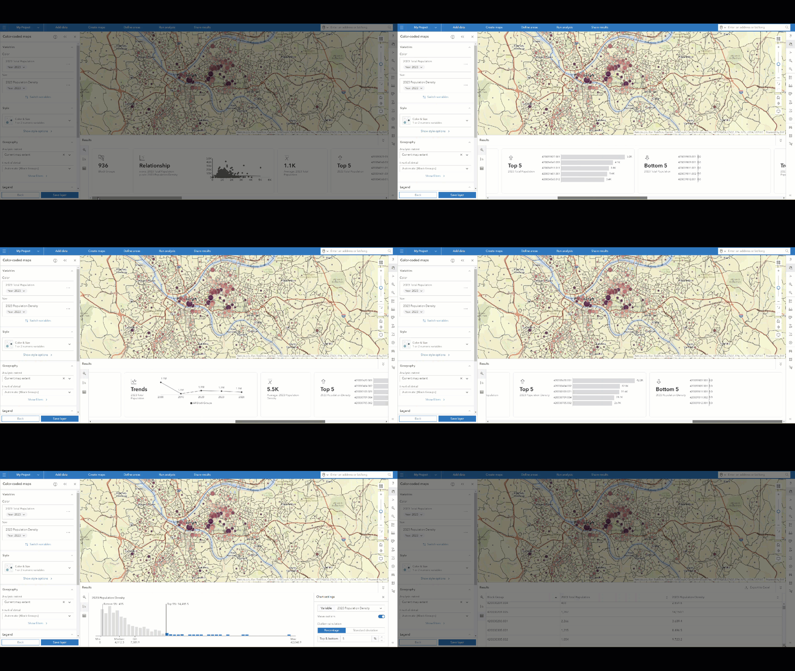
A health-care provider in western Pennsylvania is researching population density. The organization is creating a color-coded map to identify areas that have a dense population and could benefit from vaccine pop-up locations. In the color-coded map workflow, the organization uses the variables Total Population and Population Density. The results populate in the map and in the results pane, which shows a summary, histogram, and table.
Watch the animation below to explore the color-coded map results pane.

Note:
This animation was created using ArcGIS Business Analyst Web App, in which the user experience and workflows are identical to ArcGIS Community Analyst.
Smart map search example
A housing justice nonprofit in western Pennsylvania is researching housing affordability and availability. The organization is using smart map search to find areas that need investment. In the smart map search workflow, the organization uses the variables from the Housing list, which include Median Home Value, Average Household Size, Total Housing Units, Percent of Income for Mortgage, and Housing Affordability Index. The results populate in the map and in the results pane, which shows a summary, histogram, bubble chart, and table.
Watch the animation below to explore the smart map results pane.

Note:
This animation was created using ArcGIS Business Analyst Web App, in which the user experience and workflows are identical to ArcGIS Community Analyst.
Suitability analysis example
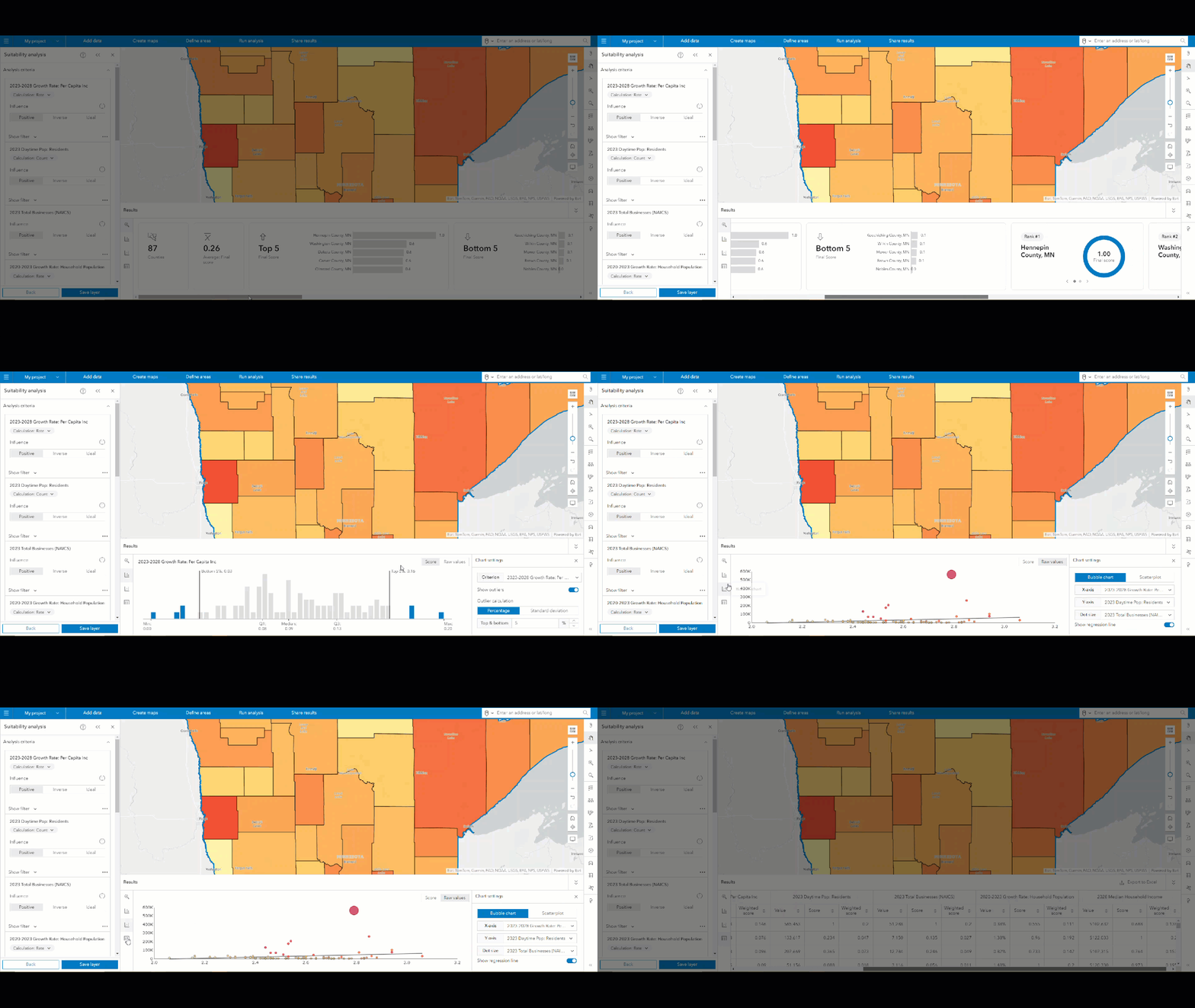
A small-business owner of laundry facilities is interested in expanding into new markets. The business owner has analyzed what factors have contributed to a successful facility, such as parking spots, areas with a high percentage of renter-occupied housing, and areas with relatively high population density. The business owner uses these criteria to perform a suitability analysis analyzing block groups in Dane County, Wisconsin. The sites' suitability scores are returned in two places: color-coding of the block groups on the map and in the results pane, which shows a summary, histogram, bubble chart, and table.
Watch the animation below to explore the suitability analysis results pane.

To create this example yourself, see the Expand a small business tutorial.
Note:
This animation was created using ArcGIS Business Analyst Web App, in which the user experience and workflows are identical to ArcGIS Community Analyst.
Points of interest (POI) search example
A cinema in New Orleans, Louisiana, is looking to expand into new territory and is seeking to gain an understanding of the current competitive landscape. They perform a points of interest (POI) search for cinemas and related POIs. The results populate in the map and in the results pane, which shows a summary, histogram, bubble chart, and table.
Note:
The results pane shows a histogram and bubble chart only when using Data Axle as the data source.
Watch the animation below to explore the points of interest (POI) search results pane.

Note:
This animation was created using ArcGIS Business Analyst Web App, in which the user experience and workflows are identical to ArcGIS Community Analyst.
Benchmark comparisons example
A business-to-consumer agency is researching locations in Pittsburgh, Pennsylvania, for a television ad campaign. They use the benchmark comparisons workflow to compare ZIP codes in the Pittsburgh designated market area (DMA) with the Population and income variable list and the median as the benchmark value. The map implements color-coding with the Above and below benchmark comparison method to represent whether a ZIP code is above or below the median.
The agency can use this analysis to determine where to target its advertising campaign based on how sites compare to the benchmark value. For instance, ZIP codes above the median represent higher-income or more populated areas, ideal for luxury advertising, whereas ZIP codes below the median might target budget-friendly products. If the agency needed to perform additional analysis, they could use standard deviation to evaluate whether there is an income gap that could suggest targeting different types of products or services within the same area.
Watch the animation below to explore the benchmark comparisons results pane.

Calculations
The information in the results pane has a statistical methodological background. The underlying statistical concepts used in each tab of the results pane are described in more detail below.
Summary tab
The Summary tab  provides an overview of aggregate-level analysis of the workflow. For instance, it lists the overall number of geographies analyzed and trends in the data.
| Calculation | Description | Workflows |
|---|---|---|
Aggregate-level data | Aggregate-level data is a summarization of data. It can be represented in the form of averages, percentages, or proportionality. |
|
Top 5/Bottom 5 | Top 5 and Bottom 5 represent the five highest- and lowest-ranking locations. |
|
Trends | Trends represent how the data variable has changed over time, if time-series data is available for the variable. |
|
Rank | The rank of a site is how that site's final score compares to other sites in the analysis. The better the final score, the higher the rank of the site. |
|
Score | A site's final suitability score is calculated by adding the weighted scores for each of the variables used in the analysis. |
|
Weighted score | The weighted score for each variable is calculated as a percent difference between the value for a given site and the target value selected by the user. A site's final suitability score is calculated by adding the weighted scores for each of the variables used in the analysis. |
|
Within range | A range sets a minimum and maximum value to limit the scope of the analysis. Values that are within range fall within the defined minimum and maximum. |
|
Mean or average | The mean (or average) is calculated by summing all values and dividing that sum by the number of values. It gives a central point of the data. |
|
Minimum | The minimum is the smallest value in the data. |
|
Maximum | The maximum is the largest value in the data. |
|
Median | The median is the middle value when the data is ordered from lowest to highest. If the dataset is skewed, the median might provide a better indication of central tendency than the mean because it is less affected by extreme values or outliers, which can distort the mean. |
|
Standard deviation | Standard deviation measures how much variation or dispersion there is in a dataset. A low standard deviation means most data points are close to the mean, while a high standard deviation indicates a wide spread of data. Evaluating the standard deviation helps assess how dispersed the data is compared to the benchmark. |
|
IQR | IQR is useful for identifying the central spread of data and is often visualized in box plots. The interquartile range (IQR) measures the spread of the middle 50 percent of the data. It is the range between the first quartile (Q1) and third quartile (Q3). |
|
Skewness | Skewness measures the asymmetry of a data distribution. |
|
Kurtosis | Kurtosis describes the peakedness and the heaviness of the tails in a data distribution compared to a normal distribution. It indicates the presence of outliers compared to a normal distribution. |
|
Histogram tab
The Histogram tab  provides an interactive histogram visualizing the variables or attributes used for the selected geography. A histogram is a graphical representation, similar to a bar chart, that represents the distribution of the data.
| Calculation | Description | Workflows |
|---|---|---|
Standard deviation | Standard deviation is the measure of how much variation exists in a variable or attribute, compared to its mean. Increasing the standard deviation (SD) represents an increase in variation to the mean, and therefore a greater range of data points. Decreasing the SD represents a decrease in variation to the mean, which narrows the data points used and may be more accurate. |
|
Outliers | Outliers represent data points or values that are in an abnormal range and do not follow the pattern of the rest of the data. |
|
Bubble chart tab
The Bubble chart tab  provides a bubble chart or scatterplot visual representation of the data. A bubble chart and scatterplot plot points on an x- and y-axis to represent the distribution of data. In a bubble chart, the size of the plotted point is proportional to the value of the data.
| Calculation | Description | Workflows |
|---|---|---|
Bubble chart | A bubble chart plots points on an x- and y- axis to represent the distribution of data. In a bubble chart, the size of the plotted point is proportional to the value of the data. |
|
Scatterplot | A scatterplot plots points on an x- and y-axis to represent the distribution of data. In a scatterplot, the size of each plotted point is standardized. |
|
X-axis | The x-axis in a chart is horizontal, or East-to-West oriented. |
|
Y-axis | The y-axis in a chart is vertical, or North-to-South oriented. |
|
Regression line | In statistics, a regression line is a straight line that is used in a data visualization (like a scatterplot) to represent how variables correspond with each other. A regression line is calculated with a formula, in which y = mx + b. In this formula, the m variable represents the slope of the regression line, and the b variable represents the y-intercept. Data analysts use a regression line to understand the trends in the data and estimate or predict what a value could be. To measure how close data is to the regression line, use the R-squared (R2) value. |
|
Table tab
The Table tab  provides the data results in a tabular and downloadable format.
| Calculation | Description | Workflows |
|---|---|---|
Score | A site's final suitability score is calculated by adding the weighted scores for each of the variables used in the analysis. |
|
Weighted score | The weighted score for each variable is calculated as a percent difference between the value for a given site and the target value selected by the user. A site's final suitability score is calculated by adding the weighted scores for each of the variables used in the analysis. |
|
Benchmark | A benchmark is a value set for comparison. |
|
Resources
To learn more about the workflows that generate results panes, see the following: