Note:
ArcGIS Community Analyst will be retired on March 1, 2026. For more information on migrating to ArcGIS Business Analyst Web App, see Migration from ArcGIS Community Analyst to ArcGIS Business Analyst.
The benchmark comparisons workflow compares sites using criteria and benchmark values that you define. First, select sites to include in the analysis, and then choose variables and set a benchmark for comparison. The workflow compares your sites—displayed as color-coded symbols on the map—and adjusts the analysis as you change the comparison method or benchmark value. The results of this analysis appear in the Results pane and can be saved as a new layer in your project or exported to an Excel worksheet.
Example
A business-to-consumer agency is researching locations in Pittsburgh, Pennsylvania, for a television ad campaign. They use the benchmark comparisons workflow to compare ZIP codes in the Pittsburgh designated market area (DMA) with the Population and income variable list and the median as the benchmark value. The map implements color-coding with the Above and below benchmark comparison method to represent if a ZIP code is above or below the median.
The agency can use this analysis to determine where to target its advertising campaign based on how sites compare to the benchmark value. For instance, ZIP codes above the median represent higher-income or more populated areas, ideal for luxury advertising, whereas ZIP codes below the median might target budget-friendly products. If the agency needed to perform additional analysis, they could use standard deviation to evaluate if there is an income gap that could suggest targeting different types of products or services within the same area.

Results
You can view the results of the analysis as a map layer and in the Results pane, which includes Summary  , Histogram
  , Bubble chart
  , and Table
  . To learn more about the benchmark comparisons Results pane, see Results pane reference. Each site on the map is color-coded to represent the benchmark comparisons.
Calculations
Benchmark comparisons use the distribution of data to compare performance relative to a benchmark. This analysis uses measures of central tendency, data spread, and the shape of the data distribution. These insights help users identify whether data is concentrated or widely spread, or if there are any extreme values.
Measures of central tendency
Measures of central tendency are used to summarize data tendencies. In the benchmark comparisons workflow, the mean and median values are available for benchmarking.
Mean
The mean (or average) is calculated by summing all values and dividing that sum by the number of values. It gives a central point of the data. In benchmark comparisons, the data's mean can be compared to the benchmark to evaluate whether the data tends to be higher or lower than the benchmark on average.
Median
The median is the middle value when the data is ordered from lowest to highest. If the dataset is skewed, the median might provide a better indication of central tendency than the mean because it is less affected by extreme values or outliers, which can distort the mean. In benchmark comparisons, the median is often used to understand the typical value, especially when skewed data is involved.
Data spread
The data spread can be measured using either the interquartile range (IQR) or standard deviation (SD). IQR is better suited for analysis with skewed or non-normal data, whereas standard deviation is more appropriate for analysis with normal distributions of data. Analyzing the data spread can identify any unusual values or outliers. Outliers represent data points or values that are in an abnormal range and do not follow the pattern of the rest of the data. Specifically, outliers are typically defined as values that fall more than 1.5 times the IQR above Q3 or below Q1, or 3 standard deviations away from the mean in a normal distribution.
The minimum and maximum values define the range within which all the data falls. In benchmark comparisons, the minimum and maximum values help identify the range or spread of the data—that is, how widely the data values are distributed—compared to the reference data, which is the benchmark used for comparison. The minimum is the smallest value in the data. The maximum is the largest value in the data.
Interquartile range (IQR)
The interquartile range (IQR) measures the spread of the middle 50 percent of the data. It is the range between the 1st quartile (Q1) and 3rd quartile (Q3).
- Q1 (1st quartile): The 25th percentile, or the point below which 25 percent of the data lies.
- Q2 (2nd quartile/Median): The 50th percentile, or the median of the data.
- Q3 (3rd quartile): The 75th percentile, or the point below which 75 percent of the data lies.
IQR is useful for identifying the central spread of data and is often visualized in box plots. By focusing on the range within which the middle 50 percent of the data falls, the IQR provides insight into the variability of the data around the median, excluding extreme values or outliers.
Standard deviation
Standard deviation measures how much variation or dispersion there is in a dataset. In a normal distribution, approximately 68.1 percent of data points fall within ±1 standard deviation of the mean, about 95.4 percent fall within ±2 standard deviations, and around 99.7 percent fall within ±3 standard deviations. A low standard deviation means most data points are close to the mean, while a high standard deviation indicates a wide spread of data. Evaluating the standard deviation helps assess how dispersed the data is compared to the benchmark.
Shape of data distribution
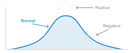
The shape of the data distribution can be measured using skew and kurtosis. Skewness measures the asymmetry of a data distribution. It helps clarify whether the data leans more toward higher or lower values compared to the benchmark. Kurtosis describes the peakedness and the heaviness of the tails in a data distribution compared to a normal distribution. It indicates the presence of outliers compared to a normal distribution.
Skewness
Skewness can be calculated using the Pearson Mode Skewness, as follows:

This formula measures how asymmetric a dataset is by comparing the mean and median. The 3 is an empirical constant that adjusts for adjusts for the typical relationship in skewed distributions, where the difference between the mean and median is approximately three times larger in skewed data. It helps quantify how much the data deviates from symmetry, indicating whether the data has more extreme low and high values compared to the mean.
After calculating, there are three types of skew.
| Type of skew | Image | Description | Calculation |
|---|---|---|---|
Symmetrical distribution |  | No skew, data is evenly spread around the mean. |
|
Positive skew (right skew) |  | More values fall below the mean, with a long tail on the right. |
|
Negative skew (left skew) |  | More values fall above the mean, with a long tail on the left. |
|
Kurtosis
Kurtosis is calculated using the following formula:

In this formula, n represents the number of observations, μ is the population mean, and σ is the population standard deviation. A positive kurtosis indicates a distribution more peaked than normal, while a negative value indicates a flatter distribution. A normal distribution has a kurtosis of 0.
After calculating, there are three types of kurtosis.
| Type of kurtosis | Image | Description | Calculation |
|---|---|---|---|
Mesokurtic |  | Similar to a normal distribution, indicating moderate outliers. |
|
Leptokurtic |  | Peaked distribution with heavier tails, indicating more outliers. |
|
Platykurtic |  | Flatter distribution with lighter tails, indicating fewer outliers. |
|
Limitations
You can select a maximum of 5,000 existing sites. Alternately, you can select up to 1,000 features on the map—for example, features added to the map through points of interest search or by importing a file.
Credits
This workflow consumes credits. Exporting results to Excel costs an estimate of 10 credits per 1,000 records.
See Credits for full information about credit consumption in ArcGIS Community Analyst.
Resources
To learn more about benchmark comparisons, see Run benchmark comparisons.