Datasets help you visualize how an area functions or operates. ArcGIS GeoPlanner allows you to discover datasets in ArcGIS Online or use ArcGIS Spatial Analyst tools to create them. Data can help you understand an area before you begin a design or plan that will change or impact an area.
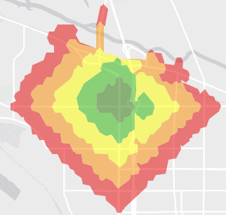
GeoPlanner helps you visualize these impacts by assigning or classifying attribute values in a dataset to a suitability scale. For example, to understand how suitable an area is for walking, you can assign a rank to various locations in that area. In this case, ranking can occur in a scale of five possible values. Scales of five values are easy to understand and allow for differentiation. In the following table, walk times are mapped to a scale of high to low. This creates a suitability scale where high indicates a zone of higher suitability and low defines an area of low suitability for walking.
| Time (minutes) | Rank |
|---|---|
5 | High |
10 | Moderately high |
15 | Medium |
20 | Moderately low |
25 | Low |
The following example shows how the scale above can be applied to a layer that is created by the Create Travel–Time Areas analysis tool. 
Suitability scales have two purposes:
- Create a common standard to help you compare values across different datasets (layers).
- Group multiple values into fewer classes to understand complex data.
Classify attribute values
GeoPlanner includes the Classify tool to help you build a suitability scale and visualize it in your data. The tool allows you to map attribute values on a one-to-nine scale that can reflect suitability or risk. You can use the Classify tool for most feature layers. The tool creates a new layer item in your organization. You can use this layer as an assessment layer in GeoPlanner dashboard charts.
Complete the following steps to classify values using the Classify tool:
- In the Contents pane, click the Options button
 next to a layer and click Classify.
 - On the Classify dialog box, click Using numeric ranges.
- Click Select a Field and choose a field that contains numeric data.
- Click a color in each class break to assign an input attribute value to a suitability scale value.
In the following example, the Classify tool assigns 2019 projected median home values to a suitability scale and assigns colors to those scale values. The lowest values are displayed in shades of green and represent higher suitability. Highest values are displayed in shades of orange and red and represent lower suitability.

- Optionally, change the color scheme of your classification by clicking the Low/High drop-down arrow and choosing a color scheme.
- Click Save As.
- Type a title and, optionally, a summary, description, and tags.
- Click Save.
- Optionally, perform the following steps to use the layer you created as an assessment layer in a dashboard chart:
- Open the dashboard and switch to a chart.
- Click the Settings button
 to display the chart configuration properties.
 - Click the Assessed Layer drop-down arrow and choose the layer you just created.

- Click Update.
You have created a new layer item in your organization and can use it as an assessment layer in GeoPlanner dashboard charts.