Weighted overlay is a type of suitability analysis that helps you analyze site conditions based on multiple criteria. Weighted overlay analysis allows you to combine, weight, and rank several different types of information and visualize it so you can evaluate multiple factors at once. By identifying and rating areas based on criteria, you can discover opportunities, risks, and constraints in an area. Weighted overlay analysis produces suitability models. Suitability models help answer questions such as the following:
- Where are the greatest risks for insect damage?
- Where are optimal locations for a commercial development?
The answers to these types of questions depend on your input data and the criteria you define from that data.
Weighted overlay with ArcGIS GeoPlanner leverages a specific type of image layer known as a weighted overlay service. These services are published to ArcGIS Server and you can add them as items to your ArcGIS organization. There are several weighted overlay services provided by Esri and available publicly in ArcGIS Online. The suitability models created by the GeoPlanner weighted overlay widget are hosted image service layers. These are referred to as weighted overlay model services, or models.
Understanding weighted overlay
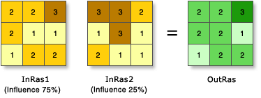
Weighted overlay has three conceptual steps. First, each raster layer is assigned a weight, as a percentage, in the analysis. This allows you to emphasize the relative importance of each layer in the analysis. Second, data classes in each raster layer are mapped to a common suitability scale. This allows you to compare the different types of information in each raster layer. Third, all raster layers in the analysis are overlaid. Each raster cell’s suitability score is multiplied by its layer weight and totaled with the values of other raster cells it overlays. The result is a suitability value that is used for symbology in the output raster layer.

Add Esri–curated services to your organization
Currently, Esri curates two publicly available weighted overlay services that you can add as items to your ArcGIS organization. Complete the following steps to add them:
- Sign in to your ArcGIS organization with an account that has privileges to create content.
- Click the Content tab then click the My Content tab on the secondary navigation bar.
- Click New item.
The New item dialog box appears with various options for new items.
- Choose the URL option.
- In the URL text box, type https://utility.arcgis.com/usrsvcs/servers/24b7c7752170431a95719323a9e71a5e/rest/services/WRO_World_Ecophysiographic_Data/ImageServer and press the Enter or Tab key.
The service's information is retrieved and ArcGIS Server web service is automatically chosen from the Type drop-down options.
- Click Next.
The Title text box is automatically populated with WRO_World_Ecophysiographic_Data and a folder is automatically chosen in the Folder drop-down menu. In ArcGIS Online, the Summary text box is automatically populated with details about the service.
- In the Tags text box, type weightedOverlayService.
If the weightedOverlayService tag is not included, the service does not appear as an option in GeoPlanner.
- Click Save.
- On the item's page, click Share.
The Share dialog box appears.
- On the Share dialog box, choose a sharing level option.
Optionally, you can also share the service with a specific group by clicking Edit group sharing in the Set group sharing section of the Share dialog box.
- Click Save.
- To use the other publicly available weighted overlay services from Esri, repeat the steps using https://greeninfrastructuremapsdev.arcgis.com/arcgis/rest/services/GreenInfrastructure/WeightedOverlay_Geoplanner/ImageServer in the URL text box.
Note:
This service is a secure URL. You must provide valid ArcGIS Online credentials to add it as an item to your organization and use it for analysis in GeoPlanner.
Weighted overlay in GeoPlanner
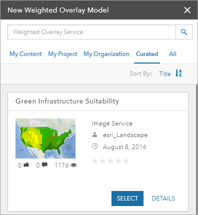
Weighted overlay in GeoPlanner is accessed through the Modeler tool in the Explore tab. The Modeler tool drop-down menu allows you to create a model or load an available existing model. If you choose to create a model, a New Weighted Overlay Model pane appears. This pane contains a list of all weighted overlay services available to you in your ArcGIS organization. These services contain the layers that you use to perform weighted overlay analysis.

Complete the following steps in GeoPlanner to perform a weighted overlay analysis:
- Click the Explore tab.
- Click the Modeler drop-down arrow and choose New Model.
The New Weighted Overlay Model pane opens with a list of services.
Tip:
You can filter the services in the list using the tabs in the pane or sort the list by title, owner, or date.

- Click Select on the service that you want to use for your weighted overlay analysis.
The layer options for the service you chose appear.
- Click the check boxes for the layers you want to include in your analysis.

- Click Design Model.
- Assign each layer a relative importance, or weight, in the analysis by providing a percentage in the % text box.
The percentage total must be equal to 100% before you can run the analysis.

- Optionally, click Set scores
 on a layer to review its data classes and assign scores to them.
How you interpret the score assigned to data classes depends on your criteria. If you are trying to identify areas at risk for flooding, a score of 9 signifies that an area is highly likely to flood. However, if you are trying to site a new housing development, a score of 9 can signify a highly suitable area.
- Optionally, change the color scheme of your design model by clicking Set symbology
 .
. - Click Save to open the Save Model dialog box.
- Provide a name for your model in the Title text box.
- Optionally, provide additional details in the Summary, Description, and Tags text boxes.
The Tags text box contains the weightedOverlayModel tag, but you can add more tags as necessary.
- Click Save.
The Save Model dialog box closes. The model is processed in your ArcGIS organization and returned as an image layer to the app.
Weighted overlay models provide a powerful way to visualize and analyze site suitability factors. Based on the shading in your model, you can identify areas of opportunity and risk, and use this information for real-time feedback in GeoPlanner dashboard charts. These charts show how your design or other feature layers overlay with assessment layers. This view can help you understand the suitability or risk in your designs and plans.