Note:
You need the following account and license types to use this workflow:
- Microsoft license—You need a Microsoft 365 license, with the Contributor role or higher, to add data layers to a map.
- ArcGIS account type—Standard users can perform the basic functions of this workflow; you do not need to sign in to an ArcGIS account.
Use Microsoft Power BI data to add a data layer to an ArcGIS for Power BI map visualization.
See Maps and Data layers to learn about adding data to a map, and see Data preparation to learn how to configure the data before you add it to a map.
Add location-based data from Power BI datasets to an ArcGIS for Power BI visualization to show where it is in the world. You can also add size and color values to change how the data is represented on the map or add fields that enhance different aspects of various data values.
Tip:
An ArcGIS for Power BI map can contain only one data layer at a time.
Add location data to a map
To add location data to an ArcGIS for Power BI map visualization, complete the following steps:
- In the Data pane, expand the dataset.
- Click the Build visual tab in the Visualizations pane.
- Drag values from the dataset into field wells in the Visualizations pane.
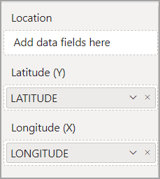
- Location—Drag a location-based value into this field well to display locations on the map.
Tip:
If the location data is contained in a single row in the data, you can drag this field directly over the map to display locations on the map.
- Latitude—Drag a latitude (y) value from the data fields into this field well to define part of a map coordinate. If you use this option, you must also specify the corresponding longitude (x) value.
- Longitude—Drag a longitude (x) value from the data fields into this field well to define part of a map coordinate. If you use this option, you must also specify the corresponding latitude (y) value.

If the data contains latitude and longitude values, use them to accurately plot the data on the map. If you populate the Latitude, Longitude, and Location field wells, ArcGIS for Power BI uses the Latitude and Longitude values to map the data and ignores the Location value. For more information about location options, see Data preparation, Specify the location type, and Use default location services.
ArcGIS for Power BI displays the locations on the map using the default styling.
- Location—Drag a location-based value into this field well to display locations on the map.
Improve location accuracy
In some cases, ArcGIS for Power BI cannot accurately identify the country for the data's location and may plot locations inaccurately. A message appears on the map indicating that the accuracy of the locations can be improved. Use the Specify the location country workflow to improve the accuracy of the data locations.
Add other data to the map
ArcGIS for Power BI includes the following options that are not location based that you can use to control the way locations appear on the map:
- Size
- Color
- Time
- Tooltips
- Join layer
- Find similar
- Drill through
Unlike location-based options, you can add data to some, none, or all the options described here to change how the data is presented on the map.
Depending on the options you populate, the map automatically updates the styling to display a more accurate picture of the data.
Note:
It is recommended that you add location-based data to the map before adding other data—either Location or Latitude and Longitude values. In some cases, if you add Size, Color, or both Size and Color values to the map before adding Latitude and Longitude values, ArcGIS for Power BI summarizes the location values, resulting in points failing to render on the map.
Size
Add numeric values to the Size field well to draw locations on the map according to their size. For example, if the map shows stores by location, drag a profit field into the Size field well; the map automatically renders symbols for each store in proportional sizes according to profit value.
Color
Add numeric data to the Color field well to distinguish locations on the map based on a color ramp. For example, a light-to-dark color ramp can show low-to-high data values such as revenue or income.
You can also add categorical data to show locations by color. For example, use different colors to represent customer language preferences.
Size and color
Choose two attributes from the data to define both the Size and Color values of point symbols on the map. You can also use the same attribute twice: to set the size of the symbols and to set the colors, based on the data you want to emphasize. This is useful to show count information, such as the number of female single-parent households, shaded by a rate, such as the rate of female single-parent households.
You can further customize the map by editing its basemap and styling options. You can also modify the visualization the same way you modify other Power BI visualizations. See Customize the map visualization format for more information.
Tip:
You can style the data by size, by color, and by size and color using the Smart map cards and Style settings.
Time
Drag a field containing temporal data (date, time, or date and time) into the Time field well to animate locations on the map according to time. This is useful for weather, climate, sales data over time, and other data that changes. For more information, see Time-aware data.
Tooltips
Drag categorical or numeric fields into the Tooltips field well to define the information that appears in the tooltips. You can drag multiple fields into this field well.
You can drag the same field into the field well multiple times and apply a different aggregation option to each one. For example, you can drag a numeric field into the field well three times, and calculate the sum for one, the average for another, and the minimum for the third. Each field appears in the tooltip with the appropriate label and value.
When you hover over a location on the map, a tooltip appears, displaying information specific to that location. See Pop-ups for more information.
Note:
Tooltip fields appear in the order you add them to the Tooltips field well.
Join layer
You can link data attributes from Power BI to those from a reference layer added from ArcGIS to provide insight into the data. To join the data layer and the reference layer, link common attributes in each dataset in the Join layer option. To use this option, the data must have attributes that align with the attributes from the reference layer (numbers to numbers, strings to strings, and so on). You can join up to five attributes. See Join layers to learn how to use this functionality.
Find similar
You can use the Find similar option to quickly identify the top 10 locations with attributes comparable to locations currently selected on the map and create a nonpersistent layer in the map containing those locations. See Find similar locations to learn how to use this functionality.
Drill through
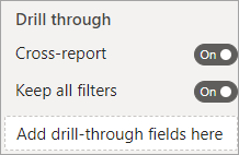
The Drill through option allows other Power BI visualizations to access the map. Map data details can be filtered to the report in a context you specify.
- Turn on the Cross-report toggle button to allow other reports to use the page as a drill through destination.
- Turn on the Keep all filters toggle button to allow drill through to the map for all filters.
- You can select multiple variables to add to the Drill through field well (this turns off the Keep all filters toggle button).

For more information, see Add the Drill through function and the Microsoft Set up drillthrough in Power BI reports article.