This is an archive related to a previous version of Esri Maps for MicroStrategy. If you need the current version go to http://doc.arcgis.com/en/maps-for-microstrategy/.
Configure clustering
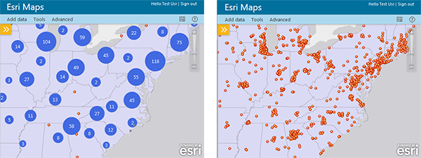
When a layer contains a large number of point features, showing each feature individually on the map is often not useful. In this scenario, point features often overlap, making it difficult to distinguish between features. Even when they do not overlap, it is usually difficult or impossible to visually extract meaningful information when hundreds or thousands of points are shown all at once.
One approach to resolving this issue is to group point features within a certain distance of one another on screen into one symbol. This is known as clustering. Since the clustering is dependent on screen distance, more points are aggregated into fewer groups as you zoom out. Conversely, points are divided into more and more groups as you zoom in. When you zoom to a level where the clustering area around one point feature no longer contains any other features, that feature will not be clustered but rather will be shown in its location with the styling specified by the layer.
Clusters are interactive: when you click on a cluster, each individual point feature in the cluster appears on the map. The cluster's pop-up window contains a separate page for each feature; use the forward and back arrows in the pop-window's title bar to scroll through pop-ups for each feature. Although you cannot change the default style of a single cluster, you can change the basic color that applies to all clusters, and the color of the text that appears within a cluster. In the screen captures below, the image on the left displays the points with clustering enabled, and the image on the right does not have clustering enabled.

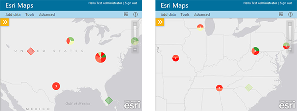
If you styled a point layer using shapes grouped by category, the clusters will display a pie chart showing the ratio of different categories within that cluster. As you zoom in, the cluster is divided into smaller groups and the pie chart changes to reflect the information in the new cluster.

Styling data is supported only in Design Mode. For more information about styling a point layer using shapes, see Use different colors.
- Click the Show map contents icon to display the Contents pane.
- On the Contents pane, click the arrow to the right of the point layer for which you want to configure clustering.
- Click the On/Off selector next to Clustering to turn on clustering for the layer.
The map automatically displays the default clustering symbols for the layer, and the Configure clustering icon appears beside the On/Off selector.
- Click the Configure clustering icon.
- Do any of the following to configure clustering for the layer:
- To change the distance at which points will be grouped together in a cluster, enter a new pixel value in the Cluster radius box.
- To change the color of the text on the cluster symbols, click the Text color drop-down menu and select a new color.
- To change the color of the cluster symbol, click the Cluster color drop-down menu and select a new color.
The map automatically updates to reflect the new cluster settings.
- Click OK when you are finished.