This is an archive related to a previous version of Esri Maps for MicroStrategy. If you need the current version go to http://doc.arcgis.com/en/maps-for-microstrategy/.
Add a heat map
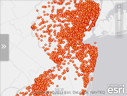
When a layer contains a large number of point features, showing each feature individually on the map is often not useful. In this scenario, point features often overlap, making it difficult to distinguish between features. Even when they do not overlap, it is usually difficult or impossible to visually extract meaningful information when hundreds or thousands of points are shown all at once.

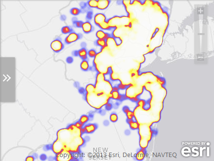
One approach to resolving this issue is to create a heat map. A heat map represents the geographic density of point features on a map by using colored areas to represent those points. The areas will be largest where the most points are concentrated together.

- Click the Show map contents icon to display the Contents pane.
- On the Contents pane, click the arrow to the right of the point layer for which you want to configure a heat map.
- Click Add heat map to create a heat map of your layer.
A new heat map layer appears in the Contents pane. The map automatically displays the heat map under the original points layer.
- To change the way the heat map appears on the map, from the Contents pane, click the arrow to the right of the heat map layer and click Configure heat map.
- Do any of the following to configure the heat map:
- Select a color scheme from the Color scheme menu.
- Adjust the intensity of the heat map using the Intensity slider.
The map automatically updates to reflect the new heat map settings.
- Click OK when you are finished.