This is an archive related to a previous version of Esri Maps for MicroStrategy. If you need the current version go to http://doc.arcgis.com/en/maps-for-microstrategy.
Infographics
Infographics are visualizations that provide rich contextual information about the areas surrounding the features in your map. When you click the Infographics icon in a pop-up window, ArcGIS aggregates the demographics around that feature on your map and delivers them using easy-to-understand Infographics that contain information such as age distribution and income for a set distance around the selected location. The information contained in Infographics is available while the pop-up window is open and is not saved to your business system.
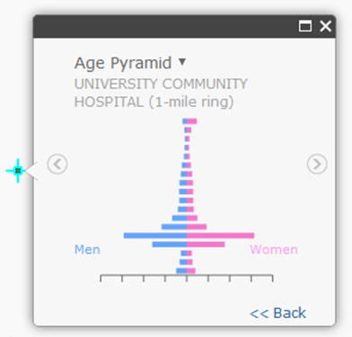
In the image below, an Infographic shows the age distribution within a one-mile radius of a university hospital. As expected, the bars show a much higher percentage of men and women between the ages of 20 and 24 in the university neighborhood. Some Infographics may contain comparisons for different demographics; if so, click the arrow in the pop-up window's title bar to view different feature representations.

To view a more detailed Infographic, click the Maximize button in the pop-up window's title bar. Click Restore to return the window to its original size.
Many Infographics are interactive; hover over elements in the Infographics or use the Forward and Back arrows to display additional information.
Click the Previous and Next arrows on the Infographics window to scroll through available feature visualizations.