Histograms visually summarize the distribution of a continuous numeric variable by measuring the frequency at which certain values appear in the dataset. The x-axis in a histogram is a number line that has been split into number ranges, or bins. For each bin, a bar is drawn where the width of the bar represents the range of the bin, and the height of the bar represents the number of data points that fall into that range. Understanding the distribution of your data is an important step in the data exploration process.
Variable
Histograms require one continuous Number variable on the x-axis.
Multiple series
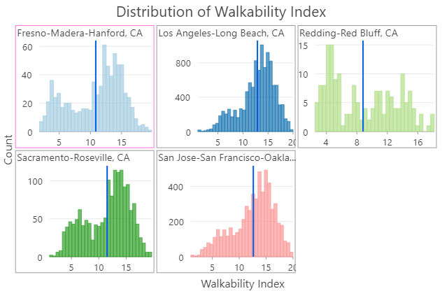
Multiple series histograms can be created by setting a Split by field. When a Split by field is set, the histogram is split into multiple series based on the number of unique categories in the field. For example, when displaying a histogram for a dataset related to housing prices, the Number control is set to SoldPrice to see the distribution of housing prices in a city. Setting the Split by control to Neighborhood will split the histogram into N series, where N is the number of unique neighborhood values. The multiple series histogram will display N minicharts, one for each unique Neighborhood value, so that the housing price distribution can be compared across the Split by values.
Note:
Category fields with many unique values are not appropriate for splitting a field into multiple series.
Display multiple series
Multiple series histograms can only be displayed with a grid layout, which can be customized on the Series tab in the Chart Properties pane. You can customize the dimensions of a grid chart layout by setting the Mini charts per row numeric input. For instance, setting Mini charts per row to 3 will display a maximum of 3 charts per row—the total number of rows in the grid will be determined by the number of series in your chart. Checking the Show preview chart check box allows you to dynamically explore each minichart in greater detail by choosing one to view in the larger preview chart.
Transformation
Some analytical methods require that data be normally distributed. When the data is skewed (the distribution is lopsided), you may want to transform the data to make it normal. Histograms allow you to explore the effects of logarithmic and square root transformations on the distribution of your data. For reference, you can add a normal distribution overlay to your histogram by checking the Show Normal distribution check box in the Chart properties pane.
Logarithmic transformation
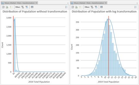
The logarithmic transformation is often used when the data has a positively skewed distribution and there are a few very large values. If these large values are located in your dataset, the log transformation will help make the variances more constant and normalize your data.
For example, the positively skewed distribution in the chart on the left is transformed to a normal distribution using a logarithmic transformation in the chart on the right: 
Note:
Logarithmic transformations can only be applied to numbers greater than zero.
Square root transformation
A square root transformation is similar to a logarithmic transformation in that it reduces right skewness of a dataset. Unlike logarithmic transformations, square root transformations can be applied to zero.
Note:
Square root transformations can only be applied to numbers greater than or equal to zero.
Inverse transformation
An inverse transformation takes the reciprocal (1/x) of each value (x) in the field.
Note:
Inverse transformations cannot be applied to zero values. If there are zero values in the field, they are evaluated as null values.
Box-Cox transformation
A Box-Cox transformation applies the following power function to normally distribute values:
where x' is the transformed value, x is the original value, λ1 is the Power parameter, and λ2 is the Shift parameter.
Note:
Box-Cox transformations can only be applied to positive values. When negative or zero values exist, use the Shift parameter to ensure all values are positive.
Number of bins
The number of bins defaults to the square root of the number of records in your dataset. You can adjust this by changing the Bins value on the Data tab of the Chart Properties pane. Changing the number of bins allows you to see more or less detail in the structure of your data.
Statistics
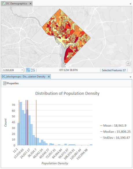
Several descriptive statistics are calculated and displayed as vertical lines on histograms. The mean and median are displayed with one line each, and one standard deviation above and below the mean is displayed using two lines. You can click these items in the chart legend to turn them on or off.
A Statistics table is displayed on the Data tab of the Chart Properties pane, containing the following statistics for the selected numeric field:
- Mean
- Median
- Standard Deviation
- Count
- Min
- Max
- Sum
- Nulls
- Skewness
- Kurtosis
If the chart's source layer has a selection set, the statistics table will have one column displaying statistics for the full dataset and one column displaying statistics for only the selection set.
The statistics table also includes controls for you to turn the histogram's mean, median, and standard deviation lines on and off, and change their color.
You can right-click in the statistics table and choose Copy Table, Copy Row, or Copy Value. This will allow you to copy and paste statistics from the Charts Properties pane into other windows or applications.
Axes
Several options control the axes and related settings.
Y-axis bounds
Default y-axis bounds are set based on the range of data values represented on the y-axis. You can customize these values by typing a new desired axis bound value. You can set axis bounds as a way to keep the scale of your chart consistent for comparison. Click the reset button to revert the axis bound to the default value.
Number format
You can format the way an axis will display numeric values by specifying a number format category or by defining a custom format string. For example, you can use $#,### as a custom format string to display currency values.
Appearance
Titles and description
Charts and axes are given default titles based on the variable names and chart type. These can be edited on the General tab in the Chart Properties pane. You can also provide a chart Description, which is a block of text that appears at the bottom of the chart window.
Color
You can change the color of a histogram's bins using the color patch next to Bins on the Data tab of the Chart Properties pane.
Guides
Guide lines or ranges can be added to charts as a reference or way to highlight significant values. To add a new guide, on the Guides tab in the Chart Properties pane, click Add guide. To draw a line, enter a Value where you want the line to draw. To create a range, enter a to value. You can optionally add text to your guide by specifying a Label.
Example
Create a histogram to visualize distribution of population density across Washington, D.C., census block groups.
- Number—Population Density
