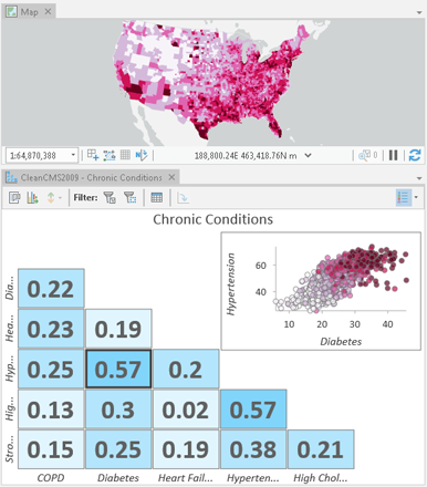
A scatter plot matrix is a grid (or matrix) of scatter plots used to visualize bivariate relationships between combinations of variables. Each scatter plot in the matrix visualizes the relationship between a pair of variables, allowing many relationships to be explored in one chart.
Variables
A scatter plot matrix is made up of three or more numeric fields. A scatter plot is created for every pairwise combination of variables selected.
Statistics
A regression equation is calculated for every scatter plot in the matrix. You can add the associated trend lines to the scatter plots by checking Show linear trend in the Chart Properties pane. Alternatively, you can view the miniplots in the grid as R² or Pearson's r values with a color gradient corresponding to the strength of the value by setting the Lower left and Upper right controls in the Chart Properties pane.
Layout
A scatter plot matrix layout consists of two halves cut across a diagonal. You can configure each half of the matrix, as well as the diagonal, to suit your visualization needs.
You can configure the lower left half of the layout to display any of the following options:
- Scatterplots—Displays a mirrored grid of the miniplots. This is the default.
- R-Squared—Displays a mirrored grid of the miniplots shown as R² values, with a color gradient corresponding to the strength of the relationship.
- Pearson's r—Displays a mirrored grid of the miniplots shown as r-values, with a diverging color gradient corresponding to the strength and direction of the relationship.
You can configure the upper right half of the layout to display any of the following options:
- Preview Plot—Displays a detailed, interactive view of the selected miniplot. This is the default.
- Scatterplots—Displays a mirrored grid of the miniplots.
- R-Squared—Displays a mirrored grid of the miniplots shown as R² values, with a color gradient corresponding to the strength of the relationship.
- Pearson's r—Displays a mirrored grid of the miniplots shown as r-values, with a diverging color gradient corresponding to the strength and direction of the relationship.
- None—The upper right half of the layout is left blank.
You can configure the diagonal to display any of the following options:
- None—The diagonal is left blank. This is the default.
- Histograms—Displays histograms that show the distribution of each numeric variable in the matrix.
- Field Names—Displays the field names.
Sorting
You can sort the scatter plot matrix grid according to the order of field names, the strength of relationships, a custom order, or alphabetically. To better understand the strength of relationships between two variables, you can set a Target field with a Sort by option of R-Squared or Pearson's r. This arranges the scatter plot matrix to move the Target field to the first column of the grid and sorts the rows according to the metric score specified by the selected Sort by option. You can also specify a sort order by selecting a Sort direction option.
Axes
Several options control the axes and related settings.
Character limit
Category labels are truncated at 11 characters by default. When labels are truncated, the full text is available by hovering over the label. To display the entire label text in the chart, increase the label character limit.
Label orientation
Axis labels can be configured to display with one of the following orientations: Horizontal, Diagonal, or Vertical.
Number format
You can format the way an axis displays numeric values by specifying a number format category or by defining a custom format string. For example, $#,### can be used as a custom format string to display currency values.
Appearance
You can customize the appearance of a scatter plot matrix, including title text and visual styling, in the Chart Properties pane.
Titles and description
Charts and axes are given default titles based on the variable names and chart type. These can be edited on the General tab in the Chart Properties pane. You can also provide a chart Description, which is a block of text that appears at the bottom of the chart window.
Visual formatting
You can configure the look of your chart by formatting text and symbol elements, or by applying a chart theme. Format properties can be configured on the Format tab in the Chart Properties pane. A chart theme can be selected on the Chart tab. Chart formatting options include the following:
- Size, color, and style of the font used for axis titles, axis labels, description text, legend title, legend text, and guide labels
- Color, width, and line type for grid and axis lines
- Background color of the chart
Color
You can visualize scatter plot points using a single color or with the colors specified in the layer's symbology. By default, scatter plots use layer colors and inherit their outline and fill colors from the source layer symbology.
Example
Create a scatter plot to visualize the relationships between several chronic conditions and identify which correlations are strongest.
- Numeric fields—COPD, Diabetes, Heart Failure, Hypertension, High Cholesterol
- Lower left—R-Squared
- Upper right—Preview Plot
