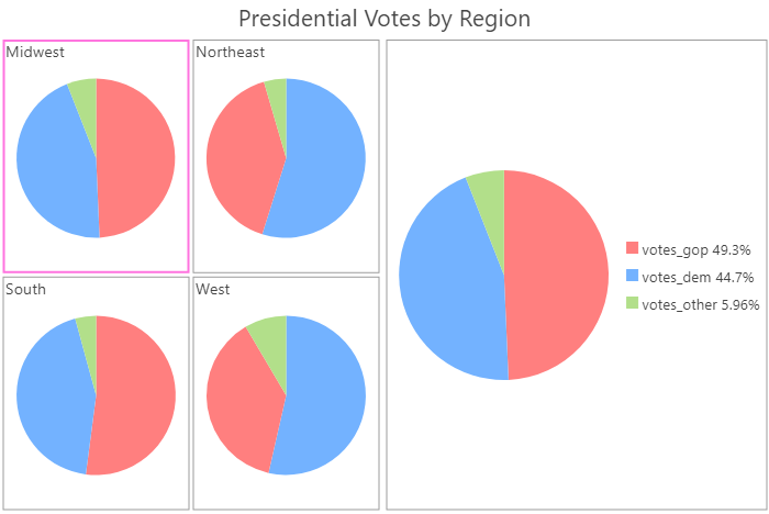
Pie charts visualize part-to-whole relationships by dividing a total amount into subcategories. Each subcategory is represented by a slice in the pie, in which the slice's size corresponds to the percentage of the whole made up by that slice.
The whole pie chart represents a total count or sum, and the combined proportional percentages of all subcategories equal 100 percent.
Variables
You can create slices in a pie chart by setting a Category field or by selecting multiple Numeric fields.
When creating slices using a Category field, each unique value in the Category field will be represented by a slice in the pie. By default, the size of each slice will correspond to the number of times each unique categorical value appears in the dataset. For example, in a dataset of school locations, the Category variable is set to GradeLevel, which contains three unique values: Elementary, Middle, and High. The pie chart will be split into three slices, and each slice will correspond to the proportion of schools belonging to that grade level.
A single numeric field can also be summed for each unique category value. For example, in the same dataset of school locations, the Category variable is set to GradeLevel and the numeric field is set to NumberOfStudents. The pie chart will be split into three slices, and each slice will represent the proportion of students belonging to each grade level.
When creating slices using multiple numeric fields, no Category field will be set, and each slice will correspond to the sum total of each numeric field. For example, in a county dataset of election results, three numeric fields are set: DemocratVotes, RepublicanVotes, and OtherVotes. The pie chart will have three slices, each representing the proportion of number of votes for each category across all counties. When using multiple numeric fields, ensure that the sum of all subcategories equals 100 percent of the whole category. In this example, the total number of votes for the Democratic party plus the total number of votes for the Republican party plus the total number of other votes equals 100 percent of all votes.
Multiple series
Multiple series pie charts can be created by setting a Split by field. When a Split by field is set, the pie chart is split into multiple series based on the number of unique categories in the field. For example, when displaying a pie chart for a dataset related to parking violations in a city, the Category control is set to ViolationType to see the breakdown of violations by type. Setting the Split by control to Neighborhood will split the pie chart into N series, where N is the number of unique neighborhood values. The multiple series pie chart will display N mini charts, one for each unique Neighborhood value, so that the differences in proportions can be compared across the Split by values.
Note:
Category fields with many unique values are not appropriate for splitting a field into multiple series.
Display multiple series
Multiple series pie charts can only be displayed with a grid layout, which can be customized on the Series tab in the Chart Properties pane. You can customize the dimensions of a grid chart layout by setting the Mini charts per row numeric input. For instance, setting Mini charts per row to 3 will display a maximum of 3 charts per row—the total number of rows in the grid will be determined by the number of series in your chart. Checking the Show preview chart check box allows you to dynamically explore each mini chart in greater detail by choosing one to view in the larger preview chart.
Slices
The Slices tab provides configuration options for determining how the slices on the pie chart are displayed.
Shape
Pie charts can be displayed as a donut shape by using the Shape slider.
Grouping threshold
The Grouping threshold control allows you to configure the percent threshold for grouping smaller slices into a single Other slice. The default grouping threshold is 0 percent, meaning all categories or fields are shown as individual slices in the chart. Increasing this value will group all slices with percent values below the threshold into a single Other category.
Labels
You can change the character limit and number of decimal places in the label. Slice labels are truncated at 11 characters by default. When labels are truncated, the full text is available by hovering over the slice. To display the entire label text in the chart, increase the label character limit. You can also choose whether the slice labels show the raw value of each slice (count or sum), the percentage, or both the raw value and percentage. The label settings apply to the data labels and hover pop-ups.
Colors
You can change the color of slices by clicking the Symbol color patch to choose a new color for any slice listed in the Slices and Grouped slices table.
Appearance
Several options control the chart appearance and related settings.
Titles and description
Charts are given default titles based on the variable names and chart type. These can be edited on the General tab in the Chart Properties pane. You can also provide a chart description, which is a block of text that appears at the bottom of the chart window.
Visual formatting
You can configure the look of a chart by formatting text and symbol elements or by applying a chart theme. Format properties can be configured on the Format tab in the Chart Properties pane. A chart theme can be selected on the Chart tab. Chart formatting options include the following:
- Size, color, and style of the font used for titles, description text, legend title, and legend text
- Background color of the chart
Sort
Pie charts are automatically sorted counterclockwise by value. Sorting can be changed using the Sort options on the Data tab of the Chart Properties pane. The following sort options are available for pie charts:
- Value counter-clockwise—Categories are arranged by value in counterclockwise order, starting at the top center of the chart.
- Value clockwise—Categories are arranged by value in clockwise order, starting at the top center of the chart.
- Label counter-clockwise—Categories are arranged alphabetically in counterclockwise order, starting at the top center of the chart.
- Label clockwise—Categories are arranged alphabetically in clockwise order, starting at the top center of the chart.
Data labels
Labels displaying information for each slice can be turned on by checking the Label slices check box on the Data tab in the Chart Properties pane.
Example
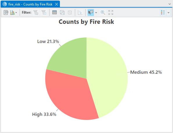
Create a pie chart to compare parcel fire risk proportions.
- Category—Fire Risk
