In Experience Builder, the theme is a set of design specifications that define much of the appearance of your app. You can use theme settings to define colors, fonts, button styles, and other appearance settings globally across your app, instead of having to change these settings for individual widgets and other app elements.
Theme settings define primary and secondary colors, functional colors that indicate information, success, warnings, errors, and neutral colors, all of which you can customize to ensure that your app's visual identity is consistent with your organization's branding or with your personal preferences. You can define the colors of surfaces, such as pages, Table widget cells, and windows, and the colors of interactive elements, such as drop-down buttons, toggle switches in the on and off states, and the keyboard focus indicator. The theme also affects typography, the border radius of app elements, the underline style for link text, and more. The theme does not affect the layout or content of your app.
The theme defines the default appearance of many app elements, but in widget, page, and other element settings you can override the app theme to change an individual element's appearance.
To see theme settings for an Experience Builder app or template, click Theme to open the Theme panel.
Choose a theme
When you open the Theme panel, a list of predesigned themes appears. Icons on the theme thumbnails indicate whether each theme is a light theme  or dark theme
  .
.
You can choose from the following predesigned themes:
- Prime—A light theme with blue and purple as the primary and secondary colors. This is the default theme.
- Astro—A dark theme with blue and purple as the primary and secondary colors.
- Ocean—A light theme with blue and green as the primary and secondary colors.
- Velvet—A light theme with red and blue as the primary and secondary colors.
- Abyss—A dark theme purple and blue as the primary and secondary colors.
- Meadow—A light theme with green and brown as the primary and secondary colors.
- Shared theme—Synchronize the theme with the shared theme setting in your organization. You cannot customize color, typography, or any other theme settings when you choose this theme. If you do not choose this theme, you can still choose colors from the organization shared theme when you configure color settings for a widget.
Note:
The ArcGIS Online October 2025 update introduced a new theme system. All apps created after this update use the new system. Apps created before this update keep their themes from the previous system, unless you change the themes in Theme settings.
Note that if you switch an existing app from an old theme to a new theme, some parts of your app may have unexpected appearances because various theme variables are not mapped in the same way. It is recommended that you keep the old app theme.
If you switch to a new theme, choose a theme with the same mode as the old one. Switch from an old light theme to a new light theme, or from an old dark theme to a new dark theme.
Customize the theme
Once you choose a theme, click Customize to reveal additional theme settings.
Note:
Click Reset to restore a theme to its default settings.
Color settings
The settings on the Color tab define the colors for different parts of your app.
You can use the color picker component to define brand colors, function colors, neutral colors, surface colors, and interactive element colors.
Brand and function colors
Brand colors are the colors used most often across your app. They are the main colors used to draw focus and communicate interactivity.
- Primary colors are meant for the most prominent components in the user interface, such as floating action buttons, high-emphasis buttons, and active states. You should use them for high-emphasis fills, text, and icons.
- Secondary colors are meant for less prominent fills, text, and icons in the user interface.
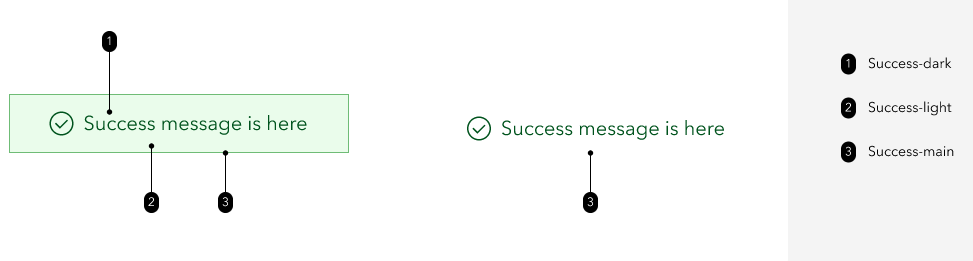
Function colors are used in alert messages, such as messages that appear when widgets successfully run a task.
- Info colors are used for information messages.
- Success colors are used for success status messages, such as messages that display when a widget process succeeds.
- Warning colors are used for warning messages.
- Error colors are used for error messages, such as messages that display when a widget process fails.
You can use the color picker component to define one base color for each of the six brand and function colors.

To make apps more dynamic, Experience Builder uses different shades of each color around the app. Next to each brand and function color, a preview shows how text appears over three shades: a light shade, a main shade, and a dark shade. The text color is chosen automatically for optimal contrast and display.
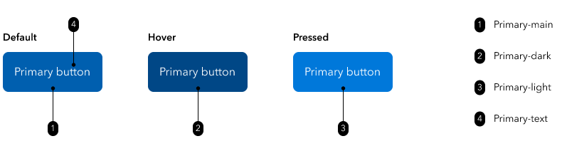
For example, buttons use the three color shades to communicate states and interaction. In the following diagram, the button uses the primary theme color. The default color of the button is the main shade, the hover state color is the dark shade, and the pressed state color is the light shade.
Note:
The color of the pressed state of some buttons may look different from the light shade, because some buttons have a ripple animation effect when pressed. The animation includes transparency that makes the button color appear lighter.
Info, success, warning, and error messages also use all three color shades.
If you change any of the default brand or function colors, you can check the Optimize my color choices check box to automatically generate shades of your chosen colors that are optimal for contrast and display.
Neutral colors
Neutral colors define the foundational colors of your application. Specifically, neutral colors define the default color of text, backgrounds, borders, and dividing lines.
Under Neutral, you can use the color picker to select a base neutral color. Based on this base color, 13 shades appear. These are all of the neutral colors used across the app.
Together, the brand colors, function colors, and neutral colors are the theme colors that appear in the color picker component in widget settings, page settings, and other element settings where you can define a color.
Surface and interactive element colors
You can use the color settings under Surface to define the colors of element backgrounds and text that appears on these elements. By default, these colors are linked to the neutral colors.
- The page colors apply to pages, section, and the main stages of screen groups.
- The container colors apply to Card widgets, list items in List widgets, and cells in Table widgets.
- The overlay colors apply to windows, tooltips, modals, and pop-ups.
You can use the color settings under Interactive elements to define the colors of elements such as drop-down menu buttons, pagination buttons, active tabs in menus, and toggle buttons.
- The default color applies to the default state of interactive buttons. By default, this color is linked to the neutral colors.
- The selected state applies to the selected state of interactive buttons. By default, this color is linked to the primary theme color.
- The Keyboard focus color applies to the indicator that shows which interactive element of the app page has keyboard focus. This is useful for when you are navigating the app with the keyboard. By default, this color is linked to the primary theme color.
Note:
By default, all of the surface and interactive element colors are linked either to the neutral colors or the primary theme color. Changing the neutral or primary theme color also changes the linked colors. If you change any of the surface or interactive element colors with their associated color pickers, the colors unlink from the neutral or primary theme color, but you can click Reset to relink them.
When you change any of the surface colors or interactive element colors, the associated text colors automatically change to colors with sufficient contrast. The minimum contrast ratio is 3:1. If you change a text color to a color that does not meet the contrast standard, a warning appears prompting you to pick a different color.
Typography settings
On the Typography tab, you can change the following text-related settings:
- Font—Choose fonts for heading and body text.
- Headings—Choose a font for heading text.
- Body—Choose a font for body text. Body text includes all other app text, including labels.
- Font size—Use the sliding scale to define the general font size. Sizes range from Very small to Very large. Smaller font sizes allow more text content to fit in an area, while larger font sizes make reading easier.
Experience Builder includes default fonts. You can add fonts by clicking Add Google Fonts in the font drop-down menus. The Add Google Fonts window appears, where you can enter a font URL in the text box. Click OK to add the font.
More theme settings
On the More tab, you can change the following settings:
- Border radius—Choose a general style for the border radius of app elements. The border radius affects the shape of the corners for elements such as containers, buttons, and input boxes. You can choose to have the border radius be defined by the selected theme, or choose None, Small, Medium, Large, or Extra Large.
- Components—Customize the appearance of input fields and link text.
- Input field—Choose a color for input fields. Input fields include text input boxes, search boxes, and the default states of check boxes, radio buttons, and toggle switches.
- Link—Choose an underline style and color for link text. For underline style, you can choose to have the style be defined by the selected theme or choose No underline, Solid underline, or Dotted underline.