Maps help you understand data by presenting significant information geographically. ArcGIS for SharePoint includes style tools that allow you to choose which information to emphasize and how to present that information in a variety of compelling ways. This feature not only improves the visual appeal of the map but helps to effectively communicate the nature and significance of the data.
Each of your style decisions can make your map easier to understand and more interesting to an audience. However, mapmaking is flexible; you can make many equally valid decisions in the absence of a single best style option.
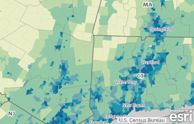
Changing the map style helps you to tell different stories with the same data and potentially discover hidden patterns. For example, in the following image, population density could be visualized as a sequence of colors, such as from light to dark (as shown), or as graduated circles, such as from small to large, to indicate the range of less populated regions to areas with higher populations.

Use the style tools to highlight specific data characteristics, show how the data evolves over time, compare and contrast different values, cluster large groups of data for manageability, or combine multiple style tools to create a spatial context for your data that is unique.
Once you decide how to present the data—for example, whether to use circles or colors to represent population density—you can make subsequent style and design choices. ArcGIS for SharePoint includes graphic configuration tools—such as color ramps, line weights, and symbols—that help you configure how the data appears on a map.
To apply or change the default style applied to the layer, also known as smart mapping, do the following:
- In the Layers pane, click the Symbology tab
 .
. - From the Active layer drop-down menu, choose the layer to modify.
The default style currently applied to the layer is shown in the Symbol types section.
- Optionally, click Add field to select an attribute.
As you add attributes, the default symbol style (smart mapping style) applied to the active layer automatically updates. The type of data you add determines the options available in the Symbol type drop-down menu and the default style applied. For example, if your layer only contains geographic point coordinates, only Location or Heat map styles are listed. However, if you have added categorical or numeric data attributes, you will see additional options, such as Types and size or Color.
Tip:
While you can represent both categorical and numeric attributes using Color, only numeric attributes can be represented by Size. Depending on the type of attribute (numeric or categorical) you add, only compatible attributes remain available when adding more fields. Once other fields cannot be added or are no longer compatible, the Add field button becomes unavailable. See the Symbol types topic for more information about choosing a style.
- Click the Style options tab
 to customize the appearance of the applied style.