Feature display and style
In this topic
With Esri Maps for MicroStrategy, you can style your data on the map using different symbols, colors, and sizes to appropriately represent the features. For example, you may want to use different public safety symbols to denote locations of police and fire stations, or use different colors or sizes of a symbol to show locations of major cities according to the population.
When you add MicroStrategy data to the map, Esri Maps for MicroStrategy creates a layer that appears in the Contents pane and draws the data on the map using a default style. The style can be changed using the options in the Style pane.
You can also configure multiple styles for a layer to allow users to customize the display of the data. Users can choose from the preconfigured styles to draw the layer in different ways. For more information, see Configure styles for a layer.
Note:
Changes to your map cannot currently be saved in Esri Maps for MicroStrategy Mobile.
How layers are drawn
The Style pane allows you to draw a layer as follows:
- With a single symbol or color—Draw the features in a layer using the same symbol or color.
- With different colors—Divide your data into groups and show each with a different color.
- With different-sized symbols—Divide your data into groups and show each with a different size.
For layers containing point features, there are two different types of symbols you can use to style your data: icons and shapes.
- Icons—Standard, Business and Facilities, Public Safety, Transportation, People and Places, Public Safety and Health, and Outdoor Recreation
- Shapes—Circles, Crosses, Diamonds, Squares, and Xs
For layers containing polygon features, you can style your data using different colors.
If you add data from ArcGIS that contains line features, you can change the style of the line features by choosing from different line types and colors and changing the line thickness.
For more information, see Style points, Style lines, and Style polygons.
Grouping methods
If you decide to style a layer using either different colors or different-sized symbols (for point features only), you'll be asked how you want to group your data and what field (or attribute) to use to group it. If you choose to group your data by categories, your data will be grouped and styled based on a common value for the field (or attribute) you chose for grouping (for example, business types such as retail or wholesale).
If your layer has numeric fields, you can choose to group your data by number ranges. For this grouping option, you must choose a classification method. Each classification method takes your data and divides it into classes (groups). Classification method options include equal interval, natural breaks, quantile, and manual breaks. The value at which a feature is placed into a different class is often referred to as a class break. The way in which class breaks are determined by each grouping method is discussed below.
Equal interval
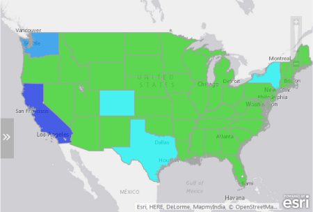
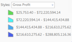
With the equal interval classification method, the range of all of your data values is divided into equal-sized subranges. With equal interval classification, you specify the number of intervals (or subranges), and Esri Maps for MicroStrategy automatically determines how to divide the data. For example, if you specify three classes for a field whose values range from 0 to 300, Esri Maps for MicroStrategy creates three classes with ranges of 0–100, 101–200, and 201–300.
Equal interval is best applied to familiar data ranges, such as percentages and temperature. This method emphasizes the amount of an attribute value relative to other values. For example, it shows that a store is part of the group of stores that make up the top one-third of all sales.
Natural breaks
Natural breaks classes are based on natural groupings inherent in the data. Class breaks that best group similar values and that maximize the differences between classes are identified. The features are divided into classes whose boundaries are set where there are relatively big differences in the data values. Natural breaks classification is good for mapping data values that are not evenly distributed, as it places clustered values in the same class.
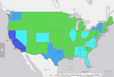
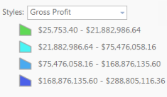
Quantile
In quantile classification, each class contains an equal number of features (for example, 10 per class or 20 per class). A quantile classification is well suited to linearly (evenly) distributed data. It's useful when you want to emphasize the relative position of a feature among other features—for example, to show that a store is in the top quarter of all stores by sales. Quantile classification assigns the same number of data values to each class. There are no empty classes or classes with too few or too many values.
Because features are grouped in equal numbers in each class using quantile classification, the resulting map can often be misleading. Similar features can be placed in adjacent classes, or features with widely different values can be put in the same class. You can minimize this distortion by increasing the number of classes.
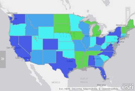
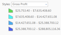
Manual breaks
If report designers want to define their own groupings, they can manually add breaks and set ranges that are appropriate for their data. There may already be certain standards or guidelines for mapping specific data. For example, as a designer, you might want to emphasize features with particular values, such as those above or below a threshold value.
