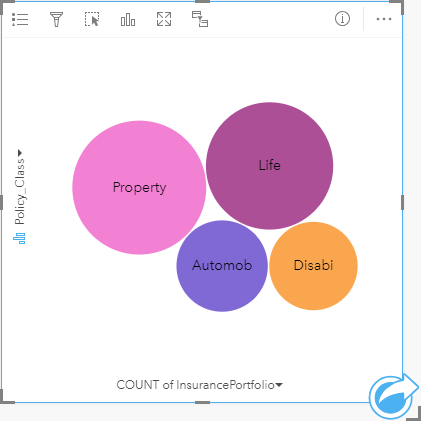


A bubble chart can be used to visualize how categorical data is related.
Bubble charts can answer questions about your data, such as: How is it related? How many are there? How is it distributed?
Example
An insurance company is reviewing the types of policies it offers to compare to the findings from a recently completed market research project. The principals want to know how many policies it has sold in each class, relative to the other classes. A bubble chart with categories can be used to visually compare the count of each policy class to the other policy classes.

Create a bubble chart
To create a bubble chart, complete the following steps:
- Select one of the following data options:
- A string field

- A string field
 plus a number
  or rate/ratio field
Note:
If you do not select a number or rate/ratio field, your data will be aggregated and a count will be displayed.
You can search for fields using the search bar in the data pane.
- A string field
- Create the bubble chart using the following steps:
- Drag the selected fields to a new card.
- Hover over the Chart drop zone.
- Drop the selected fields on Bubble Chart.
Tip:
You can also create charts using the Chart menu above the data pane or the Visualization type button  on an existing card. For the Chart menu, only charts that are compatible with your data selection will be enabled. For the Visualization type menu, only compatible visualizations (including maps, charts, or tables) will be displayed.
Usage notes
Bubble charts are symbolized using unique symbols.
The Layer options button  opens the Layer options pane. The Layer options pane contains the following functions:
- The Legend tab
 can be used to make selections on the chart. To change the color associated with a value, click the symbol and choose a color from the palette or enter a hex value. The pop out legend button
  displays the legend as a separate card on your page.
 - The Appearance tab
 changes the outline color on the chart.
Each bubble on the bubble chart can represent either a count of features in that category or the sum of a number or rate/ratio field.
Use the Visualization type button  to switch directly between a bubble chart and other visualizations, such as a unique values map, summary table, column chart, or donut chart.
Use the Flip card button  to view the back of the card. The Card info tab
  provides information about the data on the card and the Export data tab
  allows users to export the data from the card.
When you create a bubble chart, a result dataset  with the string and number fields used to create the chart will be added to the data pane. The result dataset can be used to find answers with nonspatial analysis using the Action button
  .
.