KPI (Key performance Index) are factors for determining critical measures when evaluating an urban design proposal. Using CityEngine Dashboards you can create meaningful charts of custom defined key numbers. The Charts are driven by CGA report variables. With every change of a CGA model through an attribute change in the Inspector, a handle, or a local edit, the Dashboard is updated automatically and always in sync with the 3D model in the Viewport.
- Dashboards can consist of multiple pages which can hold multiple cards.
- There are multiple card types to choose from: Key Number, Bar Chart, Stacked Bar Chart, and Pie Chart.
- Use the Title and Text Card to provide static information about the charts.
- Cards can be resized and placed freely in a grid system using the mouse.
- The menu in the corner of a card lets you edit and delete a card as well as copy values to clipboard.
- Cards can display data coming from different scenarios.
Check out the Example Philadelphia_2017 in the main menu (Help > Download Tutorials and Examples). This scene is a good example of how scenarios, CGA reports and Dashboards interact with each other.
Configure dashboard
- Click Window > Dashboard in the main menu to configure a Dashboard.
- Click the Add card tool
in the Navigation Bar.
- Choose a card type.
Dashboards have the following parameters:
Icon & Title | Choose an icon and title |
Report |
|
Divide by |
|
Multiply by | Multiply the values of a report by a constant number. |
Reporter | You can choose to display the values of the reports computed on all the scene or only on the selection. By default a card displays the values on all the scene.
|
Aggregation | The aggregation type defines how to combine all the reported values from the whole scene into a single number for each report or sub-report, that will then be shown in the chart:
|
Unit | The Unit displayed next to the value in the card. Has no influence on the calculation or the value displayed. |
Minimum and Maximum (for Bar Chart) | Defines the range of the value axis.
|
Scaling (for Bar Chart) | Specify the scaling of the axis:
|
Notation |
|
Round values | Decimal places: Specify number of decimals to display. |
Sorting (Pie Chart) | Sorting of reports:
|
Legend (Stack Charts and Pie Charts) |
|
Colors
The colors of the reports in the Dashboard are, by default, defined by the color of the scenarios set in the Scene Editor. It is possible to specify a color for each report in a CGA file by the hashtag #color. For instance:
Lot -->
	report("report_name",1.0)
	report("report_name#color","#ff0000")
Dashboards and scenarios
Two different modes are available in the Dashboard concerning the data to display:
- Active Scenario
- Compare Scenarios
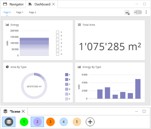
Switching from one mode to anther is done by clicking on the button in the navigation bar. In the Active Scenario mode, the cards will only display the report values of the object belonging to the scenario activated in the Scene Editor
Active scenario mode

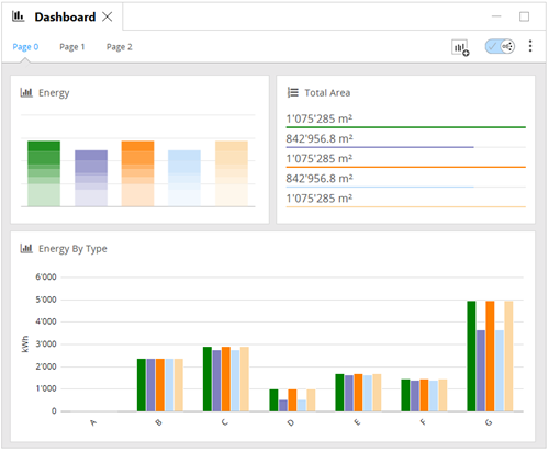
Compare scenarios mode
In the Compare Scenarios mode, the cards will display the reports values of all the scenarios of the scene :

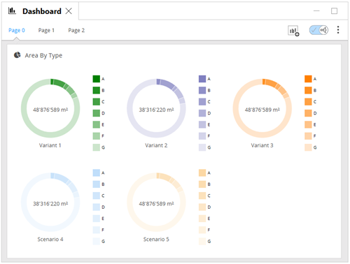
In the Compare Scenarios mode, the Pie Card will display one pie chart per scenario :

For more information about scenarios, see scenarios.
Manage Dashboard
It is possible to create many pages in the Dashboard. Click on the Options tool in the Navigation Bar to display a menu with the following options:
- Add pages: Add a new page where you can set the name.
- Rename Current Page: Rename the current page.
- Delete Current Page: Delete the current page (except if there is only one page in the dashboard).
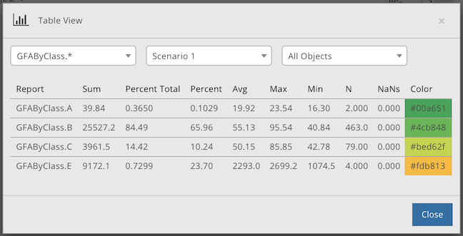
- Table View: Display the values of reports by scenario in a Table.
The Table View displays for each report its names, aggregates, and the color when it is specified in the CGA file. With the three drop-down menus on top of the Table View, it is possible to filter the reports by:
- Report or Group of Reports
- Scenario
- All Scene or Selected Objects
