Data clocks visually summarize temporal data into two dimensions to reveal seasonal or cyclical patterns and trends over time.
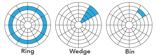
A data clock is a circular chart that divides a larger unit of time into rings and subdivides it by a smaller unit of time into wedges, creating a set of temporal bins. 
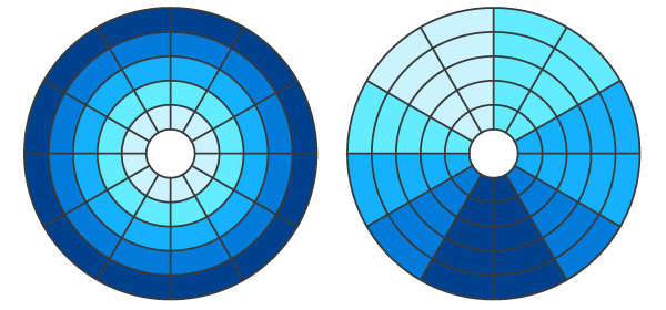
Bins are symbolized using graduated colors that correspond to a count or summarized value taking place in each time period. Overall temporal trends can be examined by noting if the concentric rings change value over time (moving from the center of the circle outward), and seasonal or cyclical patterns can be examined by noting if the wedges vary in value around different parts of the circle.
Variables
Data clocks split a Date field into Rings and Wedges.
Note:
The Date field must be of type Date.
By default, a data clock displays the count of records that took place in each temporal bin. Optionally, a numeric variable can be summarized by choosing a Number field and an Aggregation method. The aggregation method can be one of the following:
- Count—The number of records in each temporal bin
- Sum
- Mean
- Median
- Minimum
- Maximum
Rings and wedges have a part-to-whole relationship and can be split in the following ways:
| Rings | Wedges | Description |
|---|---|---|
Years | Months | Each year is split into 12 months. |
Years | Weeks | Each year is split into 52 weeks. |
Years | Days | Each year is split into 365 or 366 days. |
Weeks | Days of the week | Each week is split into 7 days. |
Day | Hour of day | Each day is split into 24 hours. |
Note:
Since a year does not split perfectly into 52 weeks, when year rings are split into week wedges, the last week bin in each year will contain one extra day, or two extra days in leap years.
Appearance
Titles and description
The charts and axes default titles are based on the variable names and chart type. These can be edited on the General tab in the Chart Properties pane. You can also provide a value for the Description option, which is a block of text that appears at the bottom of the chart window.
Color
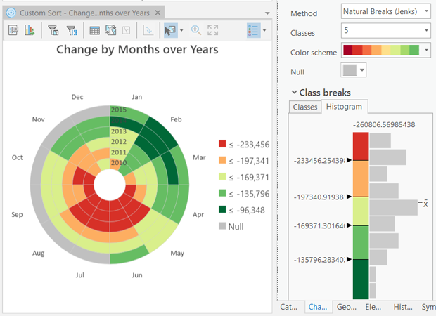
Bins are symbolized using a classified color scheme. A color classification Method, number of Classes, and Color scheme can be adjusted on the Data tab in the Chart Properties pane.

Data labels
The ring and wedge labels in the data clock can be turned on or off in the Data Labels section of the Data tab in the Chart Properties pane.
Example
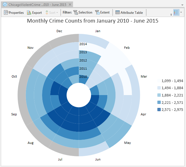
Create a data clock to visualize trends and seasonality of crimes in Chicago from January 2010 through June 2015.
- Date—Date
- Rings—Years
- Wedges—Months
- Aggregation—Count
