Whenever we look at the world around us, it is very natural for us to organize, group, differentiate, and catalog what we see to help us make better sense of it; this type of mental classification process is fundamental to learning and comprehension. Similarly, to help you learn about and better comprehend your data, you can use the Grouping Analysis tool. Given the number of groups to create, it will look for a solution where all the features within each group are as similar as possible, and all the groups themselves are as different as possible. Feature similarity is based on the set of attributes that you specify for the Analysis Fields parameter and may optionally incorporate spatial properties or space-time properties. When space or space-time Spatial Constraints is specified, the algorithm employs a connectivity graph (minimum spanning tree) to find natural groupings.
Tip:
Grouping and classification techniques are some of the most widely used methods in machine learning. The Grouping Analysis tool utilizes unsupervised machine learning methods to determine natural groupings in your data. These classification methods are considered unsupervised as they do not require a set of pre-classified features to guide or train on in order to determine the groupings of your data.
While hundreds of cluster analysis algorithms such as these exist, all of them are classified as NP-hard. This means that the only way to ensure that a solution will perfectly maximize both within-group similarities and between-group differences is to try every possible combination of the features you want to group. While this might be feasible with a handful of features, the problem quickly becomes intractable.
Not only is it intractable to ensure that you've found an optimal solution, it is also unrealistic to try to identify a grouping algorithm that will perform best for all possible data scenarios. Groups come in all different shapes, sizes, and densities; attribute data can include a variety of ranges, symmetry, continuity, and measurement units. This explains why so many different cluster analysis algorithms have been developed over the past 50 years. It is most appropriate, therefore, to think of Grouping Analysis as an exploratory tool that can help you learn more about underlying structures in your data.
Potential applications
Some of the ways that this tool might be applied are as follows:
- Suppose you have salmonella samples from farms around your state and attributes including the type/class, location, and date/time. To better understand how the bacteria is transmitted and spread, you can use the Grouping Analysis tool to partition the samples into individual "outbreaks". You might decide to use a space-time constraint because samples for the same outbreak would be near each other in both space and time and would also be associated with the same type or class of bacteria. Once the groups are determined, you can use other spatial pattern analysis tools such as Standard Deviational Ellipse, Mean Center, or Near to analyze each outbreak.
- If you've collected data on animal sightings to better understand their territories, the Grouping Analysis tool might be helpful. Understanding where and when salmon congregate at different life stages, for example, could assist with designing protected areas that may help ensure successful breeding.
- As an agronomist, you may want to classify different types of soils in your study area. Using Grouping Analysis on the soil characteristics found for a series of samples can help you identify clusters of distinct, spatially contiguous soil types.
- Grouping customers by their buying patterns, demographic characteristics, and travel patterns may help you design an efficient marketing strategy for your company's products.
- Urban planners often need to divide cities into distinct neighborhoods to efficiently locate public facilities and promote local activism and community engagement. Using Grouping Analysis on the physical and demographic characteristics of city blocks can help planners identify spatially contiguous areas of their city that have similar physical and demographic characteristics.
- Ecological Fallacy is a well-known problem for statistical inference whenever analysis is performed on aggregated data. Often, the aggregation scheme used for analysis has nothing to do with what you want to analyze. Census data, for example, is aggregated based on population distributions that may not be the best choice for analyzing wildfires. Partitioning the smallest aggregation units possible into homogeneous regions for a set of attributes that accurately relate to the analytic questions at hand is an effective method for reducing aggregation bias and avoiding Ecological Fallacy.
Inputs
This tool takes point, polyline, or polygon Input Features, a unique ID field, a path for the Output Feature Class, one or more Analysis Fields, an integer value representing the Number of Groups to create, and the type of Spatial Constraint—if any—that should be applied within the grouping algorithm. There are also a number of optional parameters including one that allows you to create a PDF Output Report File.
Analysis fields
Note:
The values in the Analysis Fields are standardized by the tool because variables with large variances (where data values are very spread out around the mean) tend to have a larger influence on the clusters than variables with small variances. Standardization of the attribute values involves a z-transform where the mean for all values is subtracted from each value and divided by the standard deviation for all values. Standardization puts all of the attributes on the same scale even when they are represented by very different types of numbers: rates (numbers from 0 to 1.0), population (with values larger than 1 million), and distances (kilometers, for example).
You should select variables that you think will distinguish one group of features from another. Suppose, for example, you are interested in grouping school districts by student performance on standardized achievement tests. You might select Analysis Fields that include overall test scores, results for particular subjects such as math or reading, the proportion of students meeting some minimum test score threshold, and so forth. When you run the Grouping Analysis tool, an R2 value is computed for each variable. In the summary below, for example, school districts are grouped based on student test scores, the percentage of adults in the area who didn't finish high school, per student spending, and average student-to-teacher ratios. Notice that the TestScores variable has the highest R2 value. This indicates that this variable divides the school districts into groups most effectively. The R2 value reflects how much of the variation in the original TestScores data was retained after the grouping process, so the larger the R2 value is for a particular variable, the better that variable is at discriminating among your features.

Dive-in:
R2 is computed as:
(TSS - ESS) / TSS
where TSS is the total sum of squares and ESS is the explained sum of squares. TSS is calculated by squaring and then summing deviations from the global mean value for a variable. ESS is calculated the same way, except deviations are group by group: every value is subtracted from the mean value for the group it belongs to and is then squared and summed.
Number of groups
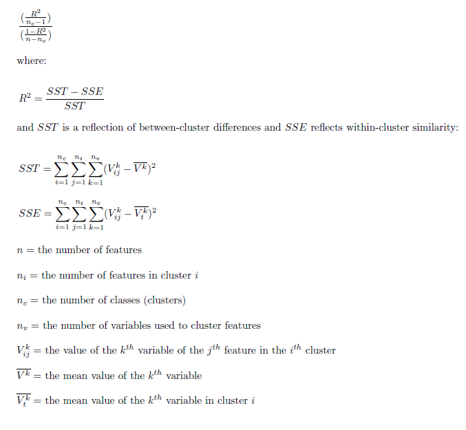
Sometimes you will know the number of groups most appropriate to your question or problem. If you have five sales managers and want to assign each to their own contiguous region, for example, you would use 5 for the Number of Groups parameter. In many cases, however, you won't have any criteria for selecting a specific number of groups; instead, you just want the number that best distinguishes feature similarities and differences. To help you in this situation, you can check on the Evaluate Optimal Number of Groups parameter and let the Grouping Analysis tool assess the effectiveness of dividing your features into 2, 3, 4, and up to 15 groups. Grouping effectiveness is measured using the Calinski-Harabasz pseudo F-statistic, which is a ratio reflecting within-group similarity and between-group difference:
Suppose you want to create four spatially contiguous groups. In this case, the tool will create a minimum spanning tree reflecting both the spatial structure of your features and their associated analysis field values. The tool then determines the best place to cut the tree to create two separate groupings. Next, it decides which one of the two resultant groups should be divided to yield the best three group solution. One of the two groups will be divided, the other group remains intact. Finally, it determines which of the resultant three groupings should be divided in order to provide the best four group solutions. For each division, the best solution is the one that maximizes both within-group similarity and between-group difference. A group can no longer be divided (except arbitrarily) when the analysis field values for all the features within that group are identical. In the case where all resultant groups have features within them that are identical, the Grouping Analysis tool stops creating new groups even if it has not yet reached the Number of Groups you have specified. There is no basis for dividing a group when all of the Analysis Fields have identical values.
Spatial constraint
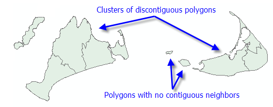
The polygon contiguity options are not good choices, however, if your dataset includes clusters of discontiguous polygons or polygons with no contiguous neighbors at all.
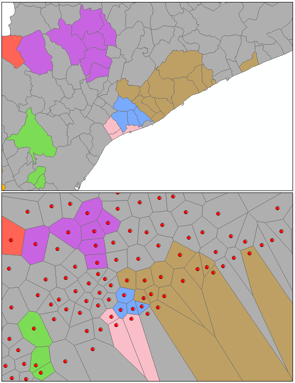
You can then specify the SWM file you created with the Generate Spatial Weights Matrix tool for the Weights Matrix File parameter when you run Grouping Analysis.
Note:
While the spatial relationships among your features are stored in an SWM file and used by the Grouping Analysis tool to impose spatial constraints, there is no actual weighting involved in the grouping process. The SWM file is only used to keep track of which features can and cannot be included in the same group.
For many analyses, imposing a spatial or space-time constraint is neither required nor helpful. Suppose, for example, you want to group crime incidents by perpetrator attributes (height, age, severity of the crime, and so forth). While crimes committed by the same person may tend to be proximal, it is unlikely that you would find that all the crimes in a particular area were committed by the same person. You might, however, elect to include some spatial variables (proximity to banks, for example) in your list of Analysis Fields to capture some of the spatial aspects of the crimes you're analyzing.
K Means
The goal of the K Means algorithm is to partition features so the differences among the features in a group, over all groups, are minimized. Because the algorithm is NP-hard, a greedy heuristic is employed to group features. The greedy algorithm will always converge to a local minimum but will not always find the global (most optimal) minimum.
The K Means algorithm works by first identifying seed features used to grow each group. Consequently, the number of seeds will always match the Number of Groups. The first seed is selected randomly. Selection of remaining seeds, however, while still employing a random component, applies a weighting that favors selection of subsequent seeds farthest in data space from the existing set of seed features (this part of the algorithm is called K Means ++).
Once the seed features are identified, all features are assigned to the closest seed feature (closest in data space). For each cluster of features, a mean data center is computed, and each feature is reassigned to the closest center. The process of computing a mean data center for each group and then reassigning features to the closest center continues until group membership stabilizes (up to a maximum number of 100 iterations).
Minimum spanning tree
When you specify a spatial constraint to limit group membership to contiguous or proximal features, the tool first constructs a connectivity graph representing the neighborhood relationships among features. From the connectivity graph, a minimum spanning tree is devised that summarizes both feature spatial relationships and feature data similarity. Features become nodes in the minimum spanning tree connected by weighted edges. The weight for each edge is proportional to the similarity of the objects it connects. After building the minimum spanning tree, a branch (edge) in the tree is pruned, creating two minimum spanning trees. The edge to be pruned is selected so that it minimizes dissimilarity in the resultant groups, while avoiding (if possible) singletons (groups with only one feature). At each iteration, one of the minimum spanning trees is divided by this pruning process until the Number of Groups specified is obtained. The published method employed is called SKATER (Spatial "K"luster Analysis by Tree Edge Removal). While the branch that optimizes group similarity is selected for pruning at each iteration, there is no guarantee that the final result will be optimal.
Outputs
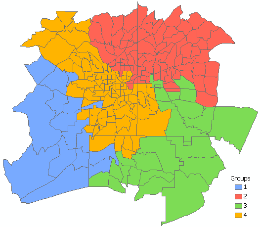
The default output for the Grouping Analysis tool is a new Output Feature Class containing the fields used in the analysis plus a new Integer field named SS_GROUP identifying which group each feature belongs to. This output feature class is added to the table of contents with a unique color rendering scheme applied to the SS_GROUP field. Hollow rendering indicates features that could not be added to any group, usually because they have no neighboring features.
Grouping analysis report file
If you specify a path for the Output Report File parameter, a PDF is created summarizing the groups that were created.
Note:
Creating the optional report file can add substantial processing time. Consequently, while Grouping Analysis will always create an output feature class showing group membership, the PDF report file will not be created if you specify more than 15 groups or more than 15 variables.
Dive-in:
The interquartile range (IQR) is the upper quartile minus the lower quartile. Low outliers would be values less than 1.5*IQR (Q1-1.5*IQR), and high outliers would be values greater than 1.5*IQR (Q3+1.5*IQR). Outliers appear in the box plots as + symbols.
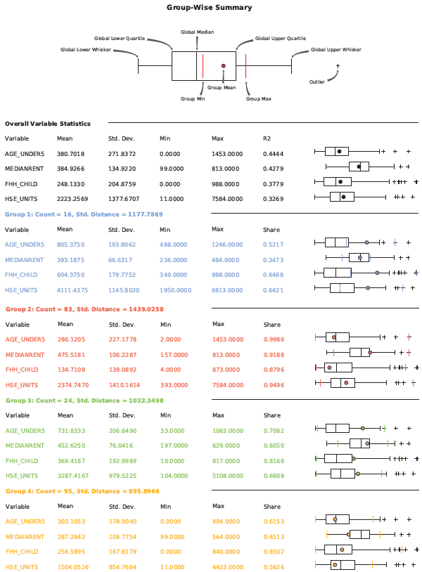
The first page of the report compares the variables (the Analysis Fields) within each group to each other. In the report below, for example, Grouping Analysis was performed on census tracts to create four groups. Summary statistics for each group are printed using a different color (blue, red, green, and gold). The first set of summary statistics are printed in black because these are the global Mean, Standard Deviation (Std.Dev.), Minimum, Maximum, and R2 values for all data in each analysis field. The larger the R2 value is for a particular variable, the better that variable is at discriminating among your features. After the global summaries, the Mean, Standard Deviation, Minimum, Maximum, and Share values are reported for each variable in each group. In the report below, for example, you see that Group 1 (Blue) contains 52 percent of the range of values in the global AGE_UNDER5 variable; the global range of values is from 0 to 1,453 children under the age of 5, and the blue group contains tracts with from 488 to 1,246 children under the age of 5. The mean number of children under 5 for the tracts in the blue group is 805.3750. The box plot to the right of the blue group statistical summary shows how the group's values relate to the global values for that same analysis field. Notice that the blue dot on the box plot falls outside the upper quartile and that the first blue vertical line (representing the minimum value for the blue group tracts) is above the global mean for this field. In fact, looking at where the blue dots fall in the box plots for all the variables, you can see that, except for the MEDIANRENT variable, the mean values in all the analysis fields is above the upper quartile. This group has the highest range of values compared to the other groups.
Dive-in:
The Share value is the ratio of the group and global range. For group 1 and the AGE_UNDER5 variable, for example, the 52 percent share is obtained by dividing the group range (1246-488=758) by the global range (1453-0=1453), yielding 0.52 when rounded to two significant digits.
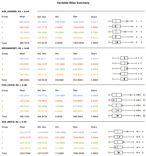
The second section of the report compares the variable ranges for each group, one analysis field (variable) at a time. With this view of the data, it is easy to see which group has the highest and lowest range of values within each variable. The group minimum, mean, and maximum values are superimposed on top of the box plot reflecting all values. Notice that group 4 (orange) has the lowest values for the MEDIANRENT variable. The minimum, mean, and maximum values for this group are lower than for any other group.
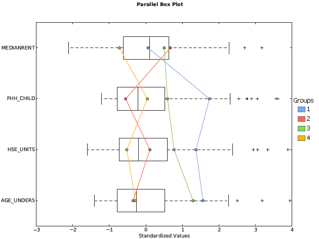
The parallel box plot graph summarizes both the groups and the variables within them. From the graph below, notice that group 1 (blue) reflects tracts with average rents, the highest values for female-headed households with children (FHH_CHILD), the highest values for number of housing units (HSE_UNITS), and the highest values for children under the age of 5. Group 2 (red) reflects tracts with the highest median rents, lowest number of female-headed households with children, more than the average number of housing units (though fewer than the tracts in groups 1 or 3), and the fewest children under the age of 5.
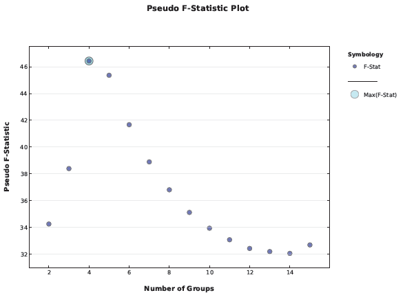
When you check on the Evaluate Optimal Number of Groups parameter, the PDF report file will include a graph of pseudo F-statistic values. The circled point on the graph is the largest F-statistic, indicating how many groups will be most effective at distinguishing the features and variables you specified. In the graph below, the F-statistic associated with four groups is highest. Five groups, with a high pseudo F-statistic, would also be a good choice.
Best practices
While there is a tendency to want to include as many Analysis Fields as possible, for Grouping Analysis, it works best to start with a single variable and build. Results are easier to interpret with fewer analysis fields. It is also easier to determine which variables are the best discriminators when there are fewer fields.
In many scenarios, you will likely run the Grouping Analysis tool a number of times looking for the optimal Number of Groups, most effective Spatial Constraints, and the combination of Analysis Fields that best separate your features into groups. Because creating the Output Report can add substantial processing time, you may not want to create the report while you are experimenting with different input parameters.
Additional Resources
Duque, J. C., R. Ramos, and J. Surinach. 2007. "Supervised Regionalization Methods: A Survey" in International Regional Science Review 30: 195–220.
Assuncao, R. M., M. C. Neves, G. Camara, and C. Da Costa Freitas. 2006. "Efficient Regionalisation Techniques for Socio-economic Geographical Units using Minimum Spanning Trees" in International Journal of Geographical Information Science 20 (7): 797–811.
Jain, A. K. 2009. "Data Clustering: 50 years beyond K-Means." Pattern Recognition Letters.
Hinde, A., T. Whiteway, R. Ruddick, and A. D. Heap. 2007. "Seascapes of the Australian Margin and adjacent sea floor: Keystroke Methodology." in Geoscience Australia, Record 2007/10, 58pp.