The Dimension Reduction tool reduces the number of dimensions of a set of continuous variables by aggregating the highest possible amount of variance into fewer components using Principal Component Analysis (PCA) or Reduced-Rank Linear Discriminant Analysis (LDA). The variables are specified as fields in an input table or feature layer, and new fields representing the new variables are saved in the output table or feature class. The number of new fields will be fewer than the number of original variables while maintaining the highest possible amount of variance from all the original variables.
Dimension reduction is commonly used to explore multivariate relationships between variables and to reduce the computational cost of machine learning algorithms in which the required memory and processing time depend on the number of dimensions of the data. Using the components in place of the original data in analysis or machine learning algorithms can often provide comparable (or better) results while consuming fewer computational resources.
It is recommended that you use PCA when you intend to perform an analysis or machine learning method in which the components are used to predict the value of a continuous variable. LDA additionally requires each record to be classified into a category, such as a land-use category, and it is recommended that you use LDA to perform an analysis or machine learning method in which the components are used to classify the category of the categorical variable based on the numerical analysis fields.
Potential applications
This tool can be used in the following types of scenarios:
- You have a feature class with many fields that are difficult to simultaneously visualize. By reducing the dataset to two dimensions, you can visualize the data using a chart to see multivariate interactions between the fields in two dimensions.
- You want to use analysis tools in the Modeling Spatial Relationships toolset, such as the Generalized Linear Regression or Geographically Weighted Regression (GWR) tools, but many of the fields are highly correlated with each other. By reducing the number of dimensions of the explanatory variables, the analysis tools may be more stable and less prone to overfitting the training data.
- You are performing a machine-learning method whose execution time increases rapidly with the number of input variables. By reducing the number of dimensions, you may achieve comparable analysis results using less memory and in a shorter amount of time.
How PCA works
PCA works by sequentially building components that each capture a certain percent of the total variance of all of the analysis fields. Each component itself is a linear combination (weighted sum) of each of the analysis fields, where the weights are called the loadings of the component. Together with the analysis fields, the loadings form an eigenvector, indicating the contribution of each analysis field to the component. The component is also associated with an eigenvalue, which represents the total variance maintained by the component.
For two analysis fields, you can visualize PCA geometrically as rotating axes in the data space where the rotation maximizes the ratio of the variability of the new axes, as shown in the following image:
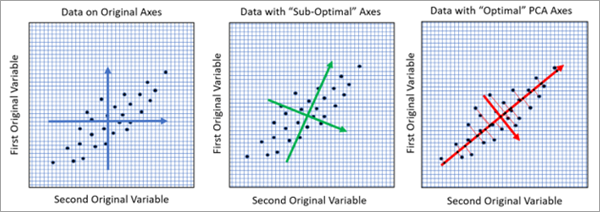
In the image on the left, each point is a record of the input table that is plotted in two dimensions with the values of the two analysis fields on the x- and y-ax es. The length of the blue axes represents the variance of each of the two variables. The lengths of the two blue arrows are approximately equal, indicating the two variables have approximately equal variance. In the middle image, the axes have been rotated to better represent the linear relationship between the variables. One of the green axes is slightly longer than the other, indicating more variance in that direction. However, this rotation is not optimal. The image on the right shows the optimal rotation found by PCA that lines up with the linear relationship between the variables. This rotation produces a red axis with the highest amount of variance. The larger red axis corresponds to the first principal component and is the best one-dimensional representation of the two-dimensional data. In all three images, the total variance of the original variables is the same, but the image on the right has assigned the largest possible amount of the variance to the first component, leaving the least possible amount of variance remaining for the second component.
You can see the eigenvalues and eigenvectors for each component using the Output Eigenvalues Table and Output Eigenvectors Table parameters, and the eigenvector table comes with a bar chart displaying the loadings of each component. For the full mathematical details of PCA, see the Additional resources section.
How Reduced-Rank Linear Discriminant Analysis works
LDA (often abbreviated RR-LDA or Reduced-Rank LDA) works by sequentially building components that maximize the between-class separability of a categorical variable. The method seeks to reduce the dimensions of the continuous analysis fields while maintaining the highest accuracy in classifying the category of the categorical variable. Similarly to PCA, the components of LDA are also associated with eigenvectors and eigenvalues to represent the contribution of the analysis fields to each component and the amount of variance maintained by each component.
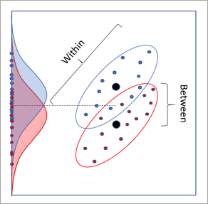
For two continuous analysis variables and a categorical variable with two categories, LDA also has a 2D geometric interpretation involving rotations. The image below shows a dataset where each point represents a record of the input dataset. The x-axis and y-axis are the two continuous analysis fields, and the points are colored red or blue based on their category. The red and blue distributions are the distributions of the categories when projected to the y-axis. There is some separability in the distributions of the classes, but they have large overlap and are difficult to separate. A similar lack of separation occurs by projecting to the x-axis.
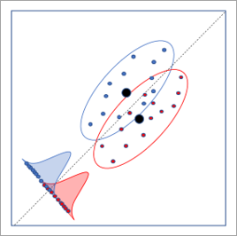
The image below shows the optimal axis rotation determined by LDA. This rotation results in the largest separation between the distributions of the categories, allowing the highest rate of classification of the category.
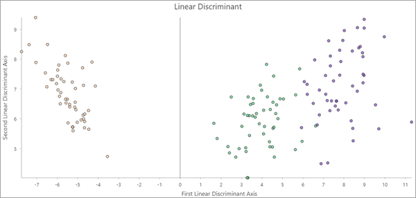
If at least two components are created, the output features include a Linear Discriminant scatterplot. The values of the first and second components are plotted on the axes, and the points are colored by their category. If the first two components maintain enough information to differentiate the categories, the points in the plot may cluster by category.
You can view the eigenvalues and eigenvectors for each component using the Output Eigenvalues Table and Output Eigenvectors Table parameters, and the eigenvector table includes a bar chart displaying the loadings of each component. For the full mathematical details of LDA, see the Additional resources section.
Determining the number of components
One of the most important choices in dimension reduction is how many components to create. This is equivalent to choosing how many dimensions of the input data to reduce. Sometimes you may know how many components you need based on your intended analysis, for example, a machine learning method that can only efficiently work with up to four variables. In other cases, you may want to use as many principal components as needed to maintain, for example, 90 percent of the total variance of the original data. In other situations, you may need a balance between minimizing the number of components and maximizing the percent of variance that is maintained.
In both data reduction methods, for p analysis fields, the percent variance explained by the ith component is  , where di is the eigenvalue of the ith component. Each sequential component maintains a smaller percent of the total variance than the component before it.
The number of components used by the tool depends on whether values are specified for the Minimum Number of Components and Minimum Percent Variance to Maintain parameters.
- If one parameter is specified and the other is not, the value of the specified parameter determines the number of components. The number of components is equal to the smallest number needed to satisfy the specified minimum.
- If both parameters are specified, the larger of the two resulting numbers of components is used.
- If neither parameter is specified, the number of components is determined using several statistical methods, and the tool uses the largest number of components recommended by each of the methods. For both dimension reduction methods, the methods include the Broken Stick Method and Bartlett's Test of Sphericity. For PCA, a permutation test is also performed if the Number of Permutations parameter value is greater than zero. The results of the statistical tests are displayed as geoprocessing messages. The mathematical details of the three tests can be found in the Additional resources section.
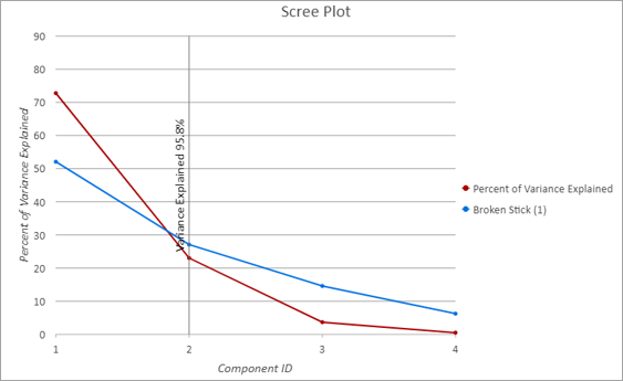
The output eigenvalues table comes with a customized line chart, called a scree plot, to show the percent of variance maintained by each component. In the scree plot below, the x-axis shows each sequential component, and the red line shows the percent variance explained by each component. The red line decreases, indicating that each new component maintains a smaller amount of variance than the previous component. The vertical black line above component 2 on the x-axis indicates that the tool used two components, and they maintained 95.8 percent of the total variance of the original variables. The blue line shows the results of the Broken Stick method used to estimate the optimal number of components. The optimal number of components often corresponds to where the red and blue lines cross, indicating agreement in the number of components.
Best practices and limitations
Consider the following when using this tool:
- For PCA, the results of this analysis depend on whether the variables are scaled. Because PCA partitions the total variance into components, the larger the raw values of an analysis field, the higher the percent of the total variance that is associated with it. Scaling each of the analysis fields to have a variance equal to one removes this effect. For example, if the analysis fields are scaled, data measured in feet and data measured in meters result in the same components. If unscaled, data measured in feet contributes more to the first component than the same data in meters. This is because a distance value measured in feet is larger than the same distance value measured in meters (1 meter = 3.2808 feet).
- PCA estimates eigenvalues and eigenvectors assuming linear relationships between all of the analysis fields. If the relationships between the analysis fields are nonlinear, PCA does not accurately capture these relationships. It is recommended that you create a scatterplot matrix of your analysis variables and look for nonlinear patterns. If nonlinear patterns are found, the Transform Field tool may be able to linearize the relationships.
Additional resources
For additional information about PCA and Reduced-Rank LDA, see the following reference:
- James, G., Witten, D., Hastie, T., Tibshirani, R. (2014). "An Introduction to Statistical Learning: with Applications in R." Springer Publishing Company, Incorporated. https://doi.org/10.1007/978-1-4614-7138-7
For additional information about the methods for determining the number of components, see the following reference:
- Peres-Neto, P., Jackson, D., Somers, K. (2005). "How many principal components? Stopping rules for determining the number of non-trivial axes revisited." Computational Statistics & Data Analysis. 49.4: 974-997. https://doi.org/10.1016/j.csda.2004.06.015.