The Theme tab in Web AppBuilder provides out-of-the-box themes. A theme is a template framework representing the look and feel of an app. Content in a theme includes a collection of panels, styles, and layouts, and a set of preconfigured theme widgets. An app can include more than one theme, but it can only use one theme while running.
Theme gallery
You can choose from one of the following themes:
| Name | Description |
|---|---|
 Billboard Theme* | For apps with simple tasks. The layout does not include the logo, links, and widget controller. All the widgets in the theme are on-screen widgets. |
 Box Theme | Focuses on the widgets in the widget controller. By default, all on-screen widgets are turned off. There are no placeholders for widgets and no logo or links display. It is for apps that require a clean look on the map. |
 Dart Theme | Widgets in the widget controller display as placeholder widgets. You can have multiple widgets open and move them around. By default, all on-screen widgets are turned off. Similar to Box Theme, there are no placeholders for widgets and no logo or links display. |
 Dashboard Theme* | All the widgets in the panel open simultaneously when the app starts. It is designed to visualize widgets and their communication directly. You can modify the predefined layout by adding or removing grids, or resizing the grids in the panel. By default, most on-screen widgets are turned off except the Home, Zoom Slider, and Full Screen widgets. Optionally, you can turn on the Header widget to display the logo, the app name, and links. |
 Foldable Theme* | The first theme created by Web AppBuilder, it supports all widget types and can be used for apps with complicated tasks. |
 Jewelry Box Theme* | Evolved from Foldable Theme with a focused widget on the side of the app. It is for apps with a workflow task. |
 Launchpad Theme* | For users who prefer the Apple Mac style. It allows you to open multiple widgets, and move, resize, and minimize them. |
 Plateau Theme* | Can be used to create a modern and basic app with flat toolbars and widget containers. This theme is not available when you build 3D apps. |
 Pocket Theme* | For apps that will be embedded in websites, stories, or other locations with surrounding context. Only one widget is supported in a panel that can be positioned on the left or the right. This theme is not available when you build 3D apps. |
 Tab Theme* | As with Foldable Theme, it supports all widget types and can be used for apps with complicated tasks. |
*These themes support web content accessibility for end users. For more information and any associated limitations, see Accessibility support.
Style
The available styles vary depending on the theme selected in the Theme tab. Most themes have seven predefined colors from which to choose, except Launchpad Theme and Dashboard Theme. If your organization has defined the shared theme with a header color, it will be the default color when an app is created.

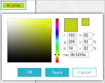
You can also choose your own color.
- For most themes, click the last color in the color picker and choose Custom to specify a custom color.
- For Dashboard Theme, you can only specify a custom color for the header. The header is turned off by default. If you choose this theme, include a header with a custom color by completing the following steps:
- On the Widget tab, point to the Header widget and click the show button
 to turn on the header in your app.
- Click the Configure this widget button
 . In the configuration window, for Set style, choose Custom. (It defaults to the theme color and you can also choose to use the shared theme.)
- On the Widget tab, point to the Header widget and click the show button

Layout
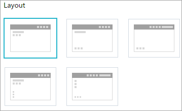
A layout represents a preset placement of user interface items.

- When you build 2D apps, the available layouts vary depending on the theme selected in the Theme tab. In addition, there are two styles of layout. One is for desktop and one is for mobile devices. When either the height or width of a screen display is less than 600 pixels, the mobile layout applies.
- When you build 3D apps, each theme has two layouts for desktop only.
- Only Dashboard Theme allows you to modify and generate your own layout.
Caution:
Currently, layouts from Dashboard Theme do not support right-to-left languages.