You can change the way questions are presented by setting the appearance for each question type. Add an appearance column to your spreadsheet to change the appearance and functionality of your survey questions.
Not all of these appearances are supported in both the Survey123 field app and web app. See the Quick reference for a table describing which appearances can be expected to work in each environment. This table can also be found in the Appearances worksheet of the Survey123 Advanced XLSForm template.
Tip:
To see how questions will be presented in a survey, see the Appearances sample in Survey123 Connect. By publishing the sample using your ArcGIS account, you can also see how questions will be presented in the Survey123 web app.
Multiple appearances
You can add multiple appearances to the appearance column for a question by separating the appearances with spaces. The appearances can be in any order. For example, an image question could have the following three appearances specified in the appearance column:
annotate new-front multilineYou can specify width appearances for questions in surveys that use a grid layout. Widths can be specified with any combination of appearances that are supported for the question type. For example, a select one question in a grid layout could have the following in the appearance column:
w3 likertHide questions
By setting the appearance to hidden, any question type, including groups and repeats, can be hidden from view when filling in the survey, but will accept and submit default values and calculations. This is more versatile than the hidden question type, as it can be applied to any question type.
Text
By setting the appearance to multiline, a text question is presented as a multiline text box. You can set the default height for this text box by setting a defaultHeight parameter in the body::esri:style column. For example, entering defaultHeight=5 in the body::esri:style column will display five lines in a multiline text box when your survey is opened. If this is not set, a multiline text box will display three lines when your survey is opened.
By setting the appearance to predictivetext or nopredictivetext, a text question enforces that predictive text is enabled or disabled, respectively, on mobile devices. By default, Android has predictive text disabled for text questions, while it is enabled by default on iOS.
Note:
Controlling the height of questions is not supported in the Survey123 web app.
The predictivetext and nopredictivetext appearances are not supported in the Survey123 web app.
Predictive text is disabled for text questions by default on Android, which can deactivate the speech to text function on some keyboards. Apply the predictivetext appearance to a text question to enable speech to text for that question.
InfraMarker text
Use the following appearances to read data from or write data to an InfraMarker RFID tag.
By setting the appearance of a text question to inframarker, you can define the information to write to a tag. This information can include assetOwner, assetName, latitude, and longitude, and the values can be derived from other questions in the survey. For example, the following expression in the calculation column writes the answers from the asset_name, asset_owner, lat, and long questions to the tag:
concat("assetName=", ${asset_name}, "&assetOwner=", ${asset_owner}, "&latitude=", ${lat}, "&longitude=", ${long})
By setting the appearance of another text question in the same survey to getinframarkerid, the unique 24 character InfraMarker tag ID is retrieved and stored in the survey.
For more information, see the InfraMarker documentation.
Geocode
By setting the appearance to geocode, a text question is used to search for and submit a geocoded address. Begin typing an address, and a series of autocomplete options appears, suggesting locations based on the default available locators for your organization. If the user isn't signed in, the ArcGIS World Geocoder will be used. The final selected address will be sent to the feature layer as a string: however, the full geocoded data is temporarily stored as a JSON object before being sent, allowing individual properties to be extracted into other fields.
To extract specific properties from the JSON object, use the pulldata("@json") function in the calculation column of another question.
pulldata("@json", ${address}, "location.x")
pulldata("@json", ${address}, "searchCandidate")
The entire JSON object can be returned in a single text field by not defining an individual property.
pulldata("@json", ${address})
For more information on the pulldata("@json") function, see Retrieve a value from JSON.
Note:
Geocoding using the ArcGIS World Geocoding Service will consume credits. For more information, see Understand credits.To set a specific locator to return results from, supply the locator's item ID in the bind::esri:parameters column, for example, geocode=36ff9e8c13e042a58cfce4ad87f55d19. A locator used in an ArcGIS Online survey must be an item in ArcGIS Online. A locator used in an ArcGIS Enterprise survey must be an item in the same portal as the survey.
Available properties will differ depending on the locator used. The exception to this is the searchText property, which is available regardless of the locator used and returns either the exact string used to search for the address, or the option selected from a list of results.
You can further control the presentation of a geocode appearance question by setting one of the following parameters in the body::esri:style column:
- indicator—Allows the geocoded results to show the direction and distance from the current device location. This parameter can be set to either distance, direction, both values separated by a comma, or none. By default, this parameter is set to show only distance.
- proximity—Controls whether the geocoded results only show results within a certain radius of the device's location. This parameter accepts a number, followed by any of the following standard units: m (meters), km (kilometers), ft (feet), mi (miles), or yd (yards). If no unit is provided, it will default to meters. If set to 0, proximity will not be accounted for in search results. By default, this parameter is set to on, allowing suggestions to be sorted by proximity without filtering out any locations because of distance.
- maxResults—Controls the maximum amount of results provided, for example, maxResults=10 will return a maximum of 10 possible results. By default, this parameter is set to show 6 results at maximum.
- suggestions—This acts as an interface for the suggest operation in the ArcGIS REST API. When this parameter is set to yes, the drop-down list of potential locations is populated by the suggest operation. When this parameter is set to no or if the geocode service doesn't support the suggest operation, the list of potential locations is populated by the findAddressCandidates operation. By default, this parameter is set to yes.
The geocode appearance requires an internet connection and will not function in an offline environment.
Note:
The indicator, proximity, maxResults, and suggestions parameters are not supported in the Survey123 web app.
Rangefinder
By setting the appearance to rangefinder, a text question can accept either the full JSON object or a specified value that is returned from a rangefinder. When used to accept the full JSON object, this question should have bind::esri:fieldLength set to 1000 to ensure the full value will fit.
By setting the appearance to rangefinder, an integer or decimal question can accept a specific value that is returned from a rangefinder. Specify which measurement to store by using one of the following values in the bind::esri:parameters column: height, azimuth, horizontalDistance, slopeDistance, inclination. For example measurement=height will store only the height value that is returned from the rangefinder.
Date
By setting the appearance to year, a date question is presented as a year-only button, with arrows to increase or decrease the year value.

By setting the appearance to month-year, a date question is presented as a pair of buttons, one for the month and one for the year. Each has arrows to increase or decrease the value.

Note:
The year and month-year appearances appear when the survey loads with values for the current month and year. However, they don't already contain these values and will submit a blank value unless manually edited or a default or calculation has been applied.
By setting the appearance to week-number, a date question is still presented with a calendar picker for choosing the date, but once selected, the result is displayed as the equivalent week number of the year. For example, if you choose April 27, 2016, Week 17 is displayed as the result.

Note:
The week-number appearance is not supported in the Survey123 web app.
Select one
By setting the appearance to minimal, a select one question is presented in a drop-down menu.
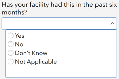
By setting the appearance to horizontal, the choices for a select one question are presented horizontally in columns of equal width.

The compact appearance is similar to the horizontal appearance but uses a different method for determining column widths that may result in the choices taking up less space.
You can specify a maximum number of columns for the compact appearance by providing a number separated by a hyphen. For example, compact-3 limits the question to a maximum of three columns.
The compact and horizontal-compact appearances are identical. In the Survey123 web app, instead of using columns, these appearances fit the choice labels for a select one question side by side in rows without additional spacing.
By setting the appearance to likert, a select one question is presented as a Likert scale. A Likert scale is a rating scale that allows respondents to specify their level of agreement on a symmetric agree-disagree scale of a statement.

By setting the appearance to autocomplete, a select one question is presented with a text field and a drop-down menu. Entering text in the field limits the drop-down menu to only answers that contain that text. This is useful for very long choice lists.

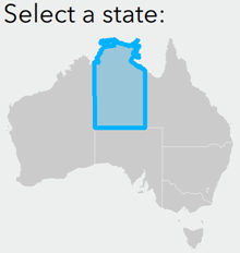
By setting the appearance to image-map, a select one question is presented as the image referred to in the media::image column, with selectable regions of the image as choices. To function, this appearance requires an SVG file to be provided in the survey's media folder and the name values of the choice list to match the path IDs for the SVG file's regions. For more information, see Work with SVG files.
Note:
The image-map appearance is not supported in the Survey123 web app.
Select multiple
By setting the appearance to minimal, a select multiple question is presented in a drop-down menu.
By setting the appearance to horizontal, the choices for a select multiple question are presented horizontally in columns of equal width.
The compact appearance is similar to the horizontal appearance but uses a different method for determining column widths that may result in the choices taking up less space.
You can specify a maximum number of columns for the compact appearance by providing a number separated by a hyphen. For example, compact-3 limits the question to a maximum of three columns.
The compact and horizontal-compact appearances are identical. In the Survey123 web app, instead of using columns, these appearances fit the choice labels for a select multiple question side by side in rows without additional spacing.
By setting the appearance to image-map, a select multiple question is presented as the image referred to in the media::image column, with selectable regions of the image as choices. To function, this appearance requires an SVG file to be provided in the survey's media folder and the name values of the choice list to match the path IDs for the SVG file's regions. For more information, see Work with SVG files.
Note:
The image-map appearance is not supported in the Survey123 web app.
Search
Select one and select multiple questions also support the search appearance, which can be used to populate the choice list with values from a CSV table in the survey's media folder, or an existing feature layer or table. When using the search appearance, you must still include an entry on the choices worksheet, but instead of listing each of the choices, you will reference the field name from the existing feature layer or table.
In the following example, a choice list named us_states is defined on the choices worksheet and will use the field STATE_NAME for both the choice name and label.

In the following example, this choice list is then referenced on the survey worksheet in the same way as other choice lists, but it includes the search appearance expression that references the existing feature layer from which to retrieve the choices.

The search appearance expression must be structured in the following way, with variables separated by commas:
search(tableName, searchType, searchColumn, searchText, filterColumn, filterText)The tableName parameter accepts either the name of the CSV file in the survey's media folder, for example, airports, or the URL of a feature layer or map service layer, preceded by a name for Survey123 to refer to the table internally. This table name doesn't need to match the name of the hosted layer, but because this is how Survey123 internally refers to your search, it must be different from all other table names and CSV files used in the survey. You can optionally append query request parameters to the REST endpoint of your feature layer or map service layers to configure the search behavior. In the following example, a feature layer URL is appended with the resultRecordCount parameter to populate the choice list with the first 10 query results, with the search being stored internally under the name airports:
"airports?url=https://services1.arcgis.com/e7dVfn25KpfE6dDd/arcgis/rest/services/Airports2/FeatureServer/0&resultRecordCount=10"The choice list can also be filtered using a WHERE
expression. When using the following example as the tableName, the
choice list will be filtered to show only states whose name is not
Alabama or Alaska:"state?url=https://services.arcgis.com/P3ePLMYs2RVChkJx/arcgis/rest/services/USA_States_Generalized_Boundaries/FeatureServer/0&where=STATE_NAME
NOT IN('Alabama', 'Alaska')"
Additional parameters are optional but can be used to narrow the results provided by the search.
| Parameter | Description |
|---|---|
searchType | Controls what type of search is performed, and accepts different values depending on whether the table being searched is a spatial table within a feature layer or a nonspatial table in a CSV or feature table. For spatial tables, the accepted search types are intersects, contains, crosses, envelope_intersects, index_intercepts, overlaps, touches, and within. To learn more, see Spatial relationships. For a nonspatial table, the supported search types are contains, startswith, endswith, and matches. |
searchColumn | Determines the column that will be searched for the text in the searchText parameter. These columns are taken from the table itself. In addition, a spatial table in a feature layer can search the columns @geopoint, @geotrace, and @geoshape. |
searchText | Contains the text that will be searched for and returned in the searchColumn parameter. |
Additionally, filter parameters can be added to the search expression to further refine the choice list values:
| Parameter | Description |
|---|---|
filterColumn | Sets a column to search for matches to the text given in the filterText parameter. The search query will only return results that contain this text. The filterColumn and filterText parameters must be used together. |
filterText | The text being searched for in the column given by the filterColumn parameter. The filterColumn and filterText parameters must be used together. |
The following is an example search expression that includes some of the optional parameters for the search appearance. It populates a choice list with the contents of a CSV file, using a previous question as the search text.
search('csvName', 'matches', 'breed', ${DogQuestion})
Note:
Questions with the search appearance are presented in the Survey123 web app in the same way as select_one questions with the autocomplete appearance.
Map questions
By setting the appearance to press-to-locate, a geopoint question will only accept a location value once the user interacts with the question, rather than the default behavior of immediately capturing location once the form loads. A geotrace or geoshape question will center on the user's location without capturing a point when first interacting with the map.
Note:
The press-to-locate appearance is not supported for geotrace and geoshape questions in the Survey123 field app.
Geopoint
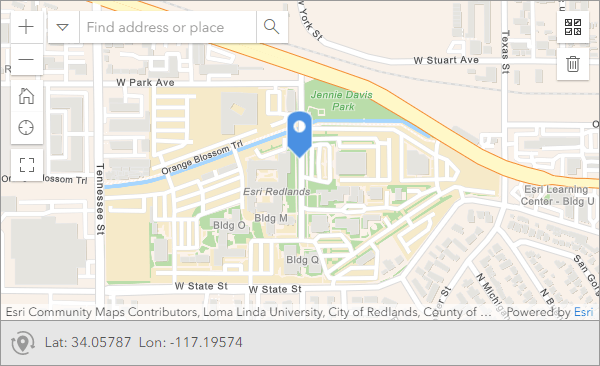
By setting the appearance to hide-input, a geopoint question viewed in the Survey123 web app appears with a read-only coordinates value, as opposed to the default coordinate input box.
Note:
The hide-input appearance is not supported in the Survey123 field app.
Image
By setting the appearance to signature, an image question presents a pop-up to capture a signature.

A signature is saved as a .jpg image attachment with the same dimensions of the pop-up. By default, the width of the pop-up stretches to the width of the device's screen, with a fixed height of 200 pixels. You can set the maximum width for this pop-up by defining a max-pixels value in the parameters column, for example, max-pixels=400.
You can also provide an image in the default column to set a custom background for the signature. The dimensions of the default image will determine the aspect ratio of the pop-up.
The width of the pop-up will be the smallest of the following:
- The max-pixels value
- The width of the default image
- The width of the device's screen
The height will be 200 pixels, unless a default image is provided.
When designing a survey using the signature appearance, be sure to take the screen size of all target devices into consideration.
Footer text can be provided for a signature question pop-up by using the footerText parameter in the body::esri:style column. By using just the footerText parameter with no value, the question's guidance hint will appear below the signature. This can be changed to the question's hint by using footerText=@[hint]. The hint or guidance hint used for the footer text will not appear in the default location below the question name. For more information on hints, see Hints.
By setting the appearance to multiline, an image question accepts multiple images in a single image question. This appearance can be combined with other image appearances by setting both appearances separated by a space, such as multiline annotate.
You can control the number of images that can be submitted by using the count-selected function in the constraint column. For example, count-selected(${image_question}) <= 5 will limit the number of images that can be submitted to a maximum of five.
By setting the appearance to new-front or new-rear, an image question will be limited to only using the device's camera, using the front-facing or rear-facing camera, respectively, as a default. These appearances can be combined with annotate by setting both appearances separated by a space, such as new-front annotate.
Note:
The Survey123 web app does not support multiline, the max-pixels parameter, or defaults when applied to the signature appearance.
The new-front and new-rear appearances are not supported in the Survey123 web app.
The pulldata("@exif") function won't work for multiline image questions. If you need to extract exchangeable image file format (EXIF) data from multiple images submitted to the same question, consider using a repeat.
Draw and annotate
By setting the appearance to draw, an image question displays a button to load a canvas on which you can sketch. In the drawing tools palette, you can switch between drawing tools as well as control the settings for each tool, such as text size, line width, color, and so on. For information about the canvas interface, see Draw and annotate. You can create custom palettes that allow you to configure drawing and annotation tools to suit your needs. For more information, see Draw and annotate palettes.
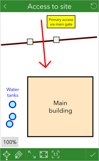
By setting the appearance to annotate, an image question displays a button to open the device's camera to take a photo that you can annotate with graphics and text. In the drawing tools palette, you can switch between drawing tools as well as control the settings for each tool, such as text size, line width, color, and so on. For information on the canvas interface, see Draw and annotate. You can create custom palettes that allow you to configure drawing and annotation tools to suit your needs. For more information, see Draw and annotate palettes.

Tip:
From Survey123 3.13, EXIF data is copied from the source image to the annotated image.
Alternatively, you can allow the user to annotate an existing image from the device's storage, or a snapshot of a map. To do this, set body::esri:style for that question to method=browse, method=camera, or method=map. The default behavior for the annotate appearance is identical to providing method=camera. You can set the question to provide a number of options for the source image by providing multiple options separated by commas, for example, method=camera,browse.
Caution:
Regardless of the method set, the Survey123 web app only displays a browse for file option.
Defaults and calculations behave differently with image questions using draw and annotate. If the file name of an image in the survey's media folder is used as a default value or the result of a calculation, the image is used as an initial background for the canvas. With annotate, this image is replaced by a provided image, and it only displays if the user specifically declines to provide an image, or resets the image once already provided.
Note:
You can set the resolution for an image by defining a max-pixels value in the parameters column. For a draw question, setting max-pixels=1000 will set the canvas to a square image of 1000x1000 pixels. For an annotate question, setting max-pixels=1000 will set the longest side of the image to 1000 pixels while preserving the aspect ratio of the provided image. If max-pixels is not set, the image size will instead be defined by the image size setting in the Options settings for your survey in Survey123 Connect.
Both of these forms of setting image resolution are overwritten by providing a default image for the question, in which case the default image's resolution will be applied. This can be used to ensure a standard resolution for all submitted images. Providing a snapshot of a map for annotation will also overwrite any other image resolution settings, with the image being set to the size of the viewable canvas area.
Spike images
Image questions also support appearances to integrate Survey123 with Spike, a laser measurement solution developed by ikeGPS that allows you to capture the measurements and location of an object from a photo. By setting the appearance to spike, spike-full-measure, or spike-point-to-point, an image question displays a button to open the Spike mobile app on iOS and Android devices.
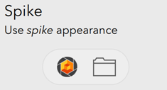
A photo taken with the Spike app and laser device allows you to record the coordinates of and distance to the object, and measure the dimensions of objects in the photo through drawing areas and lines. The photo with measurement markup is then attached to your survey, and the metadata from the photo, such as coordinates and measurements, is made available to be recorded. Associated Spike and measurement metadata is recorded in the image file using standard exchangeable image file (EXIF) tags. The EXIF information can then be extracted and used to populate other fields.
The difference between the Spike appearances is the extent of values stored in the image. The spike appearance only measures distance and location, while the spike-full-measure appearance measures distance, location, area, and length. The spike-point-to-point appearance captures a series of values exclusive to it, denoted by the property names beginning with P2P.
For more information about these EXIF tags, see Spike integration. For more information about Spike, see the Spike website.
Note:
Spike integration is not supported in the Survey123 web app.
Integer
By setting the appearance to distress, an integer question is displayed as a distress scale. A distress scale is a 10-point scale used to measure feelings such as stress, pain, and happiness.

By setting the appearance to spinner, an integer question is displayed with buttons to increase or decrease the value by one. Selecting the button repeats the progression until the button is released.
By setting the appearance to numbers, a highlighted integer question is accompanied by a custom numeric keyboard to enter a value. The keyboard also includes a button to make the value positive or negative.
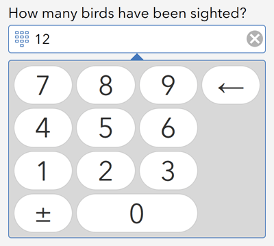
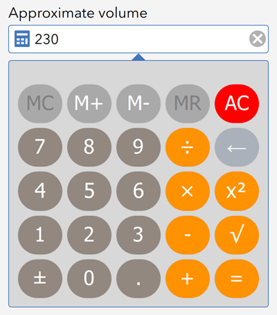
By setting the appearance to calculator, a highlighted integer question is accompanied by a custom calculator keyboard to enter and modify a value.
Note:
The distress, spinner, numbers, and calculator appearances are not supported in the Survey123 web app.
Decimal
By setting the appearance to spinner, a decimal question is displayed with buttons to increase or decrease the last digit of the value by one. Selecting a button repeats the progression until the button is released.

Use a default to define the number of decimal places for a question, and the spinner adheres to it. The following are examples of how the spinner handles different decimal values:
- 1.0 increases to 1.1, 1.2, 1.3, 1.4
- 3.07 increases to 3.08, 3.09, 3.10, 3.11
- 2.000000 increases to 2.000001, 2.000002, 2.000003
By setting the appearance to numbers, a decimal question is accompanied by a custom numeric keyboard to enter a value. The keyboard also includes a button to make the value positive or negative.
By setting the appearance to calculator, a highlighted decimal question is accompanied by a custom calculator keyboard to enter and modify a value.
By setting the appearance to thousands-sep, the answer to a decimal question appears with thousands separators. This does not affect the value sent as part of the survey response, only the display in the app. The separators are set by the device's locale and are applied only on opening a survey from the Drafts, Outbox, Inbox, or Sent folders or when the response is populated by a default or calculation. Thousands separators do not appear when manually inputting a value.

Note:
The spinner, numbers, calculator, and thousands-sep appearances are not supported in the Survey123 web app.
Range
By setting the appearance to no-ticks, a range question displays without the lines to show positions on the range slider, or the minimum and maximum values. This doesn't change the behavior of the question, only the display. For more information about the range question type, see Range.
Barcode
By setting the appearance to minimal, a barcode question displays with only a single button to start the scanner. The text box that contains the value for the barcode question is not visible. For more information about the barcode question type, see Barcodes.

Group
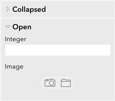
By setting the appearance of a begin group question to compact, a group of questions appears collapsed on startup and can be expanded by the user. This is useful for long surveys that can be difficult for the user to read and navigate. This appearance is defined in the begin group question.
The minimal appearance has no effect on group questions.
By setting the appearance of a begin group question to table-list, the select_one questions in the group with a common choice list appear in a table format, with the top row displaying the choice list labels and the left column displaying the question labels.

By setting the style column on the settings sheet to pages and the appearance of each begin group question to field-list, each group displays on a separate page of the survey. This is ideal for breaking down the display of your survey, organizing it, and decreasing load times. You can browse pages using the back and forward buttons at the bottom of the app. You can long press these buttons to skip to the start or end of the survey. You can also select the page number to display an index of the pages. Select a page in the index to navigate directly to it.
Caution:
When using the pages style, each question in the survey must be in a group that uses the field-list appearance.

By setting the style column on the settings sheet to fixed-grid or dynamic-grid, groups in your survey can be set to display the contained questions in a grid.
The fixed grid style creates a placeholder for each question, including those with a hidden appearance. A question will appear if its relevant conditions are met; otherwise, a blank space will occupy that place in the form.
The dynamic grid style allows questions and groups to move on the form, depending on relevant conditions to make best use of the space on the device screen.
The grid layout style on the settings worksheet is a global setting that applies to the whole survey. You can also apply a grid layout style for individual groups or repeats, allowing different styles to be used for different parts of your survey. The global setting can be overridden by entering either of the following in the body::esri:style column of the group or repeat question:
- layout=dynamic-grid
- layout=fixed-grid
Set a group's width appearance to w followed by the number of columns used to divide your grid. For example, w4 divides each row of your grid into four columns. The width parameter is also be applied to a question within a group or repeat to control how many columns from the parent group or repeat the question should span. When the stated widths of the questions add up to the number of columns set for the group, the next questions will be on a new line. These widths can be set along with most other appearances.
In the following example, the width appearances for water temperature, dissolved oxygen, pH, and conductivity are each w1, and the width appearance for the water sample location is w2.

In the following example, the group has a width of three columns (w3). In the first repeat, two columns are defined, and those two columns span two of the parent columns (w2:2). In the second repeat, two columns are defined, and those two columns span one of the parent columns (w2:1).

The following image shows how these nested repeats appear in the group on the form.
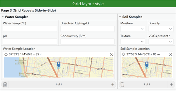
If the form is to be displayed in the web app, add the width URL parameter for launching the web app, to ensure the full screen width is used. In the following image, the group has a width of eight columns (w8); questions within the group have a width of w2, w3, or w5 to fill the page appropriately; and the survey URL has been appended with ?width=1 to use the full width of the browser.

Note:
The table-list appearance does not support select_multiple questions and does not support media in choice lists.
The table-list appearance will not function if placed in a theme-grid group.
Previously, the dynamic-grid style was called theme-grid. The theme-grid style is still supported for backward compatibility, but for new surveys, it is recommended that you use either the dynamic-grid or fixed-grid style.
Grid layout style groups do not support borderColor.
File
By setting the appearance to multiline, a file question accepts multiple files in a single file question. You can control the number of files that can be submitted by using the count-selected function in the constraint column. For example, count-selected(${file_question}) <= 5 will limit the number of files that can be submitted to a maximum of five.

Repeat
By setting the appearance of a begin repeat question to minimal, a repeatable collection of questions is not visible on startup. The user must click the add button to see the questions in the repeat. This is useful when repeated questions don't need to be completed in a survey. This appearance is defined in the begin repeat question.
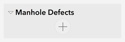
If a repeat is set to minimal and has a repeat count of zero, the repeat controls and their label are invisible.
By setting the appearance of a begin repeat question to compact, a repeatable collection of questions appears in a collapsed state on startup, which can be expanded by the user. This is useful for large surveys that may be difficult for the user to read and navigate. This appearance is defined in the begin repeat question.
Unlike other appearances, repeat can use both minimal and compact at the same time by setting the appearance to minimal compact. This presents the questions in a repeat in both a collapsed (compact) and a hidden (minimal) manner.
By setting the style column on the settings sheet to pages and the appearance of each begin repeat question to field-list, each repeatable collection of questions displays on a separate page of the survey. This behavior is the same as for a group.
By setting the style column on the settings sheet to fixed-grid or dynamic-grid, repeats in your survey can be set to display the contained questions in a grid layout. This behavior is the same as for a group.