

Histograms aggregate numerical data into equal interval groups, called bins, and display the frequency of values within each bin. A histogram is created using a single number or rate/ratio field.
Histograms can answer questions about your data, such as: What is the distribution of numeric values and their frequency of occurrence in a dataset? Are there outliers?
Example
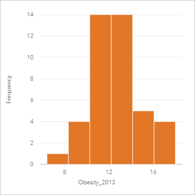
A nongovernmental health organization is studying obesity rates among adolescents in the United States. A histogram of the frequency of obesity in youth across each state can be used to determine the distribution of obesity rates, including the most and least common frequencies and overall range.

The histogram above shows a normal distribution and indicates that the most frequently occurring rates are between the 10 and 14 percent range.
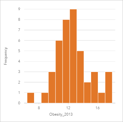
Increasing or decreasing the number of bins can have an effect on how you analyze your data. While the data does not change, its appearance can. It's important to choose an appropriate number of bins for your data so that patterns in the data are not misinterpreted. Too few bins can hide important patterns, and too many bins can make small but expected fluctuations in data appear important. The following figure is an example of an appropriate number of bins for the data. Each bin contains a range of approximately 1 percent, and the data can be examined at a finer scale to see patterns that are not visible when using six bins. In this case, the pattern that emerges is a normal distribution around the mean with a slight, but likely not significant, skew toward the left.

Create a histogram
To create a histogram, complete the following steps:
- Select a number
 or rate/ratio field
  .
.Note:
You can search for fields using the search bar in the data pane.
- Create the chart using the following steps:
- Drag the selected fields to a new card.
- Hover over the Chart drop zone.
- Drop the selected fields on Histogram.
Tip:
You can also create charts using the Chart menu above the data pane or the Visualization type button  on an existing card. For the Chart menu, only charts that are compatible with your data selection will be enabled. For the Visualization type menu, only compatible visualizations (including maps, charts, or tables) will be displayed.
Histograms can also be created using View Histogram, which is accessed from the Action button  under Find answers > How is it distributed?
Usage notes
When a histogram is created, Insights automatically calculates an appropriate number of bins for displaying your data. You can change the number of bins using the slider along the x-axis or by clicking the number of bins and entering a new number.
Note:
If the chosen number of bins does not divide evenly into the data range, then bins will be calculated using decimal values. Histograms display rounded integers as their bin labels, rather than decimals. The rounded integers are for display only, and the decimal values are used for all calculations. In a case where a bin includes data values near the upper or lower limit and the label is rounded, the bin starting and ending values may appear incorrect because the labels are displaying rounded values rather than decimals.
Use the Layer options button  to change the symbol color and outline color, which will be applied to all bins.
Use the Chart statistics button  to display the mean, median, and normal distribution of the data. A normal distribution curve represents the expected distribution of a random sample of continuous data, where the highest frequency of values is centered around the mean and the frequency of values decreases as the values increase or decrease away from the mean. A normal distribution curve is useful for determining if your data has bias (for example, the data has a higher frequency of low values) or outliers.
Use the Card filter button  to remove any unwanted data from your card. Filters can be applied to all string, number, rate/ratio, and date/time fields. A card filter does not affect other cards using the same dataset.
Use the Selection tools button  to select features on the chart using the single select tool, or invert the selection.
Use the Visualization type button  to switch directly between a histogram and a graduated symbols map or summary table.
Use the Maximize button  to enlarge the card. Other cards on the page will be reduced to thumbnails. The card can be returned to its previous size using the Restore down button
  .
.
Use the Enable cross filters button  to allow filters to be created on the card using selections on other cards. Cross filters can be removed using the Disable cross filters button
  .
.
Use the Flip card button  to view the back of the card. The Card info tab
  provides information about the data on the card and the Export data tab
  allows users to export the data from the card.
The back of a histogram displays the following calculated values: mean, median, standard deviation, skewness, and kurtosis (simplified). Skewness and kurtosis are described in the following table:
| Statistic | Description |
|---|---|
Skewness | Skewness determines whether the data's distribution is symmetrical. Skewness measurement determines whether most of the distribution values lie to the left or the right of the mean. The skewness of normal distribution is zero, showing an equal amount of the data on either side of the mean. Skewness values can be zero, negative, or positive as follows:
|
Kurtosis | Kurtosis describes the shape of the frequency distribution and gives a measure of the likelihood that the distribution will produce outliers. Distributions with relatively heavy tails are termed leptokurtic and have kurtosis greater than zero. Distributions with relatively light tails are termed platykurtic and have a kurtosis less than zero. The kurtosis of a normal distribution is equal to three, or when using simplified kurtosis, the kurtosis of a normal distribution is zero (this is found using the same formula as kurtosis, minus 3). Simplified kurtosis values can be zero, negative, or positive as follows:
|
Use the Card options button  to access the following menu options:
- Appearance button
 —Change the background color, foreground color, and border of the card.
 - Edit labels button
 —Create custom labels for the chart axes. To edit the labels, click the Edit labels button and click the axis to make it editable.
 - Order button
 —Move the card forward or send the card backward relative to other cards on the page.
 - Delete button
 —Remove the card from the page. If you did not intend to delete the card, you can retrieve it using the Undo button
  .
.
Resources
Use the following resources to learn more about charts: