

A column chart is created by displaying a string field on the x-axis and a count, number field, or rate/ratio field on the y-axis. The length of each column represents the value of each category. Column charts can also use a subgroup to create a grouped or stacked column chart so that comparisons can be made between and within categories.
Column charts can answer questions about your data, such as: How are numeric values distributed or summarized by category? How is the data ranked?
Examples
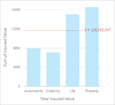
An insurance company is reviewing the types of policies it offers to compare its current offerings to the findings from a recently completed market research project. The first step in the review is to determine the total value of policies in each policy class. A column chart can be used to visualize the sum of total insured values (TIV) for each policy class.

The column chart above provides a sum of the TIV for each category of insurance policy: Disability, Automobile, Life, and Property. When the chart is sorted in ascending order, it's easy to see the highest and lowest values.
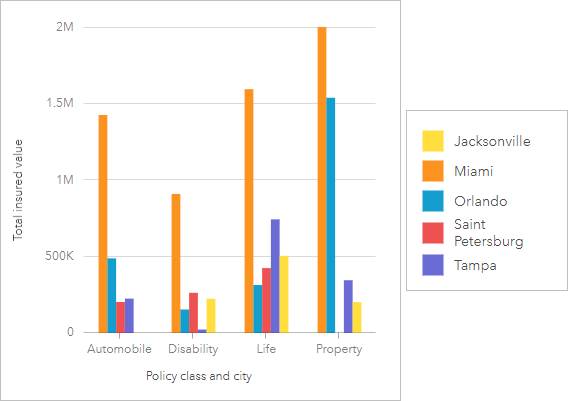
The insurance company is especially interested in expanding its business in five cities of interest. The Subgroup field can be used to compare the total insured value for each policy class across cities.

The column chart above shows the distribution of subgroups for each category. The Policy_Class values (Property, Life, Disability, and Automobile) have subgroups that show a different colored column for each city.
Create a column chart
To create a column chart, complete the following steps:
- Select one of the following combinations of data:
- One or two string fields

- One or two string fields
 plus a number
  or rate/ratio field
Note:
If you do not select a number or rate/ratio field, the data will be aggregated and a count will be displayed.
You can search for fields using the search bar in the data pane.
- One or two string fields
- Create the chart using the following steps:
- Drag the selected fields to a new card.
- Hover over the Chart drop zone.
- Drop the selected fields on Column Chart.
Tip:
 Drag a matching string field from a second dataset onto your column chart to create a combo chart.
Tip:
You can also create charts using the Chart menu above the data pane or the Visualization type button  on an existing card. For the Chart menu, only charts that are compatible with your data selection will be enabled. For the Visualization type menu, only compatible visualizations (including maps, charts, or tables) will be displayed.
Usage notes
This visualization creates a result dataset  in the data pane, which includes the fields used to create the chart. The result dataset can be used to create additional visualizations, rename the fields on the chart axes or in the pop-ups, or apply filters to the chart.
The value of each column can be symbolized as a count of features in each category on the x-axis, or as a number or rate/ratio field. If a field is used, the column values can be calculated as a sum, minimum, maximum, average, percentile, or median of values from the field for each category.
Note:
Median and percentile are not available for certain remote feature layers. If your remote feature layer does not support median or percentile, you can copy the layer to your workbook.
An optional Subgroup field can be selected on the x-axis. The Subgroup field must be a string field and will be used to divide each category on the x-axis into subcategories.
Tip:
You can style related maps with the same field you used to group your chart. When you interact with the chart or map, you can see simultaneous categorical and spatial patterns.
Use the Layer options button  to open the Layer options pane and update the following configuration options:
Use the Legend tab
To change the color associated with a value, click the symbol and choose a color from the palette or enter a hex value. Changing the symbol from the Legend tab is only available for unique symbols. to view the symbols on the chart. The pop out legend button
  displays the legend as a separate card on your page. You can use the legend to make selections on the chart (available for unique symbols).
Use the Symbology tab
Labels display the number values associated with the chart. The following configurations are available for labels: to change the Symbol type to Unique symbols and to turn labels on or off. The Symbology tab is not available if the chart has a subgroup field specified.
- Decimal places—You can choose a number of decimal places from zero to five, or choose Default or Auto for the labels. Default will abbreviate large numbers, while Auto will choose an appropriate precision.
- Label alignment—Five alignment options are available for column charts: Horizontal, outside, Horizontal, inside, Vertical, outside, Vertical, inside, and Angled.
- Context label—Characters, such as a symbol or unit, can be added to the label. The context label can be placed to the left (default) or right of the value.
- Use the Appearance tab
 to change the symbol color (single symbol only) and change the outline color on the chart.
Use the Chart statistics button  to display the mean, median, upper quartile, lower quartile, or a custom value.
Use the Card filter button  to remove any unwanted data from your card, or to show only the top or bottom n values. Filters can be applied to all string, number, rate/ratio, and date/time fields. A card filter does not affect other cards using the same dataset.
Use the Selection tools button  to select features on the chart using the single select and box select tools, or invert the selection.
Use the Visualization type button  to switch directly between a column chart and other visualizations, such as a summary table, treemap, or donut chart.
Use the Sort button  to sort the categorical data ascending or descending by the numeric variable, alphabetically, or manually. If you choose Sort manually, you can click and drag bars to a new position on the chart. Click Apply to apply the changes, or Cancel to return to the previous order.
Note:
Charts on a published report will use the same default sorting style that was used when the report was published. Sort manually will be called Predefined and manual sorting will not be available to viewers. Charts that were sorted ascending, descending, or alphabetically when published will not have a Predefined sorting option.
Use the Maximize button  to enlarge the card. Other cards on the page will be reduced to thumbnails. The card can be returned to its previous size using the Restore down button
  .
.
Use the Enable cross filters button  to allow filters to be created on the card using selections on other cards. Cross filters can be removed using the Disable cross filters button
  .
.
Use the Flip card button  to view the back of the card. The Card info tab
  provides information about the data on the card, the Export image tab
  allows users to export an image of the card, and the Export data tab
  allows users to export the data from the card.
Use the Card options button  to access the following menu options:
- Appearance button
 —Change the background color, foreground color, and border of the card.
 - Edit labels button
 —Create custom labels for the chart axes. To edit the labels, click the Edit labels button and click the axis to make it editable.
 - Order button
 —Move the card forward or send the card backward relative to other cards on the page.
 - Delete button
 —Remove the card from the page. If you did not intend to delete the card, you can retrieve it using the Undo button
  .
.
Resources
Use the following resources to learn more about charts: