A pie chart is a circular chart divided into sections. Each section is proportional to the quantity it represents. A pie chart contains a single series of data points.
Use pie charts to show part-to-whole relationships or for data composition. Pie charts are not intended for comparing individual sections with each other or representing exact values (use a serial chart for those). Pie charts are also not meant to show more than seven or eight data points.
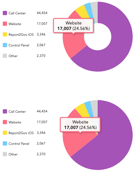
The top image below shows an example of a donut chart, and the bottom image shows an example of a pie chart.

Chart options
On the Chart tab, you can configure how the entire chart displays. A pie chart can also display as a donut chart. A donut chart is an alternative representation of a pie chart and can be thought of as a column in a stacked bar graph in a circular shape. You can create a donut chart by increasing the value for the Inner Radius (%) setting.
You can also configure labels and a legend, which will appear on either side, above, or below the chart. A pie chart's legend can be used to show and hide data points from the chart by clicking the data points on the legend.
Slice options
On the Slices tab, you can configure how the individual sections of the chart display. You can configure the color, opacity, outline, and display label for each slice. You can also group slices by providing a grouping value in the Grouping (%) setting along with a custom label. Grouping allows you to set the percentage threshold at which slices will be grouped together. For example, if you set the grouping percentage to 2%, all slices that are below 2% of the whole chart are grouped together.
Actions
In an interactive dashboard, a pie chart can be the source or target of an action. When used as the source of an action, the chart can be configured for single or multiple selection mode. This determines the number of data points that can be selected at a time. When a chart is the source of an action, it can, for example, trigger a map to pan or zoom or filter another dashboard element (see Charts as the source of actions). Conversely, when a chart is the target of an action such as a map extent change, the chart can be filtered so the data it displays corresponds with the map's new extent.