In the early stages of artificial intelligence (AI) development, not much consideration was given to the potential for bias or discrimination. The focus was primarily on accuracy and efficiency. This led to situations in which groups were unfairly impacted by AI algorithms. For example, critics have pointed out that facial recognition is less accurate when identifying people with darker skin tones. However, as the impact of AI algorithms became better known, concerns about fairness in AI arose. Subsequently, there has been a push toward understanding and mitigating biases, leading to fairness in AI.
Fairness in AI means the design and implementation of AI systems in a way that is unbiased and equitable, without discriminating based on factors such as race, gender, age, or socioeconomic status. It involves mitigating biases and ensuring that AI systems do not unfairly disadvantage certain groups. Prioritizing fairness in AI increases trust and confidence in these technologies while reducing the risk of harm or negative impacts on vulnerable populations.
In machine learning, fairness focuses on analyzing data and developing models without favoring or discriminating against protected groups. The goal is to ensure that all groups are equally represented within the dataset used for training machine learning models. This approach aims to prevent past biases from influencing present-day predictions and emphasizes including vulnerable or marginalized communities throughout model development and application.
For example, when biased assumptions about certain neighborhoods or communities exist, it can lead to unequal distribution of resources, such as parks, schools, or public transportation. Individuals living in low-income areas may be unfairly penalized by credit scoring models that rely on Zip Code information, regardless of their credit histories. Historical patterns of discrimination can be perpetuated if machine learning models are trained on datasets that reflect past discriminatory practices such as redlining or racial profiling. To address these issues and promote fairness, there are ongoing efforts to enhance machine learning tools by measuring and mitigating bias against protected groups.
Unfairness can arise from various sources, including biased datasets, different data sources or the timing of data collection, lack of subject understanding, varied data processing techniques and formats, flawed algorithms, and unequal access to resources. By recognizing these potential sources of unfairness and actively working to address them through improved methodologies and ethical considerations in AI development processes, more equitable outcomes can be achieved and the negative impacts of biases within machine learning systems can be reduced.
Train Using AutoML tool
The Train Using AutoML tool uses automated machine learning (AutoML) tools and techniques without requiring extensive human intervention. By automating many of the tasks involved in building a model, AutoML can help create highly accurate models based on the training data. One way that AutoML can promote fairness is by incorporating fairness metrics and bias mitigation into the model-building process. The AutoML tools in the GeoAI toolbox are optimized for accuracy and fairness, ensuring that the resulting model is not only accurate but also does not exhibit bias or discrimination against protected groups.
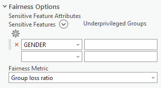
To incorporate fairness into machine learning, the Train Using AutoML tool includes Sensitive Feature Attributes and Fairness Metric parameters.
The Sensitive Feature Attribute parameter has the following columns:
- Sensitive Features—Biased or sensitive attributes in the dataset that can introduce unfairness in machine learning models. Examples of such attributes include race, gender, or socioeconomic status. By training the model while selecting these sensitive features, you can mitigate biases associated with them, resulting in a more unbiased model. The tool will assess and enhance fairness based on each attribute individually.
- Underprivileged Groups—For each specified attribute, you can define and specify underprivileged groups. These groups represent the discriminated groups related to the specified sensitive feature. For example, if gender is the sensitive feature, female can be marked as an underprivileged group. Similarly, for race, African Americans might be considered an underprivileged group. If socioeconomic status is specified as a sensitive feature, people from low-income backgrounds can be identified as underprivileged groups.
The Fairness Metric parameter provides a set of options. The choice of metric depends on the type of problem being addressed. For classification problems, use the Equalized odds difference, Demographic parity difference, Equalized odds ratio, or Demographic parity ratio options. For regression-based problems, use the Group loss ratio option. The fairness metric plays an important role in the grid search process performed by the tool. This process includes evaluating various combinations of model parameters and determining the best fair model based on how well the model aligns with the specified fairness metric.
The support for fairness in AutoML enables the assessment and improvement of fairness of the trained models for tabular data using machine learning. It allows for fair evaluation and mitigation for classification and regression models, using appropriate predefined fairness metrics for each model type. The metrics are categorized as follows:
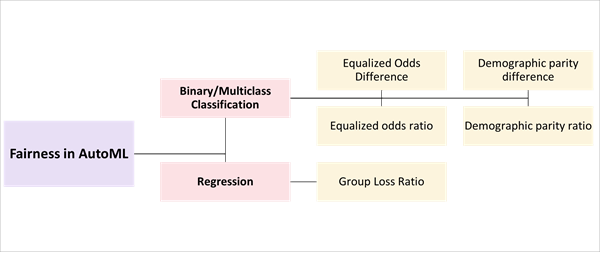
Fairness metrics for classification models
In classification, the goal is to assign input data points to predefined categories or classes. This includes training a model using labeled examples in which each example is associated with a specific class label. The model learns patterns and relationships in the data to make predictions for new, unseen instances. Classification problems can have binary (two classes) or multiclass (more than two classes) settings. Examples of classification tasks include email spam detection, image recognition, sentiment analysis, and disease diagnosis.
The following metrics for measuring fairness for classification problems are available in the Fairness Metric parameter:
- Equalized odds difference—Quantifies the disparity in true positive and false positive rates among different groups, such as racial or gender groups. It calculates the higher of these differences to determine the overall equalized odds difference. The ideal value for this metric is 0, indicating no variation in true positive, true negative, false positive, and false negative rates between groups. The fairness range for this metric is between 0 and 0.25. Achieving an equalized odds difference within this range ensures that differences in true and false positive rates between groups do not exceed 25 percent. This helps prevent unfair penalization of certain groups based on sensitive features such as race or gender. Use this metric to measure the disparity in true positive and false positive rates between different groups.
- Demographic parity difference—Assesses the disparity in selection rates among different groups of individuals. The selection rate represents the proportion of individuals classified as positive by the model. An ideal value for this metric is 0, indicating no difference in selection rates between groups. This means that all groups will be treated equally and have similar chances of being classified as positive by the model. The fairness range for this metric is between 0 and 0.25, indicating that differences in selection rates between groups should not exceed 25 percent.
- Equalized odds ratio—Similar to the Equalized odds difference metric, this metric measures the ratio of true positive and false positive rates between groups rather than the difference. The smaller of the true positive rate ratio and the false positive rate ratio is considered the equalized odds ratio. The ideal value for this metric is 1, which indicates that the true and false positive rates for different groups are equal. Fairness for this metric is between 0.8 and 1. A value close to 1 indicates there is little to no difference in the model's performance (true positive rate and false positive rate) between the sensitive groups for each sensitive feature.
- Demographic parity ratio—Similar to the Demographic parity difference metric, this metric measures the ratio of selection rates between groups rather than the difference. The ideal value for this metric is 1, which indicates that the selection rates for different groups are equal. Fairness for this metric is between 0.8 and 1. A value close to 1 indicates there is little to no difference in the model's performance between the sensitive groups for each sensitive feature.
The fairness ranges for each metric are somewhat arbitrary and depend on the specific context in which the model is being used. In general, smaller differences or higher ratios between groups are considered fairer. However, it is important to consider other factors such as the impact of the model on diverse groups and the overall accuracy of the model when assessing fairness.
The choice of which fairness metric to use depends on the specific context and application of machine learning models. Each metric has its own strengths and weaknesses, and some may be more appropriate than others depending on the goals of the model and the potential sources of bias. For example, if a model is being used where false positives can have serious consequences, the Equalized odds ratio option may be a better metric to ensure that different groups are not disproportionately impacted by false positive rates.
In addition, the fairness model can work with both binary classification and multiclass classification problems. The determination of the type of classification problem to perform is based on the number of unique values in the target variable and the data type of the target.
If the target variable has only 2 unique values, the tool performs binary classification. If the number of unique values falls between 2 and 20 (inclusive), the tool performs multiclass classification for integer, float, and string data types. For integer or float data types with more than 20 unique values, the tool performs multiclass classification. For integer or float data types with more than 20 unique values, the tool performs regression analysis on the dataset.
Fairness metrics for regression models
Regression aims to predict continuous numerical values based on the input features. Regression involves modeling the relationship between independent variables (input features) and dependent variables (output values). Regression models learn from labeled training data to estimate the underlying function that best fits the inputs and outputs provided. Regression problems include predicting housing prices and stock market trends, temperature forecasting, and sales prediction. In the context of fairness evaluation for regression problems, use the Group loss ratio metric for the Fairness Metric parameter.
The Group loss ratio metric focuses on assessing fairness by examining the losses or errors of model predictions across diverse groups or subgroups. It calculates the ratio of average loss or error between one subgroup and another and provides a relative measure of disparity in losses between different groups. A value of 1 indicates no difference in losses between groups, while values greater or smaller than 1 indicate relative disparities. By identifying biases in model predictions through these metrics, appropriate measures can be taken to address fairness concerns during AutoML training processes.
Augment a machine learning model into a fair model
The process of augmenting a machine learning model into a fair model begins similarly to training a regression or classification model using the Train Using AutoML tool. To enhance a machine learning model and make it fair, complete the following steps:
- Train a basic machine learning model using the Train Using AutoML tool.
- Once the basic model is trained, identify any sensitive features that may introduce unfairness. Refer to the output report of the trained basic model, which highlights significant features (SHAP importance) with the most impact on the model outputs. If any of these identified sensitive features also appear in the significant features list, consider them sensitive features for further evaluation. This will ensure that the sensitive feature is significantly contributing to the model predictions. If certain sensitive features have low importance and contribute less to the model's outcomes, they can be excluded from fairness evaluation.
- After identifying sensitive features and optionally selecting underprivileged groups, specify an appropriate Fairness Metric parameter value based on the problem type (classification or regression).
- Train the model with a specified Sensitive Feature Attributes parameter value.
The tool will output a mitigated machine learning model. The best-performing model will be in DLPK format for use with the Predict Using AutoML tool.
- Assess the fairness of the model.
During mitigation, grid searching is performed to determine the best fair model based solely on user-defined fairness metrics. AutoML chooses the model whose fairness metric is above a threshold level and that has the lowest logloss. Logloss—also known as logarithmic loss, logistic loss. and cross entropy loss—indicates how close a prediction probability is to the actual or corresponding true value. If no model has a fairness metric above the threshold, AutoML saves the model with the lowest logloss as the best model. When this occurs, it will be stated in the report that the tool did not determine a fair model.
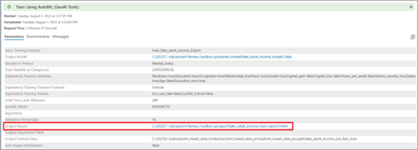
- To access a comprehensive analysis report of model fairness after the tool has completed, click the View Details option at the bottom of the Geoprocessing pane, and on the Parameters tab, click Output Report.
Fairness report interpretation
The sections below describe how to interpret the fairness report.
Classification models
The sections below described how to interpret the generated output HTML report from the Train Using AutoML for classification models.
AutoML leaderboard
The main page of the report displays the AutoML leaderboard. It includes the metrics table, various performance charts, and a Spearman correlation chart for the models.
- Metrics table—Models that were trained with the dataset are shown, including the model name, model type, metric value, best model, and the training time in seconds. This information is also available in the tool results, where the best model is indicated in the first column.
- Performance charts—The report includes various performance charts. These charts provide insights into the model performance across different metrics and highlight variations among evaluated models.
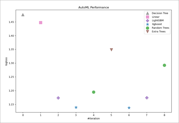
- AutoML Performance chart—This chart shows how the
evaluation classification metric (logloss) for individual models
varies across different iterations. The iteration chart provides insight into the consistency of the model across different runs of
the model.
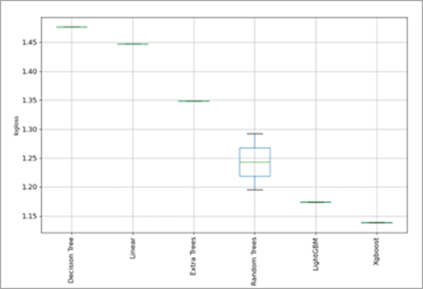
- AutoML performance box plot chart—This box plot chart represents model performance variation. The chart is a graphical representation of the distribution of logloss values across iterations for different models evaluated by AutoML. The box plot chart includes the following components:
- Median—The line in the box represents the median log loss value for that model.
- Box—The box provides insights into how tightly or widely distributed log loss values are around their median.
- Whiskers—The whiskers indicate the minimum and maximum log loss values for a model across iterations.
- Outliers—If outliers are present, individual points outside the whiskers are considered outliers. These are data points with unusually high or low log loss values compared to other values.
The following chart indicates that the best model is the XGBoost model with lowest logloss value. The chart also shows the comparatively wide variation in the logloss values of the Random Trees model across iterations.
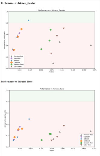
- AutoML performance versus fairness metric charts—These charts are also referred to as Logloss vs
Fairness Metric charts in classification. These charts are
particularly relevant for evaluating fairness. The charts assess model fairness by correlating how model
performance (log loss) aligns with selected fairness metrics. For
example, the following chart illustrates how log loss relates to the demographic
parity ratio (DPR) for a sensitive feature such as gender. The x-axis
represents log loss values in which lower values indicate better model
performance. The y-axis represents DPR
typically expressed as a ratio or percentage. A fair model should
have a DPR value higher than 0.8. The green zone on these charts
indicates that XGBoost meets this criterion for the gender sensitive feature
while highlighting potential trade-offs between accuracy and
fairness.
- Spearman correlation chart—This chart is generated for all the models that were evaluated. Models that are more closely related are shown in darker shades of blue.
- AutoML Performance chart—This chart shows how the
evaluation classification metric (logloss) for individual models
varies across different iterations. The iteration chart provides insight into the consistency of the model across different runs of
the model.
Output reports
To obtain more detailed information about the best model (or any other model), click the name of the model identified as the best in the models' metric table. Clicking the name opens a dedicated report page that provides comprehensive and detailed information about that particular model. This report page provides in-depth analysis of the model's performance, metrics, feature importance, and other details. Exploring this report can provide insights into why the model was identified as the best and to understand the model's strengths and weaknesses.
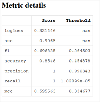
The model page includes the model name, model parameters, optimized metric, training time, and more. The Metric details table provides evaluation metric scores along with their corresponding thresholds. These metrics show how well the model performed across various aspects. Additionally, the visualizations and charts can help you understanding the model's performance characteristics. These include a confusion matrix table and chart, fairness metrics for each sensitive feature and target class, selection rates and false rates for sensitive features, learning curves, a normalized confusion matrix chart, the receiver operating characteristic (ROC) curve, the precision-recall (PR) curve, SHAP importance plot, and SHAP dependence plots.
The following is an example of the Metric details table showing various evaluation metrics with scores and thresholds:
The following is an example of the Confusion Matrix table for a classification model:

The following is an example of a fairness metrics for the sensitive groups table. This table is relevant in assessing the fairness of the best model's predictions. The table provides a comprehensive view of evaluation metrics for a specific sensitive feature, such as gender.

The columns in the Fairness metrics for the sensitive groups table can be interpreted as follows:
- Samples—The number of samples or data points within each sensitive group and overall dataset that are being evaluated.
- Accuracy—The proportion of correct predictions made by the model for each sensitive class as well as overall. It represents the ratio of correct predictions to the total number of predictions. For example, an overall accuracy value of 0.8548 means that approximately 85.48 percent of samples in the dataset were correctly predicted by the model.
- Selection Rate—The proportion of samples from a specific sensitive group that were selected or predicted as positive by the model. For example, for the male group, a selection rate value of 0.1896 indicates that approximately 18.96 percent of male samples were predicted as positive outcomes by the model.
- True Positive Rate (sensitivity)—This metric indicates how well positive cases are correctly predicted by the model. It represents the ratio between true positives and total actual positives within a specific sensitive group or overall dataset. For example, for the female group, a true positive rate value (sensitivity) of 0.8087 means that approximately 80.87 percent of positive outcomes among females were correctly identified by the model.
- False Negative Rate—This metric complements the true positive rate and calculates the number of positive cases that were incorrectly predicted as negative by the model within a specific sensitive group or overall dataset. It occurs when the model predicts a negative outcome when the actual outcome should have been positive. It can also be calculated from the true positive rate using FNR =1 - TPR. For example, for the female group, a false negative rate value would be calculated as (1 - 0.8087) = 0.1913, which implies that approximately 19.13 percent of actual positive outcomes for females were misclassified as negative by the model.
- False Positive Rate—This metric calculates the number of actual negative cases that were incorrectly predicted as positive by the model within a specific sensitive group or overall dataset. It occurs when the model predicts a positive outcome when the actual outcome should have been negative. For example, in the overall dataset, a false positive rate value of 0 .056 means that approximately 5.6 percent of actual negatives were falsely predicted as positives. The false positive rate for the male group is 0.0408, indicating that approximately 4.08 percent of the actual negative cases within the male group were incorrectly predicted by the model as positive.
- True Negative Rate(specificity)—This metric complements the false positive rate and calculates the proportion of actual negative cases correctly predicted as negative by the model. It represents the ratio between true negatives and total actual negatives within a specific sensitive group or the entire dataset. For example, for the male group, the true negative rate is calculated as 0.9592, which means that the model correctly predicted approximately 95.92 percent of the negative outcomes involving males.
By analyzing these columns in relation to different groups within a sensitive feature, you can gain insights into potential disparities or biases present in how well the best model performed across various evaluation metrics related to fairness considerations.
The following fairness metrics table illustrates how the best model mitigates bias, allowing you to evaluate its effectiveness in achieving fairer outcomes. The table provides insights into the extent to which the model addresses and reduces biases related to sensitive features. The metric scores show the bias mitigation achieved by the best model.
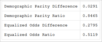
The metrics can be interpreted as follows:
- Demographic Parity Difference—The difference between the selection rates for the genders is 0.0291. A lower value indicates less disparity in the selection rates. In this case, there is a 2.91 percent difference in the selection rates of positive outcomes between different genders, which is lower than the permissible limit of 25 percent. This suggests a low potential bias or less unequal treatment based on gender in the model's predictions, which signifies a fairer model for the sensitive feature of gender.
- Demographic Parity Ratio—The ratio of selection rates is 0.8465 after mitigation (training with fairness parameters). A value closer to 1 indicates a better balance in the positive outcome selection rates between genders.
- Equalized Odds Difference—The difference in false positive and false negative rates between two genders is 0.2795 after mitigation, which is close to the permissible limit of 0.25. This indicates that the model is sensitive to disparities in prediction errors between genders
- Equalized Odds Ratio—This metric represents the ratio of false positive and false negative rates after mitigation. With a value of 0.5119, there is room for improvement to achieve an equitable distribution of prediction errors between genders, as values closer to 1 indicate more balanced outcomes.
Mitigated and unmitigated model comparison
In the models' metric table, model names with a __SampleWeighting suffix indicate that they have undergone mitigation. Tables without the suffix represent the unmitigated version of the model. The two tables allow for a direct comparison between mitigated and unmitigated models in terms of their performance and fairness. It provides insights into how applying mitigation techniques impacts fairness metrics and helps you evaluate whether bias reduction efforts have been effective. By examining both versions of a model, you can gain a better understanding of how bias has been addressed and assess improvements made in achieving fairer outcomes.
While the final model may not achieve perfect fairness across all metrics, it demonstrates improvements in terms of demographic parity difference and demographic parity ratio for gender-related predictions. Overall, through effective mitigation measures implemented during training with fairness parameters, significant progress has been made toward creating a fairer model for gender-sensitive predictions by reducing differences and improving balance in outcomes. This summary confirms that the selected sensitive feature (gender) has been addressed appropriately by mitigating biases and improving fairness in the final model.
The chart reporting the selection rate provides further validation of fairness in the model. In this context, the selection rate refers to the proportion of samples from a specific group that the model predicts as positive or assigns a certain outcome to. It measures how often the model selects or predicts a particular outcome for a given group compared to the total number of samples in that group.
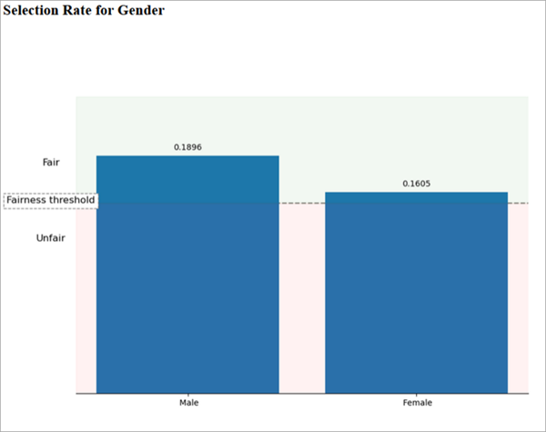
The chart above displays a selection rate of 0.1896 for the male group. This means that among all samples identified as male, approximately 18.96 percent are predicted by the model as having a higher salary or being classified with a positive outcome. For the female group, there is a selection rate of 0.1605, indicating that approximately 16.05 percent of all samples identified as female are predicted by the model with a positive outcome related to higher salary or similar criteria.
The selection rate shows how frequently and consistently the model assigns positive predictions to different sensitive groups. In this case, although there is some variation between male and female groups, both rates exceed the permissible limit set by fairness thresholds. These slight differences in selection rates suggest that there are no significant biases or imbalances present in terms of gender-based predictions made by the model. With both rates surpassing fairness thresholds and exhibiting minimal disparity, it can be concluded that predictions made by this model are unbiased and equitable across various sensitive groups.
In the following chart, the False Negative Rate and False Positive Rate metrics can provide further insight into how the fairness mitigated model is performing for the different sensitive groups of male and female. These metrics are important for assessing bias and fairness concerns in such models. Its values can be analyzed the same way as described in the fairness metric for the sensitive groups table description earlier in this topic.
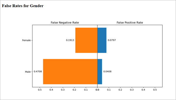
The comparison of false negative rates between the male and female groups reveals the following insights about fairness in the model:
- The higher false negative rate for the male group suggests that the model is more likely to miss actual positive outcomes of individuals with higher salaries among males. In other words, it may incorrectly predict that males have lower salaries than they actually earn.
- Conversely, the lower false negative rate for the female group indicates that the model is relatively better at correctly predicting positive outcomes for females compared to males. It is less likely to mistakenly classify females as having lower salaries than they actually earn.
- When looking at false positive rates, the female group has a higher rate compared to the male group. This means that the model is more prone to incorrectly predict positive outcomes of individuals with higher salaries for females when they actually have lower incomes.
- Conversely, the lower false positive rate for males suggests that the model performs relatively better at avoiding false positive predictions for this gender group. It makes fewer mistakes in classifying males as having higher salaries when they actually earn less.
Overall, while most biases in prediction have been addressed by similar false positive and false negative rates, there are still some differences in behavior based on gender. These differences indicate areas where further improvements can be made to achieve a more equitable prediction across different gender groups.
Fairness metrics play an important role in detecting discrepancies in prediction outcomes among diverse groups associated with sensitive features. In some cases, it may not be possible to achieve fairness during training. In such situations, it is important to plan appropriate strategies to work toward achieving a fairer model. Additionally, when comparing new fair models with previous fair models, consider evaluating and assessing improvements made specifically in terms of fairness.
Improve the fairness of a model
The following actions can improve the fairness of a model:
- Increase the inclusion of unbiased samples—By incorporating a more diverse range of samples into the dataset, you can improve the model's ability to learn and generalize across different groups. This helps mitigate biases that may have been present in the training data.
- Add relevant features—Add relevant features and factors that may influence outcomes, as this can contribute to building a fairer and more accurate model.
- Analyze unfairly treated samples—Review predictions and outcomes for samples that have been treated unfairly, particularly those from underprivileged groups. By understanding why certain samples are subject to unfair treatment, you can discover potential sources of bias or discrimination in the model's decision-making process.
Implementing these actions will help improve fairness in the model by addressing biases, reducing disparities, and ensuring equitable treatment across various groups.
Regression models
For regression tasks, use the Group loss ratio metric in the Fairness Metric parameter, and choose sensitive features that have groups that are susceptible to discrimination and biases. Similar to the classification report, the main page of the regression report displays a leaderboard where the best model is indicated in the first column.
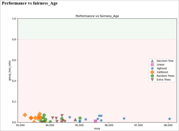
Among various performance charts, the AutoML performance versus sensitive features charts are particularly relevant for assessing fairness. These charts demonstrate how model performance, measured by root mean square error (RMSE), correlates with the Group loss ratio metric for specific sensitive features such as age. The x-axis represents RMSE, which is a common performance metric used in regression tasks. RMSE measures the average difference between predicted values and actual values. Lower RMSE values indicate better predictive performance. The y-axis represents group loss ratio (GLR), which compares loss metrics (RMSE) for different age subgroups to overall model RMSE. GLR indicates how well the model performs for a particular group compared to its overall performance. A value of 1 suggests no difference in losses between groups, while values greater or smaller than 1 indicate relative disparities. For a fair model, GLR should be higher than 0.8. The green zone on the following charts indicates models that meet this criterion and are considered unbiased models. However, if models cluster near the lower range of GLR, it suggests potential disparities in predictive accuracy and fairness across different groups. Adjustments are necessary to ensure equitable outcomes.
Click the Best model option to open a model-specific page. This page provides information about the general performance of the best model in the Metric details chart. The chart provides an overview of various metrics that evaluate the model's performance. The next chart on this page is specific to the selected sensitive feature, such as gender. This chart focuses on how the model performed differently for different sensitive groups while considering both predictive accuracy and fairness. The first row of this chart reports overall metrics of the model, providing an aggregate view of its performance. The following individual group metrics are then presented, showing how well the model performed for each specific group within the sensitive feature.
| Samples | MAE | MSE | RMSE | R2 | MAPE | Spearman | |
|---|---|---|---|---|---|---|---|
Overall | 6105 | 7.1448 | 110.228 | 10.4989 | 0.270251 | 0.288477 | 0.517567 |
Male | 4080 | 7.27697 | 114.756 | 10.7124 | 0.232757 | 0.261594 | 0.465998 |
Female | 2025 | 6.8785 | 101.104 | 10.055 | 0.225144 | 0.34264 | 0.436187 |
The metrics reported include MAE, MSE, RMSE, R2, MAPE, and Spearman correlation for each gender group. These metrics provide an overall assessment of the mitigated model's performance. The chart helps you evaluate whether the model's predictive accuracy and performance metrics are consistent across different subgroups based on a sensitive feature such as gender. It also helps identify any disparities that may require further investigation and potential adjustments to ensure fairness. Additionally, the model's performance is evaluated in terms of fairness using RMSE. This evaluation involves comparing the model's performance metrics between different gender groups, specifically examining the privileged and underprivileged groups. The RMSE metric is used to assess fairness.
RMSE difference—The RMSE difference is a key component of this fairness metric. It quantifies the absolute difference in RMSE values between the male and female subgroups. In the table above, the difference is 0.6574. A larger RMSE difference indicates a greater disparity in prediction errors between these two groups, while a lower value suggests less discrepancy in prediction errors. In terms of fairness, a lower RMSE difference generally signifies a smaller disparity in prediction errors between different groups, which is considered positive for achieving fairness. However, determining an appropriate threshold or range for RMSE difference as an indicator of fairness depends on the specific context of the problem and may require domain expertise.
RMSE Ratio—The RMSE ratio represents the ratio between the RMSE value for the underprivileged group (male) and that of the privileged group (female). In the table above, the ratio is 0.9386. A value closer to 1 indicates a more equitable distribution of prediction errors, suggesting similar error rates for both groups. On the other hand, a value significantly different from 1 suggests a higher error rate for one group compared to the other. In this case, an RMSE ratio of 0.9386, which is closer to 1, indicates a more equitable distribution of prediction errors between the privileged (female) and underprivileged (male) groups. This implies that the model performs similarly in terms of prediction accuracy for both gender groups. Achieving this fairness was possible by using the Group loss ratio metric in optimizing results for regression problems. By considering this metric and achieving an RMSE ratio close to 1, it suggests that predictions made by the model are fairer with comparable error rates across different gender groups.
Conclusion
Ensuring fairness in machine learning models is necessary for promoting equitable outcomes. By carefully selecting sensitive features and fairness metrics, analyzing performance charts, and considering the impact on different sensitive groups, you can identify potential biases and work toward mitigating them. Through actions such as including unbiased samples, examining unfairly treated cases, and continuously evaluating model performance with respect to fairness metrics, you can develop fairer and more reliable models. By prioritizing fairness along with accuracy, you can build trustworthy AI systems that uphold ethical standards and promote equal opportunities for all individuals.