Multispectral imagery is a tool for distinguishing different types of materials and features in the landscape. Natural and human-made materials often have unique spectral signatures that can be used to identify them quantitatively. Spectral profile charts allow you to select areas of interest or ground features on the image and review the spectral information of all bands in a chart format. A spectral profile consists of geometry to define the pixel selection and an image with key metadata from which to sample.
To create a chart, right-click the layer you want analyze in the Contents pane, point to Create Chart, and click Spectral Profile to open the Chart Properties pane. To define the parameter settings for a chart, click the Data tab at the top of the Chart Properties pane.
Define an area of interest for the spectral profile
There are several options for defining the set of pixels you want to profile. You can use the Define an area of interest tools at the top of the Chart Properties pane to delineate an area or feature of interest in the map view.

The pixel values of the image bands that intersect the area of interest will be plotted. The area of interest sketch tools include a point, line, circle, rectangle, polygon, and freeform shape. Additionally, you can define an area of interest by selecting a line, point, or polygon feature layer in the map view that overlays the image. If you have a segmented image layer in the Contents pane, you can select a segment as the area of interest. Use the drop-down arrow next to the segment icon to select the segmented image you want to use. Large areas of interest or segments can impact the performance of the chart. To minimize these effects, avoid large, regional-scale selections.

Use the color picker to specify a color when defining the area of interest. Use different colors for the various features you want to compare with the spectral profile. If you don't specify a color for the area of interest, a random color is automatically assigned to each area of interest.
Define the spectral profile
Each area of interest you collect is listed in a table under Spectral Profiles and is given a default label such as Profile_1, Profile_2, and so on, as they're collected. To assign your own labels, select the label for an area of interest, type a new string, and press the Tab key to register the string. Labels are stored as you type them, making them available in the list for reuse. You can specify a different color for any of the areas of interest by clicking the color box and selecting a color from the color picker.
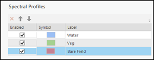
Check the Enabled check box to manage the area of interest, which enables the area of interest to be displayed in the spectral profile chart and map view. You can also delete the area of interest or move it to a different position in the list using the up and down arrows. These selections determine the data that is processed and displayed in the spectral profile chart and how the data is visualized.
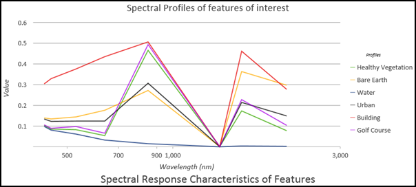
When the spectral profile is defined using a collection of pixels, the default visualization is a line chart. You can also display the spectral profile as another plot type.
The best plot type for a spectral profile defined with a point is the Mean Line option because a range of values is not available.
You can create a spectral profile of a single band image, but the Mean Line option for Plot Type will be unavailable. The spectral plot of a single band image displays useful information such as the minimum, maximum, median, and quartile values.
Chart and plot types
Several plot types are available to visualize and analyze spectral profile data. Data for each enabled area of interest, or the entire image, is processed and displayed in the spectral profile chart of choice.
Mean line
A mean line plot is a line connecting the mean values within a set of pixels, per band. Point collections have no mean value and use the point pixel value collected in each image band.
Box
The Boxes chart type allows you to visualize and compare the distribution and central tendency of the set of pixels collected through their quartiles. Quartiles are a way of categorizing numeric values into four equal groups based on five key values: minimum, first quartile, median, third quartile, and maximum.
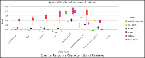
The box portion of the chart illustrates the middle 50 percent of the data values, also known as the interquartile range (IQR). The IQR illustrates the variability in a set of values. A large IQR indicates a large spread in values, while a smaller IQR indicates most values fall near the center. For example, an agriculture field with varying degrees of emerging crop will have high variability, while bare fields or those with mature crops will have lower variability within their spectral identity. Box plots also illustrate the minimum and maximum data values through statistical whiskers (vertical lines) extending from the box, and optionally, outliers as points extending beyond the whiskers.
Boxes and mean lines
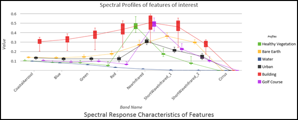
This type of chart plots boxes and a line graph connecting the mean values within the set of pixels comprising the area of interest. It shows multiple boxes and lines for each ground feature in each spectral band.
Consolidated boxes and mean lines
This type of chart consolidates the range of the boxes into a single box with a new range, IQR, median, and quartiles, while also displaying the mean lines from each profile.
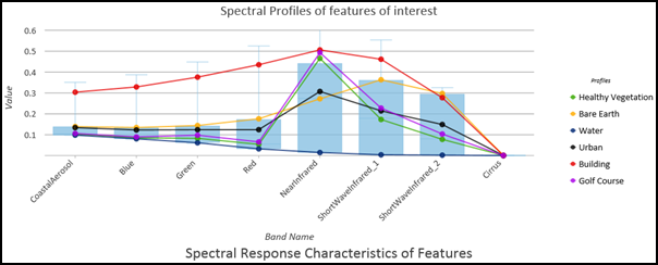
This chart is useful when collecting similar features, segments, or interactively collecting similar features. For example, it's a good choice for comparing agricultural fields growing the same crop when each may have varying levels of health, leading to varying yields.
How invalid data is handled
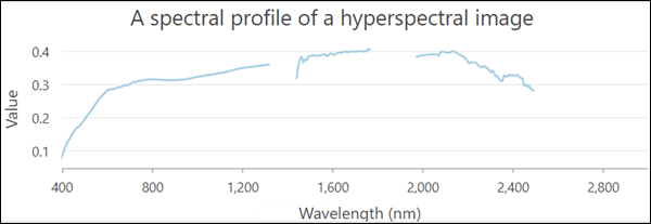
Sometimes imagery contains invalid data such as negative values, and missing bands, especially when using superspectral or hyperspectral imagery data. In these cases, the invalid data is not represented on the chart, and your spectral profile plot will contain breaks. An example of a mean line chart with missing bands is shown below.
Show outliers
Outliers are useful to gain further insight into the data. Outliers are available for Boxes, Boxes and Mean Lines, and Consolidated Boxes and Mean Lines chart types. When you select the outliers in the chart, those pixels are highlighted on the screen. For example, you can create an information product from multispectral imagery such as NDVI. Draw or select an area of interest, display the outliers on the spectral plot, select them, and view exactly which portions of the fields are stressed and may need attention.
Axes
Spectral profile charts are composed of an x-axis and a y-axis. The x-axis is determined by the number of bands in the image being profiled and the wavelengths associated with each band. Pixel values for the image bands are displayed along the y-axis. The appearance of a chart's axis is set in the Chart Properties pane on the Axis tab.
X-axis
The x-axis displays the band names or wavelengths of the electromagnetic spectrum for each band. When plotting Boxes, Boxes and Mean Lines, and Consolidated Mean Lines, the x-axis is labeled with the band names. Hover over the boxes in the plot to see wavelength information. For Mean Line charts, you can choose Band IDs, Band Wavelength, or Band Name units for the x-axis.
When using a single band image from a derived dataset such as NDVI or tasseled cap, the x-axis is unitless. Each bar on the x-axis correlates to each ground feature profile collected.
Y-axis
The y-axis measures pixel or ground feature values composed of statistical measurements for minimum, first quartile, median, third quartile, and maximum values. Default minimum and maximum y-axis bounds are based on the range of data values represented on the axis. These values can be customized by providing an axis bound value. Clicking the reset button returns the axis bound to the default value. This is helpful when the boxes do not have a wide range of values and appear very small.
Number format
You can format how the y-axis displays numeric values by specifying a number format category or defining a custom format string.
Label the chart
Click the General tab at the top of the Chart Properties pane. Provide a title for the chart and legend, and label the x-axis and y-axis. You can also add a detailed description of the spectral profile chart.
For more information about how to adjust the appearance of a spectral profile chart, refer to Change chart appearance.