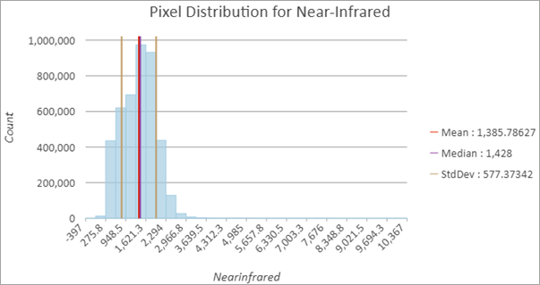
Image histograms visually summarize the distribution of a continuous numeric variable by measuring the frequency at which certain values appear in the image. The x-axis in the image histogram is a number line that displays the range of image pixel values that has been split into number ranges, or bins. A bar is drawn for each bin, and the width of the bar represents the density number range of the bin; the height of the bar represents the number of pixels that fall into that range. Understanding the distribution of your data is an important step in the data exploration process.
Variable
Image histograms require one continuous Number variable on the x-axis, comprised of the pixel values of a particular image band.

Transformation
Some analytical methods require that data be normally distributed. When the data is skewed (the distribution is disproportionate), you might want to transform the data to make it normal. Histograms allow you to explore the effects of logarithmic and square root transformations on the distribution of your data. For reference, you can add a normal distribution overlay to your histogram by checking the Show Normal distribution check box in the Chart Properties pane.
Logarithmic transformation
Logarithmic transformation is often used when the data has a positively skewed distribution and there are a few very large values. If these large values are in your dataset, the logarithmic transformation will help make the variances more constant and normalize your data.
For example, the positively skewed distribution in the chart on the left is transformed to a normal distribution using a logarithmic transformation in the chart on the right:
Note:
Logarithmic transformations can only be applied to numbers greater than zero.
Square root transformation
A square root transformation is similar to a logarithmic transformation in that it reduces right skewness of a dataset. Unlike logarithmic transformations, square root transformations can be applied to zero.
Note:
Square root transformations can only be applied to numbers greater than or equal to zero.
Number of bins
The number of bins defaults to the square root of the number of records in your dataset. This can be adjusted by changing the Number of bins value on the Data tab in the Chart pane. Changing the number of bins allows you to see more or less detail in the structure of your data.
Statistics
Some basic descriptive statistics are calculated and displayed on histograms. The mean and median are displayed with one line each, and one standard deviation above and below the mean is displayed using two lines. You can click these items in the statistics table or chart legend to switch them on or off.
A Statistics table is displayed in the Data tab of the Chart Properties pane containing the following statistics for the selected numeric field:
- Mean
- Median
- Standard Deviation
- Count
- Min
- Max
- Sum
- Nulls
- Skewness
- Kurtosis
If the chart's source layer has a selection set, the statistics table will have one column displaying statistics for the full dataset and one column displaying statistics for only the selection set.
If the chart's source layer is a thematic or categorical dataset with fields other than the Variable Number Value, cell counts will not be calculated for Sum. This is the default. If you want the Sum calculation to include the cell counts for your chart, click Variable, and check the Adjust for cell count check box.
The statistics table includes controls to turn the histogram's mean, median, and standard deviation lines on and off, and change their color.
You can right-click in the statistics table and click Copy Table, Copy Row, or Copy Value to copy and paste statistics from the Charts Properties pane into other windows or applications.
Axes
Y-axis bounds
Default y-axis bounds are set based on the range of data values represented on the y-axis. These values can be customized by typing a new axis bound value. Setting axis bounds can be used as a way to keep the scale of your chart consistent for comparison. Clicking the reset button returns the axis bound to the default value.
Number format
You can format the way an axis displays numeric values by specifying a number format category or defining a custom format string. For example, $#,### can be used as a custom format string to display currency values.
Guides
Guide lines or ranges can be added to charts as a reference or way to highlight significant values. To add a guide, navigate to the Guides tab in the Chart Properties pane and click Add guide. To draw a line, enter a value where you want the line to draw. To create a range, enter start and end values. You can optionally add text to your guide by specifying a Label value.
Appearance
Titles and description
Charts and axes are given default titles based on the variable names and chart type. These can be edited on the General tab in the Chart Properties pane. You can also provide a chart Description, which is a block of text that appears at the bottom of the chart window.
Visual formatting
When a chart window is active, the Chart contextual tab becomes available, allowing visual formatting of the chart. Chart formatting options include the following:
- Changing the size, color, and style of the font used for axis titles, axis labels, description text, and legend text
- Changing the color, width, and line type for grid and axis lines
- Changing the background color of the chart
For more information about how to adjust the appearance of your histogram plot, refer to Change chart appearance.