Calendar heat charts visualize patterns in temporal data by aggregating incidents into a calendar grid. Calendar grids can be configured to display temporal patterns across the months in a year or across the days in a week.
In a year view, each row in the calendar grid corresponds to a month, and each column corresponds to a day of the month.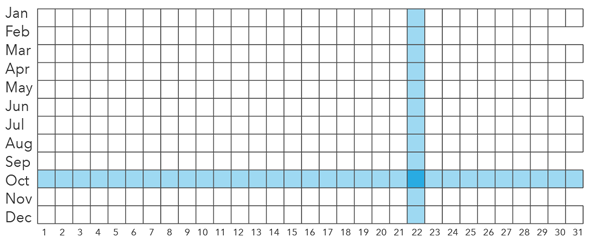
In a week view, each row in the calendar grid corresponds to a day of the week, and each column corresponds to an hour of the day.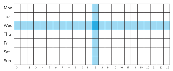
When displayed as a single calendar view, each cell in the calendar heat chart corresponds to the specific calendar unit defined by the intersection of the row and column, and all incidents sharing those two dimensions will be aggregated into the same cell. For example, when aggregating a dataset spanning multiple years into a single year view, all incidents with the dimensions October and 22 will be aggregated into the same cell, regardless of year. Similarly, when aggregating a dataset spanning multiple weeks into a single week view, all incidents with the dimensions Wednesday and 12pm will be aggregated into the same cell, regardless of week number. This single calendar view reveals typical day-of-month or hour-of-day patterns found by summarizing many time spans into one calendar.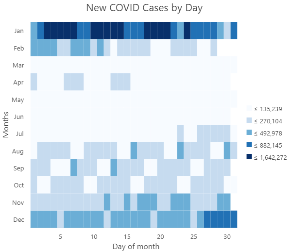
Alternatively, calendar heat charts can display sequential calendar views to visualize what took place in each individual year or week. For example, when visualizing a dataset spanning multiple years as consecutive calendars, a unique calendar grid is drawn for each year. A sequential calendar view helps reveal patterns that occur on specific years or weeks across a linear time span.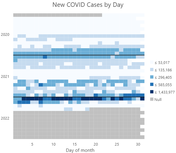
Variables
Calendar heat charts aggregate a Date field into a calendar grid. The calendar grid can be divided into one of two Calendar type options: Year by month and day of month or Week by day of week and hour of day. Calendar heat charts can also be configured with one of two View type options: Single calendar view or Sequential calendar views.
Note:
The Date field must be of type Date.
By default, a calendar heat chart displays the count of records that took place in each temporal unit. Optionally, a numeric variable can be summarized by choosing a Number field and an Aggregation method. The aggregation method can be one of the following:
- Count—The number of records in each temporal unit
- Sum
- Mean
- Median
- Minimum
- Maximum
The chronology of a calendar heat chart can be inverted by checking the Invert calendar views check box.
Note:
By default, February 29 is not included when drawing a calendar heat chart. To include February 29, check the Include leap day check box on the Data tab in the Chart Properties pane.
Appearance
Several options control the chart appearance and related settings.
Titles and description
The charts and axes default titles are based on the variable names and chart type. These can be edited on the General tab in the Chart Properties pane. You can also provide a value for the Description option, which is a block of text that appears at the bottom of the chart window.
Color
Grid cells are symbolized using graduated colors that correspond to a count or summarized value taking place in each calendar unit. The color classification Method, number of Classes, and Color scheme can be adjusted on the Data tab in the Chart Properties pane.
Example
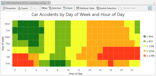
Create a calendar heat chart to identify which days of the week and during which times of day most car accidents take place.
- Date—Date
- Calendar type—Week by day of week and hour of day
- Aggregation—Count
- View type—Single calendar view
