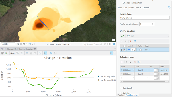
Surface profile charts allow you to visualize change in raster values, such as elevation or surface temperature, over distance.
You can generate a chart for multiple bands, multiple layers, or multiple dimensions. This allows you to visualize and compare overall trends and statistics between rasters or across bands and physical dimensions.
To create a surface profile, right-click a raster, multidimensional mosaic dataset, or mosaic dataset in the Contents pane, select Create Chart, and click Surface Profile to open the Chart Properties pane.
Data settings
Define the data settings for a chart on the Data tab in the Chart Properties pane.
Source type
Specify whether the chart will be created for a single raster layer or multiple layers using the Source type parameter.
- Single layer—The chart will be created for the selected layer.
- Multiple layers—Charts can be created for multiple layers that intersect the polyline feature that you will draw.

Profile sample distance
The profile sample distance is defined by the spatial resolution of the raster layer. You can change this value and the profile will be resampled using bilinear interpolation.
Define a polyline
You can use the Draw tool in the Chart Properties pane to draw a polyline feature on the raster layer, mosaic dataset, or multidimensional raster layer in the map view. This line feature is added to the feature table in the Chart Properties pane. In the feature table, you can deselect or delete the line feature and edit the symbol and label. The marker checkbox is used to show the sample points of the profile in the chart, which is off by default. You can also draw a surface profile by selecting an existing line feature that intersects with the raster layer.
Select surfaces
When generating a chart for single or multiple layers, you can select the bands or layers to graph using the layer table. This table allows you to select one or multiple surfaces from which to graph the profiles. If the source type is Single Layer, the surfaces can be raster bands and you can select one or multiple bands. Slices of a multidimensional raster are also supported, and you can select slices by defining the dimensions. If the source type is Multiple layers, the surfaces are layers.
The Surfaces table also allows you to specify the width of the line in the chart and the label that appears in the chart legend and ToolTips.
Data labels
Specify whether you want to label the data points in a chart.
Statistics
View the statistics for each profile in a chart. The statistics are calculated by analyzing the pixel values for the areas of interest over time.
Axes
Define the axes settings for a chart on the Axes tab in the Chart Properties pane.
X-axis
The surface profile x-axis displays the distance values along the profile. Default minimum and maximum x-axis bounds are set based on the range of the polyline. The zero reference value corresponds to the first point drawn in the polyline. These values can be customized by providing a new x-axis bound value. Click the reset button to return the x-axis bound to the default value.
You can use the Unit parameter to convert between different linear units.
Y-axis
Default minimum and maximum y-axis bounds are based on the range of data values represented on the axis. These values can be customized by providing a new y-axis bound value. Click the reset button to return the y-axis bound to the default value.
By default, line chart axes are displayed on a linear scale. To display numeric (non-date) axes on a logarithmic scale, check the Log axis check box.
You can format the way an axis will display numeric values by specifying a number format category or by defining a custom format string. For example, $#,### can be used as a custom format string to display currency values.
You can use the Unit Scalar box to define a custom value for converting or scaling the y-axis. For example, use 0.001 to convert y-axis values from meters to kilometers.
Guides
Guide lines or ranges can be added to charts as a reference or way to highlight significant y-axis values. To add a new guide, browse to the Guides tab in the Chart Properties pane, choose whether to draw a vertical or horizontal guide, and click Add guide. To draw a line, provide a value where you want the line to draw. To create a range, provide a to value. You can optionally add text to a guide by specifying a Label value.