Matrix heat charts analyze relationships between two categorical fields, which can be visualized by count or summarized by a numeric field. Each cell in a matrix heat chart corresponds to the intersection of the categories from the Column and Row fields, and all records sharing those two category values will be aggregated into the same cell. For example, in the following diagram, all records with a value of C in the Row field and with a value of X in the Column field will be aggregated into the same cell.

Variables
Matrix heat charts aggregate pairings between the Column and Row fields into a grid of cells.
Note:
The Column and Row fields must be of type date, integer, or text.
By default, a matrix heat chart displays the count of occurrences between the Column and Row field categories. Optionally, you can summarize a numeric variable by choosing a Number field and an Aggregation method. Applying a numeric variable is helpful when you want to investigate the patterns for a secondary field when two categories intersect. The aggregation method can be one of the following:
- Count—The number of records in each cell
- Sum
- Mean
- Median
- Minimum
- Maximum
Time binning options
When a date field is used for the Column or Row properties, time aggregation options can be configured by turning on the Enable temporal binning for columns or Enable temporal binning for rows toggle button. When temporal binning is enabled, several options control the interval size and related settings applied to the binning.
Interval size
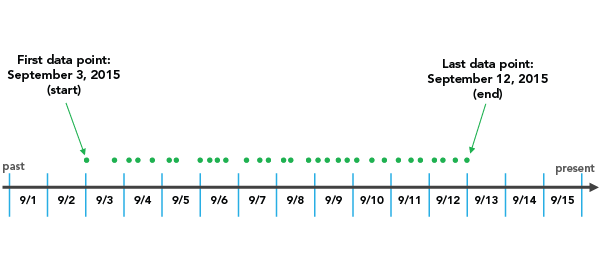
Temporal data is binned into time intervals. A default interval size is chosen based on the temporal extent of the dataset and can be manually changed using the Interval size option.
Interval alignment
Time intervals may align to the first data point, the last data point, or a specific reference time.

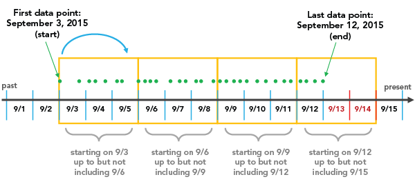
The Snap to first data point option initiates binning with the earliest date and works forward.

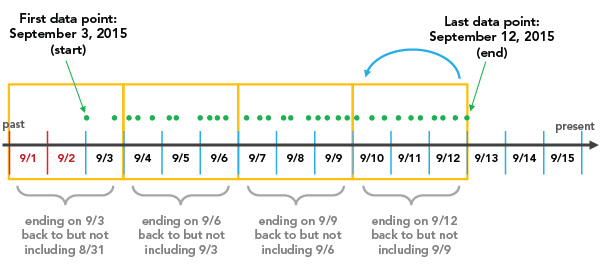
The Snap to last data point option initiates binning with the most recent date and works backward.

The Reference time option initiates binning at a specific, user-defined date.
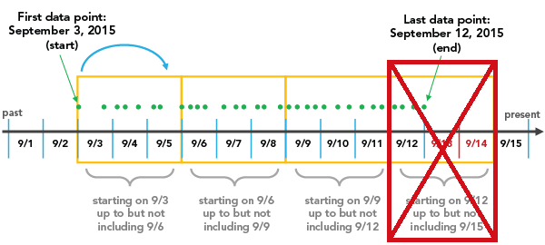
Interval alignment is important to consider because, depending on the configuration, partially empty bins may be created. Partially empty bins can give the misleading impression that there is a dip in the value or count during that time, when really the data collection began or ended during the span of that bin. To avoid bin bias, check the Trim incomplete interval option. This removes the partially filled bin from the visualization.

Axes
Several options control the axes and related settings.
Character limit
Category labels are truncated at 11 characters by default. When labels are truncated, the full text is available by hovering over the label. To display the entire label text in the chart, increase the label character limit.
Label orientation
Axis labels can be configured to display with one of the following orientations: Auto, Horizontal, Diagonal, or Vertical.
Appearance
Several options control the chart appearance and related settings.
Titles and description
The charts and axes default titles are based on the variable names and chart type. These can be edited on the General tab in the Chart Properties pane. You can also provide a value for the Description option, which is a block of text that appears at the bottom of the chart window.
Color
Grid cells are symbolized using graduated colors that correspond to a count or summarized value in the category pairings between the Column and Row fields. You can adjust a color classification method, number of classes, and color scheme on the Data tab in the Chart Properties pane.
Sort
Matrix heat chart axes are automatically sorted alphabetically by their categories. Sorting for either axis can be changed using the Sort columns and Sort rows options in the Chart Properties pane. The following sort options are available for matrix heat charts:
- Ascending—Categories are sorted in alphabetical order.
- Descending—Categories are sorted in reverse alphabetical order.
- Custom—Categories can be arranged manually in the Custom sort table.
Examples
Create a matrix heat chart to identify the flights that have the highest average arrival delay time between origin and destination city by setting the following properties:
- Column—DestCity
- Row—OrigCity
- Aggregation—Mean
- Number—DelayTime

Create a matrix heat chart to identify the cities that have the highest count of flights between origin and destination by setting the following properties:
- Column—DestCity.
- Row—OrigCity.
- Aggregation—Count.
- Number—Leave this property unset.
