Line charts visualize change over a continuous range, such as time or distance. Visualizing change with a line chart allows for the overall trend to be displayed at once and for multiple trends to be compared simultaneously.
Variables
Line charts are made up of a continuous date or number on the x-axis, and an associated numeric value on the y-axis.
The x-axis of a line chart displays a continuous variable such as time or distance, and a line is drawn visualizing the change in value between each consecutive time or distance interval. Each interval is marked with a point corresponding to a numeric value measured by the y-axis.
When a number field is chosen for the x-axis and each number appears in the table only once, no aggregation is necessary, but a numeric field must be specified.
When a date field is chosen for the x-axis, the dates are binned, or aggregated, into time intervals. When a line chart is drawn using a date field or an aggregated number field, an Aggregation method must be chosen to specify how the data will be summarized.
If no numeric fields are specified, the chart will use the Count aggregation method, which totals the number of records that appear at each time or distance interval. For example, in a dataset of crime incidents, a date field is binned into two-week intervals with a Count Aggregation method. The resulting chart will display a marker for every two-week interval representing how many crimes took place during those two weeks.
If numeric fields are specified, the aggregation method can be one of the following:
- Sum
- Mean
- Median
- Minimum
- Maximum
Lines can be smoothed by checking the Smooth line check box, which applies interpolation to each line in your chart.
Time binning options
Time aggregation, or binning, occurs automatically when a date field is chosen for the x-axis. Several options control the interval size and related settings applied to the binning.
Interval size
Temporal data is binned into time intervals along the x-axis. A default interval size is chosen based on the temporal extent of the dataset and can be manually changed using the Interval size option.
Empty bins
Depending on the sparsity of the dataset and the time interval size chosen for binning, there may be bins that contain no data. Empty bins may be treated as zero when a lack of data truly represents a value of zero (for example, no illnesses were reported in May or no rain was collected during a week span). It is not appropriate to assign a zero value to a bin in which no data exists because none was collected (for example, no reading from a temperature gauge does not mean there was a temperature of zero).
There are three options for dealing with empty bins.
- Treat them as zero (Treat as zero)—This is most appropriate when counting incidents, as no incidents counted likely means zero incidents took place.
- Interpolate neighboring values (Connect line)—Null values can be visually interpolated by connecting the line between the bins on either side of the empty bin.
- Break the line (Break line)—Leaves a blank space where an empty bin falls.
Interval alignment
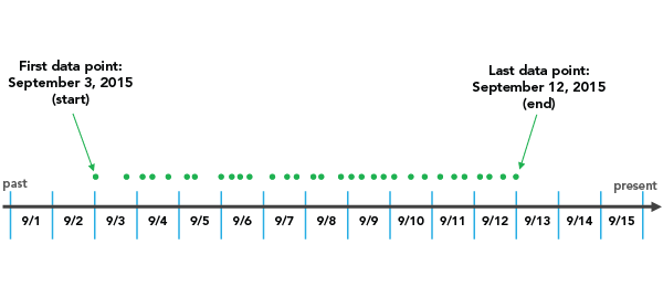
Time intervals may align to the first data point, the last data point, or a specific reference time.

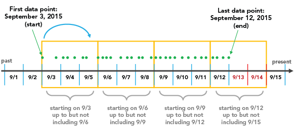
The Snap to first data point option initiates binning with the earliest date and works forward.

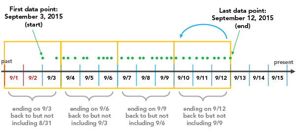
The Snap to last data point option initiates binning with the most recent date and works backward.

The Reference time option initiates binning at a specific, user-defined date.
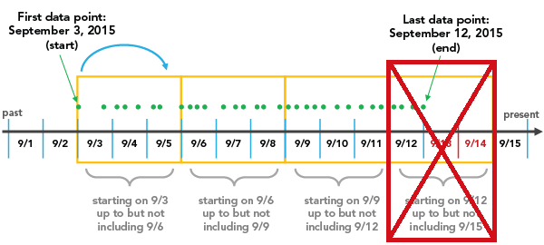
Interval alignment is important to consider because, depending on the configuration, partially empty bins may be created. Partially empty bins can give the misleading impression that there is a dip in the value or count during that time, when really the data collection began or ended during the span of that bin. To avoid bin bias, check the Trim incomplete interval option. This removes the partially filled bin from the visualization.

Multiple series
Multiple lines, or series, can be visualized in the same chart to compare trends.
You can create multiple series line charts by adding multiple numeric fields or by setting a Split by category field.
When multiple numeric fields are added, one line is drawn to visualize the change for each numeric field. For example, in a dataset of crime incidents, a date field is binned into two-week intervals with a Sum Aggregation method and two numeric fields, PropertyLoss and TotalDamage. The resulting chart will display two lines, one representing the sum of PropertyLoss and the other the sum of TotalDamage for every two-week interval.
You can also use a category field to split a line chart into multiple series. For example, in a dataset of crime incidents, a date field is binned into two-week intervals with a Count Aggregation method and a CrimeType Split by field. The Series table will populate with each unique CrimeType (Theft, Vandalism, Arson), and the resulting chart will display three lines, each representing the total number of crimes of that type that took place during those two weeks.
Note:
A Split by category cannot be applied when more than one numeric field has been added.
Note:
Category fields with many unique values are not appropriate for splitting a field into multiple series.
Display multiple series
To configure a line chart with multiple series, use the Display multiple series as option under the Series tab in the Chart Properties pane. By default, multiple series are displayed with the Single chart option. In this representation, all series are drawn in the same plot area, but each series is assigned a unique color to allow for comparisons between the groups.
You can also view a line chart with multiple series as a grid chart (also known as small multiples) by selecting the Grid option. This option displays a matrix of smaller charts in which each mini chart only shows data for an individual series. Grid charts are helpful for comparing trends and patterns between subgroups in your data. You can customize the dimensions of a grid chart layout by setting the Mini charts per row numeric input. For instance, setting Mini charts per row chart to 3 will display a maximum of 3 charts per row—the total number of rows in the grid will be determined by the number of series in your chart. Checking the Show preview chart check box will allow you to dynamically explore each mini chart in greater detail by selecting one to view in the larger preview chart.

Axes
Several options control the axes and related settings.
Y-axis bounds
Default minimum and maximum y-axis bounds are set based on the range of data values represented on the axis. You can customize these values by typing a new desired axis bound value. Clicking the reset button will revert the axis bound to the default value. Setting axis bounds can be used as a way to keep the scale of your chart consistent for comparison.
Log axis
By default, line chart axes are displayed on a linear scale. Numeric (nondate) axes can be displayed on a logarithmic scale by checking the Log axis check box on the Axes tab in the Chart Properties pane.
Logarithmic scales are useful when visualizing data with large positive skew in which the bulk of data points have a small value, with a few data points with very large values. Changing the scale of the axis does not change the value of the data; it only changes the way it is displayed.
Linear scales are based on addition, and logarithmic scales are based on multiplication.
On a linear scale, each increment on the axis represents the same distance in value. For example, in the axis diagram below, each increment on the axis increases by adding 10.

On a logarithmic scale, increments increase by magnitudes. In the axis diagram below, each increment on the axis increases by multiplying by 10.

Note:
Logarithmic scales cannot display negative values or zero. If you log the axis of a variable with negative values or zero, those values will not appear on the chart.
Adaptive axis bounds
When a multiseries line chart is displayed with the Grid option, the axis bounds can be configured with the following options:
- Fixed—Applies the global minimum and maximum bounds to all mini charts.
- Adaptive—Adjusts to the local minimum and maximum bounds for each mini chart.
Grid intervals
Configure grid intervals for the y-axis using the Interval control. The default grid interval will be calculated automatically.
Invert axis
The y-axis of a line chart can be inverted by checking the Invert axis check box.
Number format
You can format the way an axis will display numeric values by specifying a number format category or by defining a custom format string. For example, $#,### can be used as a custom format string to display currency values.
Appearance
Several options control the chart appearance and related settings.
Titles and description
The charts and axes default titles are based on the variable names and chart type. These can be edited on the General tab in the Chart Properties pane. You can also provide a value for the Description option, which is a block of text that appears at the bottom of the chart window.
Color
Line colors can be changed on the Series tab in the Chart Properties pane by clicking the Symbol color patch in the Series table and choosing a new color.
Data labels
Labels displaying the value of each data point can be turned on by checking Label lines on the Data tab in the Chart Properties pane.
Orientation
Lines can be drawn vertically by clicking the Rotate chart button  in the chart window.
Guides
Guide lines or ranges can be added to charts as a reference or way to highlight significant values. To add a new guide, browse to the Guides tab in the Chart Properties pane, choose whether you want to draw a vertical or horizontal guide, and click Add guide. To draw a line, enter a Value where you want the line to draw. To create a range, enter a to value. You can optionally add text to your guide by specifying a Label.
Example
Create a line chart to visualize trends in fire events in Naperville from 2007 through 2010.
- Date or Number—Date
- Aggregation—Count
- Time Interval Size—3 months
- Split by—Time of day
