In ArcGIS AllSource, you can visualize and explore your data using charts. Charts are a graphical representation of tabular data, which helps you gain insight into the relationships, distribution, categories, trends, and patterns in data that otherwise may be difficult to see as raw numbers in a table.
To make a chart, start with the layer you want to visualize and select the type of chart. Next, define the chart's variables, then adjust the chart's properties and use interactive selection to explore further. You can manage the charts that are associated with the layers in your map and finally share the chart through a layer, map, or project package, or add it to a layout.
Choose layer and chart type
You can make a chart from any map layer that has an attribute table (including stand-alone tables). You can also make select charts for rasters and imagery layers that do not have attribute tables. If you wish to create a chart from data that is not yet in your map, add the layer to the map so it shows in the Contents pane.
- Select a layer in the Contents pane.
- On the layer's contextual Data tab, in the Visualize group, click Create Chart. Alternatively, you can right-click the layer in the Contents pane and click Create Chart.
- Choose the type of chart to make from the menu.
After you choose the type of chart to make, the following events occur:
- A chart window appears. This will remain blank until you define the chart's variables.
- The Chart Properties pane appears. Here you can define the chart variables, properties, and title text.
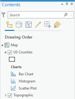
- A new chart is added to the Charts section under the source layer in the Contents pane on the List By Drawing Order tab
 .
.
Set chart variables and properties
To display data on the chart, you must set required chart variables by selecting attribute fields from the source layer.
- On the Data tab of the Chart Properties pane, select the attribute fields to use for each axis.
- Depending on the type of chart you are making you can adjust other properties, such as grouping (bar chart) or the number of bins (histogram).
- On the General tab of the Chart Properties pane, you can edit the chart and axes titles and provide a description.
After you define chart variables, the chart window will display values on the axes and data will be drawn on the chart.
Select data in the chart
A selection rectangle tool is always active when working in a chart window.
- Draw a rectangle to select the data objects in the chart. Alternatively, you can press the Ctrl key and click to select a single data object on the chart.
- You can draw a selection box where there is no chart data to clear the selection.Alternatively, on the Map tab, in the Selection group, you can click to Clear to clear the selection on the map, chart, and table.
Change the appearance of a chart
You can configure the look of a chart by formatting text and symbol elements, or by applying a chart theme. Format properties can be configured on the Format tab in the Chart Properties pane. A chart theme can be selected on the Chart tab. Chart formatting options include the following:
- Size, color, and style of the font used for axis titles, axis labels, description text, legend title, legend text, and guide labels
- Color, width, and line type for grid and axis lines
- Background color of the chart
Manage your charts
Every layer that has an attribute table can have one or many charts. Since charts are stored as a type of layer property, you manage charts with your list of layers in the map Contents pane.
- Switch to the Contents pane List By Drawing Order tab
 to see charts listed below their parent layer.
- To open one of the charts listed, double-click the chart. Alternatively, right-click the chart and click Open.
- To delete one of the charts listed, right-click the chart and click Delete.
Disseminate your charts
You can package any layer that contains a chart, and that chart will be maintained in the shared layer. Similarly, if you package a map containing layers with charts, or a project containing maps with layers with charts, those charts will also be maintained.
- On the Disseminate ribbon tab in the Share group, click Package Project, or click the Map drop-down arrow and click Package Map, or click the Layer drop-down arrow and click Package Layer to create a package.
- The recipient of the shared package will see the charts listed under their parent layer in the Contents pane List By Drawing Order tab
 .
.
You can also export and share your chart as a graphic.
- In the chart window toolbar, click Export and save your chart as either an SVG, JPG, or PNG graphic file. Specify the corresponding extension (.svg, .jpg, or .png) to control the type of exported graphic file.