Image scatter plots are used to examine the association between image bands and their relationship to features and materials of interest. The pixel values of one band (variable 1) are displayed along the x-axis, and those of another band (variable 2) are displayed along the y-axis. Features and materials in the image can be identified where the two variables intersect in the distribution, or scatter plot.
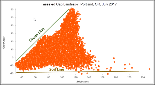
You can plot transformed bands to determine valuable information about features in the image. For example, the Tasseled Cap transformation is a special form of principle components analysis, where the first component, called brightness, is compared with the second component, called greenness. The resulting scatter plot displays the tasseled cap distribution where different vegetation species are located along the so-called green line, while soil types and man-made features are distributed along the soil line. The tasseled cap distribution is also useful for determining the growth stage of agriculture fields from emergence through senescence, vegetation vigor, and other phenomenology.

Create an Image Scatter plot
To create an image scatter plot, right-click the layer you want analyze in the Contents pane, point to Create Chart, and click Scatter plot to open the Chart Properties pane.
To define the parameter settings for your chart, click the Data tab at the top of the Chart Properties pane.
Define an area of interest
At the top of the Chart Properties pane is a selection of drawing tools to define an area of interest on your image. You can choose to display only the values within the area of interest in your scatter plot. Draw the area of interest defined by a line, circle, rectangle, polygon, or freeform shape.
Variables
Image scatter plots display the pixel values of two bands, one band variable for the x-axis and one band variable for the y-axis.
If you want to display only the bands' pixel values in the area of interest you defined on your image, check the Using custom area of interest check box. If you want to display all the bands' pixel values in your scatter plot, do not check the check box. You can delete the area of interest by clicking the delete button  , which will delete the area of interest and display all the bands' image pixels.
Symbol
Single color is the default symbol option for image scatter plots. To define a display color for your data, click the Single color symbol to display a gallery of colors and choose a color.
Statistics
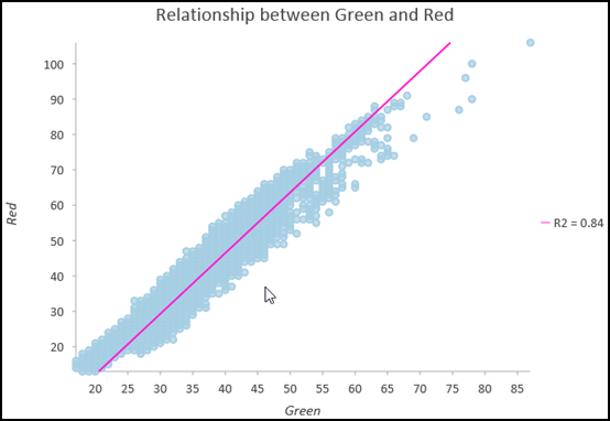
A regression equation is calculated and the associated trend line and R2 are plotted on scatter plots. Click the Show linear trend check box to display the trend line. The trend line models the linear relationship between x and y, and the R2 quantifies how well the data fits the model. This is only relevant for linear relationships. To turn off the trend line, uncheck the Show linear trend check box in the Chart Properties pane, or switch visibility by clicking the item in the legend.
To change the color of the trend line, click the trend line color swatch in the Chart Properties pane and choose a new color.
When small x values correspond to small y values, and large x values correspond to large y values (line sloping up), this indicates a positive correlation. When small x values correspond to large y values, and large x values correspond to small y values (line sloping down), this indicates a negative correlation.

The statistical strength of the correlation is indicated by the R2 value. In most cases, you want to avoid highly correlated multispectral bands because they cannot be used to reliably separate multiple features and materials from imagery. Scatter plots can help identify the best uncorrelated bands to use for identifying and extracting features from multispectral imagery.
Axis
Axis bounds
Default minimum and maximum axis bounds are set based on the range of data values represented on the axis. These values can be customized by typing in a new axis bound value. Clicking the reset button  sets the axis bound back to the default value.
Log Axis
By default, scatter plot axes are displayed on a linear scale. One or both axes can be displayed on a logarithmic scale by checking the Log axis check box in the Axes section of the Chart Properties pane.
Most multispectral imagery bands have values within the same order of magnitude and using a logarithmic scale is not necessary. If imagery has been transformed into a different domain, such as a Fast Fourier Transform (FFT), displaying the magnitude signal and phase signal using log scales can be useful for analysis.
Number format
You can format the numeric values on an axis by specifying a number format category or by defining a custom format string.
Guides
Guide lines or ranges can be added to charts as a reference or way to highlight significant values. To add a new guide, navigate to the Guides tab in the Chart Properties pane and click Add guide. To draw a line, enter a value where you would like the line to draw. To create a range, enter a value. You can optionally add text to your guide by specifying a Label.
Interactive analysis
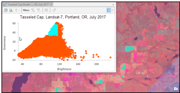
The scatter plot can interact with the imagery in your map view. After setting up your scatter plot, you can interactively select a region in the distribution and visualize the associated image pixels in the map display. This allows you to visually examine the distribution of pixel values comprising particular feature classes in your scatter plot, and visualize the separation between feature classes for a given set of scatter plot variables.

The image above shows a group of values activated in the Tasseled Cap distribution with the associated image pixels highlighted in the map display. Only pixels in the defined area of interest are highlighted. If you have not defined an area of interest, pixels in the entire image can be affected by your selection in the scatter plot distribution.
Appearance
Titles and description
Charts and axes are given default titles based on the variable names and chart type. These can be edited on the General tab in the Chart Properties pane. You can also provide a chart Description, which is a block of text that appears at the bottom of the chart window.
You can further adjust the appearance of your chart using the Data, Axes, Guides, and Format tabs in the Chart Properties pane. For more information about how to adjust the appearance of your scatter plot, refer to Change chart appearance.