

Note:
ArcGIS Insights is deprecated and will be retiring in 2026. For information on the deprecation, see ArcGIS Insights deprecation.
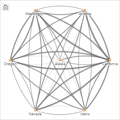
Link charts show the magnitude and direction of relationships between two or more categorical variables. They're used in link analysis for identifying relationships between nodes that are not easy to see from the raw data.
Link charts can answer questions about data, such as the following:
- How is it related?
- In which direction does the information flow?
Example
A GIS analyst is studying patterns of migration in the United States. A link chart can be used to visualize the rate of migration between individual states. The link chart can be configured to show the direction of migration.
Create a link chart
To create a link chart, complete the following steps:
- Select one of the following combinations of data:
- Two string fields

- Two string fields
 and a number field
  or a rate/ratio field
Note:
If you do not select a number or rate/ratio field, the data will be aggregated and a count will be displayed.
You can search for fields using the search bar in the data pane.
- Two string fields
- Create the chart using the following steps:
- Drag the selected fields to a new card.
- Hover over the Chart drop zone.
- Drop the selected fields on Link Chart.
Tip:
You can also create charts using the Chart menu above the data pane or the Visualization type button  on an existing card. For the Chart menu, only charts that are compatible with the data selection will be enabled. For the Visualization type menu, only compatible visualizations (including maps, charts, or tables) will be displayed.
Link charts can also be created using View Link Chart, which is accessed from the Action button  under Find answers > How is it related?
Usage notes
Click a node to display the Hide leaf nodes button  , the Set as root node
  or Set as central node button
  , and the Edit button
  . Hide leaf nodes will collapse any nodes that are connected only to the selected node. The nodes can be unhidden using the Show leaf nodes button
  . Set as root node and Set as central node will change the root or central node from the node with the highest centrality to the selected node. Set as root node is only available for charts using a hierarchical layout and Set as central node is only available for charts using a radial layout. Edit can be used to change the style of the selected image. Symbol styles that are changed using the Edit button will be saved in the workbook and on the page, but not in the model.
Use the Layer options button  to change the style of the symbols. Select a node or link to change the style options in the Layer options pane. The style options include changing the size and color of nodes, changing the node symbol to an image, changing the pattern and thickness of links, and applying classification types to both links and nodes.
The nodes can be sized using the following centrality methods:
- Degree—The number of direct neighbors of the node. If the chart is directed, the degree can be measured as either indegree (the number of direct neighbors with connections directed toward the node) or outdegree (the number of direct neighbors with connections directed away from the node).
- Betweenness—The extent to which a node lies on the shortest path between other nodes in the network.
- Closeness—The average of the shortest distance paths to all other nodes.
- Eigenvector—The measure of the influence of a node in a network based on its proximity to other important nodes.
The Symbology tab, Appearance tab, and Legend tab will display different options based on the selections you make in the Layer options pane. The following options are available for link charts:
| Selection | Symbology  | Appearance  | Legend  |
|---|---|---|---|
None | The Directed parameter can be used to change the links to arrows from one node to the other. The centrality method can be set from the Size node using parameter. Use the Edge weight parameter to calculate weighted centrality values. By default, the Edge weight parameter is set to Uniform, meaning the centrality calculation is unweighted. You can choose a field to apply weights to the calculation. Edge weight is available for betweenness, closeness, and eigenvector centralities. Use the Normalized parameter to normalize the node centralities by dividing by another field to create a ratio or proportion. The Normalized parameter is enabled by default but can be disabled for nodes using betweenness and closeness centrality. The Natural Breaks, Equal Interval, and Unclassed classifications can be chosen in the Classification type parameter. If you choose Natural Breaks or Equal Interval, you can also edit the number of classes. Learn more about chart classification Click View centralities to create a reference table showing the centrality values for each node. The table includes a column for entity (field name), node (feature), and centrality. | Switch the chart layout between Force directed (default), Hierarchical, and Radial. A hierarchical layout can be directed Top to bottom | Unavailable |
Tip:
| |||
Node | Use the Choose node field parameter to switch the selected node to a different string field. | Configure Node style options, including the following:
Add an image file or URL to symbolize the nodes using Custom from the Symbol shape menu. | Unavailable |
Use the Add button Tip: Use Ctrl+click to select multiple nodes. You can do the following:
| |||
Link | Use the Weight parameter to change or remove the number or rate/ratio field being used to apply weight to the links. Use the Type parameter to change or remove the string field being used to style the links by unique category. | Configure the Link style options parameter, including the following:
| The Legend tab is enabled if a Weight field or Type field is added. The Legend tab can be used to view the classification values or unique categories for the links and to make selections on the chart. |
If the arrows are pointing in the wrong direction, use the Flip button If the chart includes three or more node fields, the Delete button Tip:
| |||
Use the Card filter button  to remove any unwanted data from the card. Filters can be applied to all string, number, rate/ratio, and date/time fields. A card filter does not affect other cards using the same dataset.
Use the Selection tools button  to select features on the chart using the single select tool, or invert the selection.
Use the Zoom tools button  to zoom in or out on the chart.
Use the Visualization type button  to switch directly between a link chart and other visualizations, such as a summary table, stacked bar chart, or chord diagram.
Use the Maximize button  to enlarge the card. Other cards on the page will be reduced to thumbnails. The card can be returned to its previous size using the Restore down button
  .
.
Use the Enable cross filters button  to allow filters to be created on the card using selections on other cards. Cross filters can be removed using the Disable cross filters button
  .
.
Use the Flip card button  to view the back of the card. The Card info tab
  includes a count of features and a text box for a description of the card.
Use the Card options button  to access the following options:
- Appearance button
 —Change the background color, foreground color, and border of the card.
 - Edit labels button
 —Create custom labels for the chart axes. To edit the labels, click the Edit labels button and click the axis to make it editable.
 - Order button
 —Move the card forward or move the card backward relative to other cards on the page.
 - Delete button
 —Remove the card from the page. If you did not intend to delete the card, you can retrieve it using the Undo button
  .
.
How link charts work
There are three layout options available when creating a link chart: force directed, hierarchical, and radial.
Force directed
A force directed layout displays the relationships between nodes in an organization that balances performance and drawing quality, including minimizing edge crossing, optimizing space, creating an even distribution of nodes, and displaying the graph symmetrically. A force directed layout is especially useful in analyses in which the relationships are not hierarchical, so the organization is based on optimizing the clarity of the graph. Force directed is the default layout, and is used in the example above.
Hierarchical
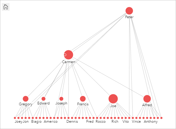
A hierarchical layout organizes a link chart so that the most important node (by default, this will be the node with the highest centrality) is located at the top, with links directed downward, similar to a family tree. A hierarchical layout is especially useful in analyses in which the hierarchy is inherent in the dataset (for example, a workplace with an employer, managers, and employees).
Example
A police department has been tracking communication between members of a criminal organization. A link chart can be used to create connections between the different members of the organization. A hierarchical layout provides the police department with information about the internal organization, including who is the boss, and which lower-level members are working together.

Radial
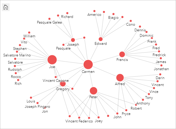
A radial layout functions similarly to the hierarchical layout, but with an organization that is circular rather than linear from top to bottom. In a radial layout, the most important node (by default, this will be the node with the highest centrality) is located in the center, with links directed outward in an orbital pattern. A radial layout tends to have a more efficient use of space than a hierarchical layout, which makes it useful for large datasets. However, the change in layout can have trade-offs; for example, the hierarchical structure may be less obvious in a radial layout. Therefore, it is more useful to use a radial layout in situations when aspects such as groups of related nodes are more important than the hierarchical relationship.
Example
In the previous example, a police department was tracking communication between members of a criminal organization. Rather than using a link chart to understand the internal hierarchy of the organization, this time the link chart can be used to look more specifically at direct relationships. By switching the chart to a radial layout, the focus is switched from Peter (the leader of the organization) to Carmen (the second-in-command). This change in focus is caused by Carmen's role as a go-between for the top level and the lower levels, whereas Peter only has contact with a small number of lower-level members. The radial organization puts more emphasis on how those levels are grouped, rather than who is commanding whom.

Limitations
A limit to the number of connections that can be displayed is based on the maximum query limit for the dataset. The There's too much data to complete this operation error message is displayed if the number of connections is greater than the limit. The maximum query limit for point features is 16,000. The maximum query limit for line and area features is 8,000.
For example, a dataset of flights throughout Europe contains hundreds of thousands of flight numbers for 126 airports. Every airport has at least one direct flight to every other airport. Therefore, the number of connections is as follows:
126 origins * 126 destinations = 15876 connectionsThe number of flights does not affect the query limit, but the number of airports does. If one extra airport is added to the dataset with direct flights to all other airports, the number of connections increases to 16,129, which is over the query limit. However, if a connection does not exist between every unique value, the number of unique values can be higher. If some of the airports do not have direct flights between each other, the number of airports that can be displayed can increase until the number of connections surpasses the query limit.
Resources
Use the following resources to learn more about charts:
 (default),
  ,
,  , or
, or  .
. Drag a string field to the
  and
and  and
and  to merge or unmerge the values from the From and To fields. Merging the fields sets the nodes to the same symbol.
 and
and  to remove or add a link between two node fields. These options are only available if there are three or more node fields.
 to change the direction of the flow.