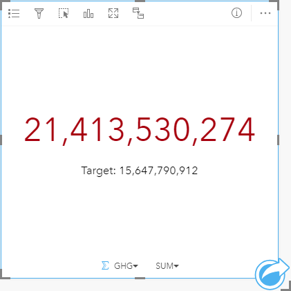


A Key Performance Indicator (KPI) card is a method of evaluating the status of a measure by comparing key indicators to a target.
KPI cards can answer questions about your data, such as how close the indicator is to the target.
Examples
An environmental organization is keeping track of global greenhouse gas emissions with the short-term goal of reducing emissions below 1990 levels. A KPI card can be used to show the current emissions (indicator) compared to the 1990 level (target).

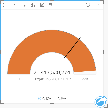
The same KPI card can also be displayed using a gauge layout, which shows a visual comparison of the indicator and the target.

Create a KPI card
To create a KPI card, complete the following steps:
- Select one of the following combinations of data:
- One or two number
 or rate/ratio fields
- A string field
 , including subfields from a date/time field
Note:
If you use a string field, the number displayed will be a count of features.
Tip:
You can search for fields using the search bar in the data pane.
- One or two number
- Create the chart using the following steps:
- Drag the selected fields to a new card.
- Hover over the Chart drop zone.
- Drop the selected fields on KPI.
Tip:
You can also create charts using the Chart menu above the data pane or the Visualization type button  on an existing card. For the Chart menu, only charts that are compatible with your data selection will be enabled. For the Visualization type menu, only compatible visualizations (including maps, charts, or tables) will be displayed.
Usage notes
By default, a KPI card is displayed as a number value. KPI cards may display rounded integers for the target and indicator labels rather than decimals for some datasets. The rounded integers are for display only, and the decimal values are used for all calculations. In a case where the indicator is close to the target value and one or more of the labels is rounded, the KPI color may appear incorrect because it is reflecting the decimal values rather than the rounded values.
This visualization creates a result dataset  in the data pane, which includes the fields used to create the chart. The result dataset can be used to create additional visualizations, rename the fields on the chart axes or in the pop-ups, or apply filters to the chart.
KPI cards using a Number layout can be resized smaller than the default card size. The font size for the indicator will change dynamically to fit the card as the size is decreased. The Gauge layout uses the default card size as the minimum.
Use the Layer options button  to open the Layer options pane and update the following configuration options:
- Use the Symbology tab
 to change the following settings:
- If your layout is Number, the Symbology tab can be used to change the indicator and target values.
- If your layout is Gauge, the Symbology tab can be used to change the indicator, target, minimum, and maximum values.
- If your KPI card includes a target value, the Symbology tab can be used to change the target label.
- Use the Appearance tab
 to change the layout between Number and Gauge. The Number layout displays the numeric value of the indicator and target. The Gauge layout displays the indicator and the target, along with a minimum and maximum value, on a semicircular scale. The Appearance tab can also be used to change the KPI color parameter (Equal to or above target color and Below target color) and the Target color parameter.
Use the Card filter button  to remove any unwanted data from your card. Filters can be applied to all string, number, rate/ratio, and date/time fields. A card filter does not affect other cards using the same dataset.
Use the Maximize button  to enlarge the card. Other cards on the page will be reduced to thumbnails. The card can be returned to its previous size using the Restore down button
  .
.
Use the Enable cross filters button  to allow filters to be created on the card using selections on other cards. Cross filters can be removed using the Disable cross filters button
  .
.
Use the Flip card button  to view the back of the card. The Card info tab
  provides information about the data on the card and the Export data tab
  allows users to export the data from the card.
Use the Card options button  to access the following menu options:
- Appearance button
 —Change the background color, foreground color, and border of the card.
 - Edit labels button
 —Create custom labels for the chart axes. To edit the labels, click the Edit labels button and click the axis to make it editable.
 - Order button
 —Move the card forward or send the card backward relative to other cards on the page.
 - Delete button
 —Remove the card from the page. If you did not intend to delete the card, you can retrieve it using the Undo button
  .
.
Resources
Use the following resources to learn more about charts: